Neutral Sans Workhorse

Blackrend + Helina
Lets Blackrend own the focal silhouette while handling secondary copy, sizing and subheads cleanly.
Inspect Helina specimenDisclosure: MakerFileHub may earn a commission from qualifying purchases via paid links on this page. How our links work.
Plain solid blackletter with broad diamond shoulders
Blackrend is a blackletter display face with a heavy vertical stroke, cut diamond feet and stems that break apart where a historical textura would join, so the letters look stencilled rather than woven.
Paid link
Get this fontProject & layout blueprintsAt-a-glance maker compatibility
Fine grain and micro-texture excel in 300 DPI print, sublimation, and screen print rather than small vinyl weeding.
Visual anatomy & craft review
Blackrend spans the card in solid black on a pale grey wall with a mottled texture, and the letters are wide with heavy stems and sharp diamond spurs at the top and foot. The joins between the stem and the arch are drawn as separate pieces, which opens small gaps in the letter and gives the face a stencil quality; the counters are square rather than rounded, so the word reads clearly at a distance. Three captions surround the title, one above and two below, in a gothic with a lighter weight and a roman for the credit, and the sample is otherwise plain — no ornament, no frame. That plainness is useful: it shows the face is a workmanlike display blackletter for signage, merch and titles that need period weight without the illegibility of a replica textura.
Plain solid blackletter with broad diamond shoulders
Two-font hierarchy recipes
Tested contrast partners — pairing Blackrend with grounded secondary typography.
Blackrend + Helina
Lets Blackrend own the focal silhouette while handling secondary copy, sizing and subheads cleanly.
Inspect Helina specimen
Blackrend + The Bilstein Editorial
Grounds bold display lettering with classic typographic authority on posters, badges and apparel.
Inspect The Bilstein Editorial specimenPractical applications
Concrete hierarchy, scale and production guidance tailored to Blackrend’s stroke geometry.
The stencil gaps give the lettering a carved look that suits a lantern-lit event, and the square counters stay legible on a sign read in poor light.
Hierarchy & layout recipe
Print a 600 by 400 mm sign: set the event name at 100 pt across one row, keep 26 mm of clear ground beneath before the times at 15 pt, and hold 24 mm of margin so no diamond spur is trimmed.
Pre-production check
Stencil gaps close up in vinyl; print one sign on the intended material and check the counters before the set.
The face reads like a hand-painted shopfront letter rather than a vinyl sign, and one word on glass identifies the business to anyone walking past without a logo.
Hierarchy & layout recipe
Print a 400 by 250 mm window decal: set the shop name at 70 pt on one row, keep 18 mm of clear ground beneath before the street number at 12 pt, and hold 16 mm from the widest letter to the cut edge.
Pre-production check
Cut vinyl loses the thin spurs; print one decal on the real material and check the D before the order.
The plain weight holds a long title at jacket size, and the carved quality sets the mood without illustration on a series that needs consistency.
Hierarchy & layout recipe
Print a 129 by 198 mm cover: set the title at 48 pt across two rows, keep 20 mm of clear ground beneath before the author at 10 pt, and hold 14 mm from the widest letter to the spine edge.
Pre-production check
The mottled grey of the sample is not part of the font; print one cover on white stock to check the letters stand alone first.
Technical & licence verification
Confirm included OTF/TTF/WOFF formats, full glyph tables and licence coverage on the live store page before batch production.
Closest visual alternatives
Matched across letterform anatomy, stroke behaviour and craft applications.
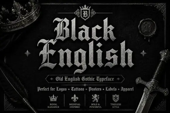
Angular blackletter with diamond-ended strokes and ornate initials
Black English shows pale Gothic mixed case on black, where angular broken bowls, pointed joins and diamond stroke endings give the lowercase a dense rhythm, the large B and E carry extra entry flourishes and a grey hatched treatment adds surface detail to the shown title.
Ideas for this font
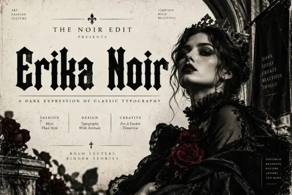
Heavy upright blackletter with blunt notches and diamond dots
Erika Noir is a wide blackletter display face with heavy stems, flat feet and a dense texture, set here in a fashion editorial where the lettering takes half the page.
Ideas for this font
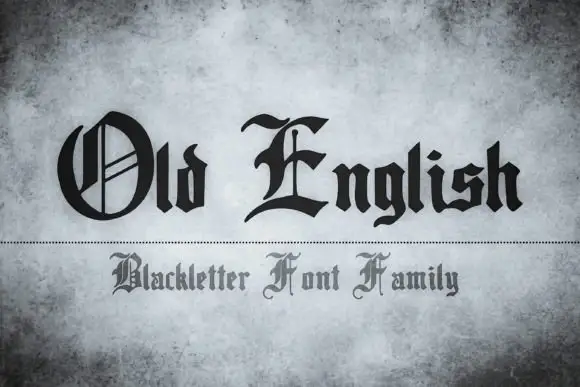
Blackletter family display
Old English is a blackletter family shown in black on a mottled grey ground: two lines in two treatments, the first with a decorated round O and a sweeping E over a compact angular lowercase, the second in a smaller and lighter cut below a dotted rule.
Ideas for this font
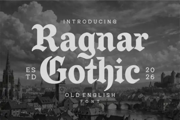
Rounded blackletter display
Ragnar Gothic is a rounded blackletter in cream over a monochrome medieval cityscape: mixed case with broad round bowls, a split capital G, curled spurs and softened corners, set in two lines between a small line above and a tracked caption beneath, with dated notes at the shoulders.
Ideas for this font
Same independent foundry
Allow optional Google Analytics to measure visits and catalogue actions. Your search words and notes are not included. Privacy & storage