Neutral Sans Workhorse

Old English + Lemon Milk Pro FTR
Lets Old English own the focal silhouette while handling secondary copy, sizing and subheads cleanly.
Inspect Lemon Milk Pro FTR specimenDisclosure: MakerFileHub may earn a commission from qualifying purchases via paid links on this page. How our links work.
Blackletter family display
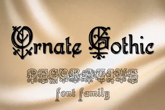
Old English is a blackletter family shown in black on a mottled grey ground: two lines in two treatments, the first with a decorated round O and a sweeping E over a compact angular lowercase, the second in a smaller and lighter cut below a dotted rule.
Paid link
Get this fontProject & layout blueprintsAt-a-glance maker compatibility
Open counter bridges hold interior islands intact on laser-cut wood, acrylic, and mylar stencils.
Visual anatomy & craft review
The plate sets the family rather than one cut, and the comparison is the point: the larger face has a decorated O and a sweeping E, while the smaller cut beneath is lighter and more regular, so a buyer sees both a display weight and a smaller one in one glance. The drawing is a blackletter with compact angular lowercase beneath the capitals, which is what makes the face workable for a phrase rather than a word. That construction sets a moderate size floor, because the fine strokes in the smaller cut close first. The mottled grey ground is staging, and the dotted rule separates the two specimens without competing. It suits a poster, a book cover and a bar sign for a historical subject.
Decorative, blackletter, historic, family
Two-font hierarchy recipes
Tested contrast partners — pairing Old English with grounded secondary typography.
Old English + Lemon Milk Pro FTR
Lets Old English own the focal silhouette while handling secondary copy, sizing and subheads cleanly.
Inspect Lemon Milk Pro FTR specimen
Old English + Vanielst Elegant Serif Display Stylistic
Grounds bold display lettering with classic typographic authority on posters, badges and apparel.
Inspect Vanielst Elegant Serif Display Stylistic specimenPractical applications
Concrete hierarchy, scale and production guidance tailored to Old English’s stroke geometry.
A blackletter family gives a period evening two voices, so a title and a detail line can share a genre without repeating a face.
Hierarchy & layout recipe
A2 poster: the title in the display cut at 95 mm cap height, the details in the lighter cut at 16 mm, and the venue at 11 mm. Keep 32 mm margins and print one colour on a dark stock.
Pre-production check
Check the A2 at five metres, where a fine stroke in the lighter cut can vanish; keep it above 1.5 mm. Confirm the 11 mm venue reads at two metres and that the title clears the trim.
A blackletter family frames a history as a printed plate, and the lighter cut carries the subtitle without a second typeface.
Hierarchy & layout recipe
Set the title at 80 mm cap height across 180 mm in the display cut, the subtitle in the lighter cut at 12 pt, and the imprint at 8 pt. Print two colours on a textured stock.
Pre-production check
Check the title at 80 mm, where a decorated O can clot on a rough sheet; keep the counters open. Confirm the 12 pt subtitle holds and that the imprint survives lamination.
A blackletter mark gives a pub a period sign, and the lighter cut covers a menu header at a size that a display cut could not reach.
Hierarchy & layout recipe
Paint a 900 by 320 mm board: the pub at 110 mm cap height in the display cut, the line in the lighter cut at 26 mm, and a 5 mm rule. Keep 24 mm margins and paint two colours on a primed board.
Pre-production check
Check the board at five metres, where a decorated O can read as a smudge; keep the contrast inside the letter. Confirm the 26 mm line reads at two metres and that the rule survives rain.
Technical & licence verification
Confirm included OTF/TTF/WOFF formats, full glyph tables and licence coverage on the live store page before batch production.
Closest visual alternatives
Matched across letterform anatomy, stroke behaviour and craft applications.
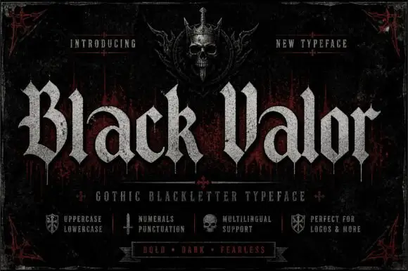
Broad blackletter with curved a shoulders and hooked capitals
Black Valor sets a gothic blackletter in distressed white on a black ground, with broad strokes, curled lowercase shoulders and hooked capitals whose ends finish in fine diamond points.
Ideas for this font
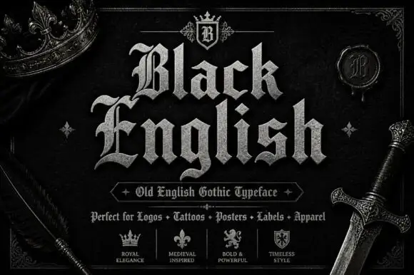
Angular blackletter with diamond-ended strokes and ornate initials
Black English shows pale Gothic mixed case on black, where angular broken bowls, pointed joins and diamond stroke endings give the lowercase a dense rhythm, the large B and E carry extra entry flourishes and a grey hatched treatment adds surface detail to the shown title.
Ideas for this font
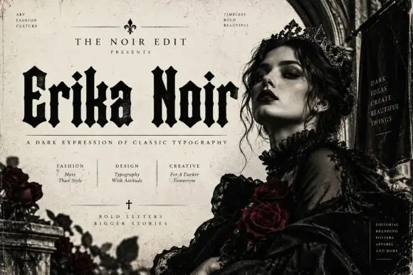
Heavy upright blackletter with blunt notches and diamond dots
Erika Noir is a wide blackletter display face with heavy stems, flat feet and a dense texture, set here in a fashion editorial where the lettering takes half the page.
Ideas for this font
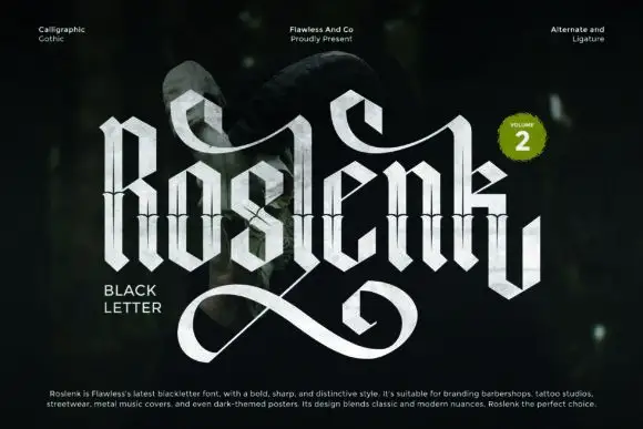
Tall calligraphic blackletter with fine waist lines and extended loops
Roslenk Volume 2 is a blackletter drawn without a single curve: every stroke is a straight cut, the joins are mitred, the spurs end in diamonds, and the last letter throws a long angular swash under the word.
Ideas for this font
Same independent foundry
Allow optional Google Analytics to measure visits and catalogue actions. Your search words and notes are not included. Privacy & storage