Neutral Sans Workhorse

Bavarian Brezen + Taught
Lets Bavarian Brezen own the focal silhouette while handling secondary copy, sizing and subheads cleanly.
Inspect Taught specimenDisclosure: MakerFileHub may earn a commission from qualifying purchases via paid links on this page. How our links work.
Broad broken letters with clipped bowls and wedge-like terminals
Bavarian Brezen is a handwritten fraktur: the strokes wobble slightly as a pen would, the capitals carry curled spurs, and the face covers a large character set for European languages.
Paid link
Get this fontProject & layout blueprintsAt-a-glance maker compatibility
Sturdy stroke walls and open counters weed cleanly on adhesive vinyl, HTV apparel film, and cut cardstock.
Visual anatomy & craft review
The preview sets the name across two lines in a warm reddish brown on aged paper, with a smaller handwritten line above it in green and a note about the glyph count below. The letterforms follow the fraktur model closely: the B has a doubled bowl, the r and the e share a small hook, and the z carries a tail that drops below the baseline. What separates the face from a library blackletter is the drawing: the stems are slightly uneven, the terminals taper, and a few strokes overshoot the baseline, which gives the word the feel of a sign painted by hand. Six small flags sit along the sides of the card to advertise the language support, and the credits are set in the same hand at a smaller size. It is a face for beer halls, bakeries and festival posters, and the hand-drawn edge is the reason to choose it.
Broad broken letters with clipped bowls and wedge-like terminals
Two-font hierarchy recipes
Tested contrast partners — pairing Bavarian Brezen with grounded secondary typography.
Bavarian Brezen + Taught
Lets Bavarian Brezen own the focal silhouette while handling secondary copy, sizing and subheads cleanly.
Inspect Taught specimen
Bavarian Brezen + The Bilstein Editorial
Grounds bold display lettering with classic typographic authority on posters, badges and apparel.
Inspect The Bilstein Editorial specimenPractical applications
Concrete hierarchy, scale and production guidance tailored to Bavarian Brezen’s stroke geometry.
The handwritten fraktur suits a beer hall better than a library blackletter, and the warm brown fill reads across a long table in low light.
Hierarchy & layout recipe
Print a 300 by 200 mm table sign: set the greeting at 60 pt across two rows, keep 16 mm of clear ground beneath before the menu at 11 pt, and hold 18 mm of border on all four sides of the card.
Pre-production check
Warm brown on kraft goes flat; print one sign on the intended stock and check the contrast before the set is cut.
The hand-drawn letters match the product on a shelf of loaves, and the uneven strokes keep a small shop from looking like a supermarket brand.
Hierarchy & layout recipe
Print a 80 by 50 mm bag label: set the bakery name at 18 pt on one row, keep 6 mm of clear ground beneath before the word brot at 5 pt, and hold 5 mm from the lowest tail to the label edge.
Pre-production check
Small tails fill in on paper labels; print one label on the actual stock and check the hook on the z before the batch.
The fraktur is the printed voice of a German market, and the tight lowercase keeps a long stall name inside a narrow vertical board.
Hierarchy & layout recipe
Print a 400 by 600 mm board: set the stall name at 90 pt across two rows, keep 26 mm of clear ground beneath before the dates at 14 pt, and hold 24 mm of margin so no spur is cropped.
Pre-production check
Snow and rain blur painted boards; print one board with an outdoor finish and check the fine hooks before the fair opens.
Technical & licence verification
Confirm included OTF/TTF/WOFF formats, full glyph tables and licence coverage on the live store page before batch production.
Closest visual alternatives
Matched across letterform anatomy, stroke behaviour and craft applications.
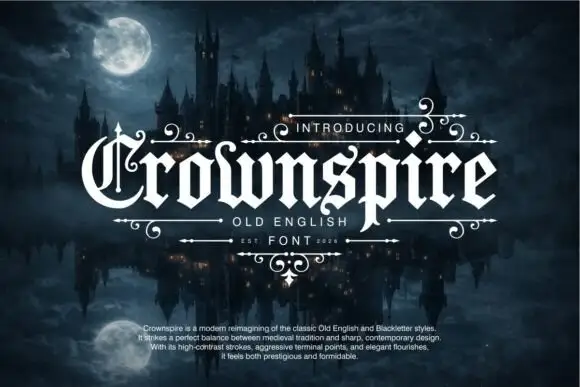
Pointed blackletter with a split ornate C and descending p
Crownspire is an old English display face with long entry and exit flourishes, sharp spurs and a heavy lower stem weight, framed here by a symmetrical ornament of curls and diamonds.
Ideas for this font
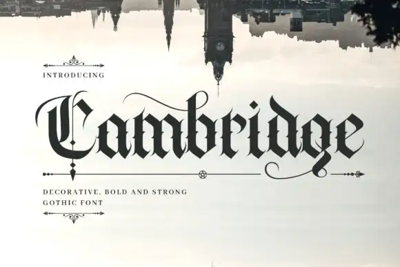
Dense blackletter with split C and long hairline swashes
Cambridge shows a black gothic word beneath an inverted skyline, where the C carries a thin parallel inner stroke and a wide upper arc, the heavy lowercase bodies meet in sharp diamond joins, fine curves extend above the middle and beneath the final g, and the i dot is a tilted diamond.
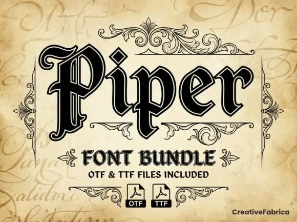
Outlined blackletter with doubled edges
Piper is an outlined blackletter in black on aged cream: a large curled P with doubled edges, narrow bodies, a diamond counter and fine inner lines, set as one large word above a scroll-flanked line that names the bundle and two format marks.
Ideas for this font
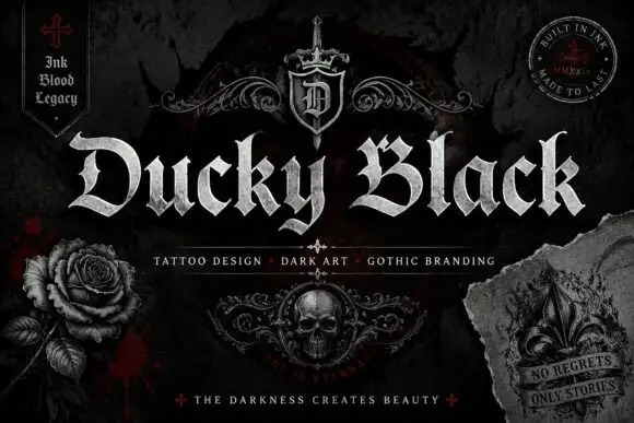
Wide blackletter with sweeping D and a densely split B
Ducky Black is a tattoo and dark-art blackletter with wide stems, sharp spurs and a distressed silver fill, framed by drawn roses, a skull and a fleur.
Ideas for this font
Allow optional Google Analytics to measure visits and catalogue actions. Your search words and notes are not included. Privacy & storage