High-Contrast Display Serif

Balveros Vecia + Glofi
Pairs sculptural editorial warmth with Balveros Vecia's clean modern geometry.
Inspect Glofi specimenDisclosure: MakerFileHub may earn a commission from qualifying purchases via paid links on this page. How our links work.
Fine formal script paired with a tall high-contrast serif in capitals
Balveros Vecia pairs a fine formal script with upright loops against a tall capital serif with hairline horizontals, giving a brand one elegant pair for headers and one for detail.
Paid link
Get this fontProject & layout blueprintsAt-a-glance maker compatibility
Weld or Unite overlapping script joins into one continuous vector path before sending to the blade.
Visual anatomy & craft review
The script half is a classic formal hand: the capital B opens with a tall open loop, the stems swell and shade, the joins stay hairline and the word finishes with a mirrored flourish at the other end. It is drawn to sit quietly above a large capital line rather than to carry a design alone. The serif half is a tall roman in capitals with strong vertical contrast, fine unbracketed serifs and wide proportions, so a single word reads as a masthead. Used together they let one lockup carry a script signature and a serif headline, which is the combination most heritage brands use. The dark velvet ground, the cream ink and the small centred credits are presentation; the duo is the two lines.
Formal · Contrasted · Paired
Two-font hierarchy recipes
Tested contrast partners — pairing Balveros Vecia with grounded secondary typography.
Balveros Vecia + Glofi
Pairs sculptural editorial warmth with Balveros Vecia's clean modern geometry.
Inspect Glofi specimen
Balveros Vecia + Honey
Introduces organic movement on pull-quotes, signatures and gift tags.
Inspect Honey specimenPractical applications
Concrete hierarchy, scale and production guidance tailored to Balveros Vecia’s stroke geometry.
The script handles the names and the serif handles the venue line, so one invitation carries both the personal and the formal register from a single pairing.
Hierarchy & layout recipe
Set both names in the script at 26 pt on a 120 by 180 mm card, set the venue and date in the serif at 9 pt, and hold 18 mm between the names and the venue line.
Pre-production check
A tall contrasted serif at 9 pt can thin out on textured stock; print one card on the actual paper and raise the serif to 10 pt if it breaks.
The serif reads as a shopfront name and the script as a signed label inside a garment, which is how a tailoring house is normally branded.
Hierarchy & layout recipe
Set the house name in the serif at 20 pt on the shopfront plate, set the tailor's line in the script at 11 pt on the inside label, and leave 10 mm of clearance on both.
Pre-production check
Woven labels round off hairline serifs; check a woven sample and keep the smallest serif 0.4 mm at production size.
The pairing gives a cover a masthead and a signature line without a second family, and the contrast holds at cover sizes where a single serif would look plain.
Hierarchy & layout recipe
Set the title in the serif at 84 pt across the top third, set the editor's note in the script at 20 pt at the foot, and leave 20 mm of margin at each side.
Pre-production check
A hairlined serif at 84 pt fills in on newsprint; check the press sheet and print the cover on a coated stock if the serifs begin to merge.
Technical & licence verification
Confirm included OTF/TTF/WOFF formats, full glyph tables and licence coverage on the live store page before batch production.
Closest visual alternatives
Matched across letterform anatomy, stroke behaviour and craft applications.
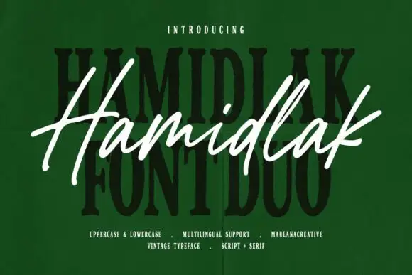
Brush signature script layered over a heavy vintage serif
Hamidlak layers a loose brush signature over a heavy vintage serif, so the same word appears twice in the sample — once as a signature and once as a stamped plate.
Ideas for this font
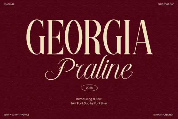
Serif and script duo pairing tall engraved caps with a light italic
Georgia Praline is a two-cut family in which a tall engraved serif carries the headline and a light italic script answers beneath it, so a design gets a formal voice and a written line from one purchase.
Ideas for this font
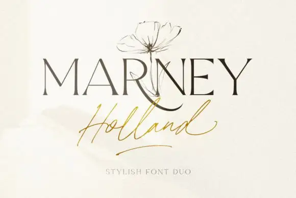
Fine serif and loose signature duo
Marney Holland pairs a tall high-contrast serif capital cut with a loose thin script: the R curls its leg below the serif line, the script runs light through its joins and a long low exit stroke closes the written line.
Ideas for this font
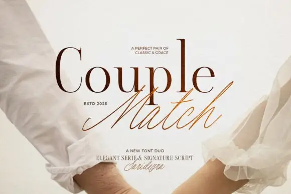
Duo pairing a high-contrast serif with a quick signature script
Couple Match is a two-cut family in which a high-contrast serif sets a formal word and a quick signature script writes the second, so a design gets a staged and a handwritten line from one purchase.
Ideas for this font
Same independent foundry
Allow optional Google Analytics to measure visits and catalogue actions. Your search words and notes are not included. Privacy & storage