Modern Grotesque Body

Grimoire Modern + Hermano
Creates crisp high-hierarchy contrast beneath Grimoire Modern headlines across menus, websites and labels.
Inspect Hermano specimenDisclosure: MakerFileHub may earn a commission from qualifying purchases via paid links on this page. How our links work.
Organic cozy-witch & apothecary display serif (TTF)
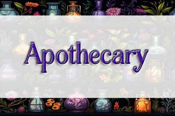
Grimoire Modern is a warm, hand-softened high-contrast serif blending mystical apothecary curves with friendly modern legibility (TTF).
Paid link
Get this fontProject & layout blueprintsAt-a-glance maker compatibility
Sturdy stroke walls and open counters weed cleanly on adhesive vinyl, HTV apparel film, and cut cardstock.
Visual anatomy & craft review
Grimoire Modern is a high-contrast serif with hand-softened curves: stems are gently bowed rather than straight, crossbars on the G and e sit unusually high, and the terminals taper into narrow points instead of flat cuts. The result reads as an old apothecary label that has been redrawn for modern legibility, warm rather than gothic. Contrast is strong but the hairlines are short, so the face holds better at 14 to 16 pt than a pure display Didone would. It is a title and label face, comfortable in mixed case, and it tolerates small amounts of ornament around it without losing its footing.
Modern-witch · Warm-organic-serif · Celestial
Two-font hierarchy recipes
Tested contrast partners — pairing Grimoire Modern with grounded secondary typography.
Grimoire Modern + Hermano
Creates crisp high-hierarchy contrast beneath Grimoire Modern headlines across menus, websites and labels.
Inspect Hermano specimen
Grimoire Modern + Handmade Calligraphy
Adds a warm human signature touch for 1-to-3-word callouts without competing against structured serif capitals.
Inspect Handmade Calligraphy specimenPractical applications
Concrete hierarchy, scale and production guidance tailored to Grimoire Modern’s stroke geometry.
Bow-stemmed serifs with high crossbars read as an old label rather than a novelty spooky face, which lets a metaphysical shop stay credible with adult customers. Mixed-case shapes hold a two-word product name on a small tin where an all-caps gothic would cram.
Hierarchy & layout recipe
Box 100 x 60 x 60 mm, name 12 mm, description 6/8 pt. Jar 60 mm diameter, label 55 x 45 mm, name 8 mm, 3 mm top arc clearance. Tea tin 75 x 100 mm, name 14 mm, brewing data 5.5 pt at 8 mm from the foot.
Pre-production check
Small labels go through a shrink sleeve or a wipe-down at the counter, and the tapered points of this face disappear under a matte laminate. Proof one laminated label and one unlaminated, then decide which surface carries the 5.5 pt data.
Warm contrast reads as a book that has been on a shelf for decades, which is the promise a cozy fantasy cover makes. The bowed stems survive being set over a painted background without an outline, where a razor-sharp Didone would fight the illustration.
Hierarchy & layout recipe
Cover 130 x 198 mm, title 32 pt in mixed case, author 14 pt, 15 mm margins, spine 7.5 pt. Journal A5, section heads 18 pt, ruled area 7 mm pitch. Bookplate 90 x 60 mm, owner line 8 pt with a 1 pt rule beneath.
Pre-production check
Titles over illustrations need enough contrast in value, not just letterform; a warm mid-toned serif on a warm painting disappears. Convert one cover proof to greyscale and confirm the title still separates from the background before moving to colour.
The apothecary warmth suits a winter theme without any snowflake ornament, which keeps a solstice greeting distinct from the Christmas pile. Mixed-case shapes read gently at card size, and high contrast gives the short greeting a focal word.
Hierarchy & layout recipe
Card 120 x 170 mm, greeting 22 pt, message 8/12 pt, 14 mm margins. Bottle label 70 x 50 mm, name 10 mm, volume 4.5 pt. Bookplate 100 x 70 mm, owner name 9 pt on a 5 mm baseline.
Pre-production check
Mulled wine is served warm, and heat plus condensation lifts uncoated labels within an evening. Specify a wash-proof synthetic label, apply it at room temperature, and test one bottle in a warm bath before the run.
Technical & licence verification
Confirm included OTF/TTF/WOFF formats, full glyph tables and licence coverage on the live store page before batch production.
Closest visual alternatives
Matched across letterform anatomy, stroke behaviour and craft applications.
Playful rounded monoline display with curls
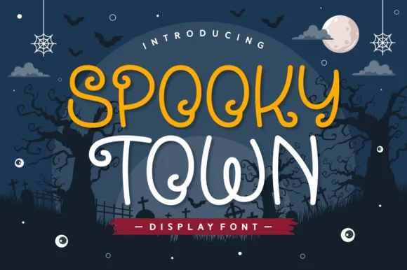
Spooky Town is a playful rounded display in mustard and cream on a navy Halloween scene: an even monoline stroke, wide rounded bowls, curls at the ends of the S and the y, and a bounce that lifts alternate letters off the baseline.
Ideas for this font
Whimsical witchy storybook Halloween font with curls, stars & spiders
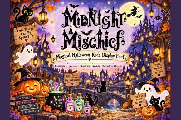
Midnight Mischief is an enchanted children's Halloween display font curling fairy-tale serif stems with hanging spiders, stars, and moons! (Full charset + elements).
Ideas for this font
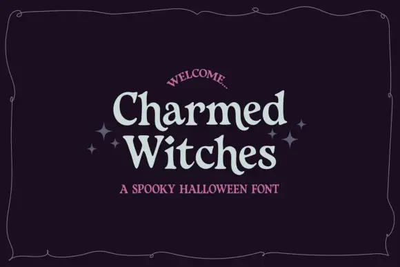
Soft irregular mixed case with flared rounded endings
Charmed Witches shows pale letters with softly curved stems, small flared serifs and uneven proportions: the W spreads broadly while the lowercase h and t rise above compact rounded bowls inside a thin wavy frame.
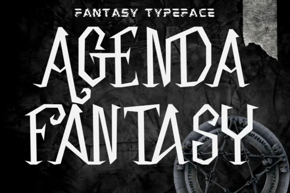
Angular blade-hooked dark-fantasy & Halloween display
Agenda Fantasy is a creepy, razor-angled dark-fantasy display font hooking jagged scythe spurs onto tall Gothic-inspired capitals.
Ideas for this font
Same independent foundry
Allow optional Google Analytics to measure visits and catalogue actions. Your search words and notes are not included. Privacy & storage