Editorial Serif Anchor

Cowboy + Rosemode
Anchors Cowboy's fluid strokes with crisp Roman proportions on wedding suites, headers and packaging.
Inspect Rosemode specimenDisclosure: MakerFileHub may earn a commission from qualifying purchases via paid links on this page. How our links work.
Smooth slanted brush-marker script with heavy joins and blunt ends
Cowboy is a smooth slanted brush-marker script in which every stroke is heavy and even, the joins are as thick as the letters and the ends are blunt rather than tapered.
Paid link
Get this fontProject & layout blueprintsAt-a-glance maker compatibility
Weld or Unite overlapping script joins into one continuous vector path before sending to the blade.
Visual anatomy & craft review
The capital C opens as a broad crescent that begins above the x-height and closes low, and the letters after it keep that volume: the o closes a wide bowl, the w holds three heavy arches, the b and the y both carry tall stems and the final y drops a curved tail that ends blunt. Nothing in the word thins: joins carry the same weight as stems, which is what gives the phrase its single continuous ribbon quality, and the lean stays constant at roughly ten degrees. Counters are open and round, and the ends are cut flat rather than tapered, so a word holds up when reproduced small or cut from vinyl. The soft garden background and the single tracked caption are presentation; the script is the word.
Smooth · Slanted · Marker
Two-font hierarchy recipes
Tested contrast partners — pairing Cowboy with grounded secondary typography.
Cowboy + Rosemode
Anchors Cowboy's fluid strokes with crisp Roman proportions on wedding suites, headers and packaging.
Inspect Rosemode specimen
Cowboy + Bargain Condensed
Keeps small-scale dates, URLs, nutrition facts and care instructions crisp and legible below script titles.
Inspect Bargain Condensed specimenPractical applications
Concrete hierarchy, scale and production guidance tailored to Cowboy’s stroke geometry.
The heavy even strokes read at a distance in daylight, and the blunt ends cut cleanly in vinyl for a sign that has to last a single day outdoors.
Hierarchy & layout recipe
Set the greeting at 14 cm on a 700 by 500 mm board, set the names in the same face at 8 cm beneath, and leave 12 cm of margin so the final tail stays on the board.
Pre-production check
Vinyl on painted board can lift at the blunt ends; check one applied word and add a 2 mm overlap at the tail before cutting the rest.
The smooth marker hand thanks a supplier warmly without sentimentality, and the heavy weight keeps the message readable on a small card printed in one colour.
Hierarchy & layout recipe
Set the message at 20 pt on a 148 by 105 mm card, keep the supplier name in a 7 pt caps sans, and hold 14 mm between the message and the signature line.
Pre-production check
A heavy script at 20 pt closes its counters on cheap stock; print one card on the actual board and open the o and e if the ink spreads.
The marker weight holds up on a bottle where a fine script would disappear, and the blunt ends keep the mark legible when the label is compressed by the curve.
Hierarchy & layout recipe
Set the brand at 16 pt on a 60 by 90 mm label, keep the volume in a 6 pt sans, and leave 7 mm at the sides so the tail is not squeezed by the label edge.
Pre-production check
A curved label compresses the outer letters; check the printed label on the bottle and increase the side margins rather than reducing the point size.
Technical & licence verification
Confirm included OTF/TTF/WOFF formats, full glyph tables and licence coverage on the live store page before batch production.
Closest visual alternatives
Matched across letterform anatomy, stroke behaviour and craft applications.

Substantial handwriting script
Simple Handwriting is a substantial handwritten script in deep green on white: connected lowercase with open round bowls, a firm even stroke, tall ascenders and a long entry stroke on the H, set across two lines over a soft brush swipe, with a serif caption beneath and a studio credit at the foot.
Ideas for this font
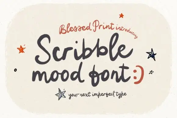
Loose rough handwritten script
Scribblemood is a loose rough handwritten script in charcoal on speckled cream: fat uneven strokes, letters of different heights and a deliberately unpolished line, presented as an imperfect type with drawn stars around it.
Ideas for this font
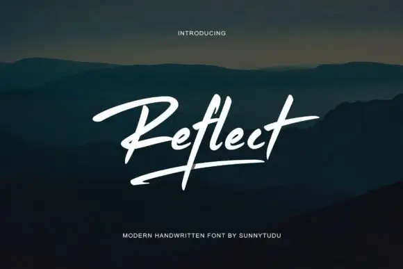
Modern brush signature with an underline
Reflect Handwritten Font is a modern brush signature in white: a single slanted word with a long underline stroke, set over a dark photograph of hills at dusk.
Ideas for this font
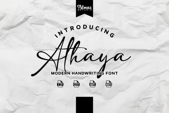
Handwritten script with a crossing baseline stroke
Athaya is a loose handwritten script whose capital sweeps a long flat horizontal stroke across the whole word, crossing beneath the lowercase to finish in a small curl.
Same independent foundry
Allow optional Google Analytics to measure visits and catalogue actions. Your search words and notes are not included. Privacy & storage