Editorial Serif Anchor

Tired Hand + Worldstar
Anchors Tired Hand's fluid strokes with crisp Roman proportions on wedding suites, headers and packaging.
Inspect Worldstar specimenDisclosure: MakerFileHub may earn a commission from qualifying purchases via paid links on this page. How our links work.
Soft slanted handwriting
Tired Hand is a handwritten script shown on a desk scene: a loose slanted hand with long capitals, uneven baseline movement, thin joins and a light weight, set as one line across the middle with a small presenting line above, a two-line descriptor beneath and four small feature notes along the foot, beside dried flowers, books, a mug and a fanned note in the same hand.
Paid link
Get this fontProject & layout blueprintsAt-a-glance maker compatibility
Weld or Unite overlapping script joins into one continuous vector path before sending to the blade.
Visual anatomy & craft review
The plate is a styled mock-up, and the props earn their place because two of them carry the same handwriting: the note at the upper right and the card at the foot are set in the face at small size, which shows how it behaves away from a headline. The drawing is loose and slanted with long capitals and an uneven baseline, so the words read as written quickly by hand rather than as a script designed for display, and the light weight keeps it soft. That construction sets a moderate size floor, because the thin joins break first. The presenting line, the descriptor and the four notes are product copy. It suits a journal page, a card and a label for a personal or a quiet subject.
Handwritten, loose, soft, journal
Two-font hierarchy recipes
Tested contrast partners — pairing Tired Hand with grounded secondary typography.
Tired Hand + Worldstar
Anchors Tired Hand's fluid strokes with crisp Roman proportions on wedding suites, headers and packaging.
Inspect Worldstar specimen
Tired Hand + Limited Coffee
Keeps small-scale dates, URLs, nutrition facts and care instructions crisp and legible below script titles.
Inspect Limited Coffee specimenPractical applications
Concrete hierarchy, scale and production guidance tailored to Tired Hand’s stroke geometry.
A loose hand reads as a personal note, and the light weight keeps a short message warm rather than formal. It suits a quiet occasion.
Hierarchy & layout recipe
A6 card: the greeting at 26 pt, the message in a 10 pt sans, and the date at 9 pt. Keep 15 mm margins, print one ink on a cream card and leave 12 mm at the foot for a line.
Pre-production check
Check the 26 pt greeting at home-print resolution, where a join breaks; keep the joins above 0.3 mm. Confirm the message reads at arm's length and that the card folds flat.
A handwriting tag finishes a present, and the uneven baseline suits a parcel wrapped by hand rather than a printed box. It suits a parcel wrapped by hand.
Hierarchy & layout recipe
Print 45 by 70 mm tags: the name at 12 pt, the year at 8 pt, and one ink on a kraft card. Keep 5 mm inside the die, keep the joins above 0.4 mm and punch clear of a capital.
Pre-production check
Check the 12 pt name on kraft, where a thin join can fill; keep it above 0.4 mm. Confirm the year reads at arm's length and that the tags tie cleanly.
A loose hand heads a journal page, and the long capitals give a short line a personal start where a serif would look printed.
Hierarchy & layout recipe
A5 page: the heading at 22 pt, the note in a 10 pt serif, and the date at 8 pt. Keep 18 mm margins, print one ink on a cream sheet and keep the joins above 0.35 mm.
Pre-production check
Check the 22 pt heading at actual size, where a join closes; keep it above 0.35 mm. Confirm the 10 pt note reads in hand and that the heading clears the margin rule.
Technical & licence verification
Confirm included OTF/TTF/WOFF formats, full glyph tables and licence coverage on the live store page before batch production.
Closest visual alternatives
Matched across letterform anatomy, stroke behaviour and craft applications.
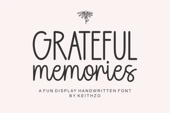
Tall handwritten capitals over a rounded script with a bouncing baseline
Grateful Memories is a handwritten display alphabet in which tall rounded capitals sit above a bouncy connected script, with even weights and fully rounded ends throughout.
Ideas for this font
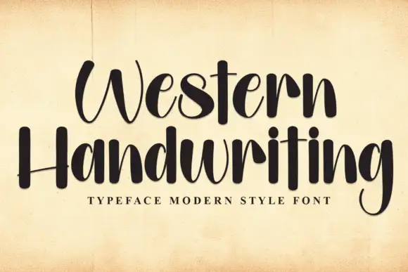
Tall brush handwriting
Western Handwriting is a tall handwritten display in near-black on aged paper: very tall ascenders, a thick-to-thin brush stroke, a bounce across both lines and blunt terminals, with a tracked line beneath naming the category.
Ideas for this font
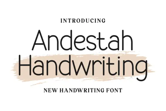
Fine open separate handwriting with even strokes and a narrow skeleton
Andestah Handwriting is fine open handwriting in which the letters stand apart, the stroke stays light and even and the skeleton is narrow, so a word reads as something written neatly with a fineliner.
Ideas for this font
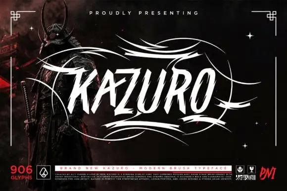
Sharp slanted brush capitals with cut terminals and a wide flourish frame
Kazuro is a sharp slanted brush alphabet in capitals, with strokes that end in hard cut angles and a flourish frame of thin sweeping lines drawn around the word.
Ideas for this font
Allow optional Google Analytics to measure visits and catalogue actions. Your search words and notes are not included. Privacy & storage