Modern Grotesque Body

After Midnight + Base Edge
Creates crisp high-hierarchy contrast beneath After Midnight headlines across menus, websites and labels.
Inspect Base Edge specimenDisclosure: MakerFileHub may earn a commission from qualifying purchases via paid links on this page. How our links work.
Fine lowercase with tall looped ascenders and curling descenders
After Midnight shows black lowercase serif lettering across two rows on a pale field: thin joins meet rounded bowls, while a long descender and the final t extension curl into rounded endpoints below the baseline and a large upper loop rises above the h region.
Paid link
Get this fontProject & layout blueprintsAt-a-glance maker compatibility
Crisp hairline serifs shine on stationery, foil stamping, and packaging; add slight offset for small decals.
Visual anatomy & craft review
The stems stay fine, the bowls round out, the ascenders close into loops and two strokes fall away beneath the line to finish in round ends that sit as clearly drawn marks. The falling loops are the character: the row reaches down as much as up, which is why the sample sets two rows with stars beside them. Because the loops travel in both directions, keep 22 mm between rows from 26 pt and print on coated stock. The loops reach in both directions, so 22 mm between rows from 26 pt is the working minimum, and the round ends silt first on an uncoated stock.
Fine · Looped ascenders · Curled descenders
Two-font hierarchy recipes
Tested contrast partners — pairing After Midnight with grounded secondary typography.
After Midnight + Base Edge
Creates crisp high-hierarchy contrast beneath After Midnight headlines across menus, websites and labels.
Inspect Base Edge specimen
After Midnight + Wishful Women
Adds a warm human signature touch for 1-to-3-word callouts without competing against structured serif capitals.
Inspect Wishful Women specimenPractical applications
Concrete hierarchy, scale and production guidance tailored to After Midnight’s stroke geometry.
The curled descenders give a dark card its softness, and the fine lowercase holds a short line at 28 pt on an A6 sheet. The curls also keep a dark card from feeling plain.
Hierarchy & layout recipe
Print an A6 card: set the line at 28 pt, keep 20 mm of clear card at each end for the curls, and set the details at 9 pt in a clean sans in the lower third. Keep the details on one line.
Pre-production check
Two looped rows stacked at 22 pt tangle; check the card and open the leading to 24 mm. Keep the line on a smooth stock.
The looped ascenders set a night feature, and the fine contrast holds a one-word title at 54 pt across a printed spread. The looped ascenders also give a heading its reach.
Hierarchy & layout recipe
Print a 210 mm spread: set the title at 54 pt, keep 22 mm beneath the curls before the standfirst at 10 pt, and keep the block on the plain outer column. Keep the title on the outer column.
Pre-production check
A curl printed over an image loses its round end; check the page and keep the title on unprinted paper. Keep the foot band plain.
The soft lowercase suits a jar label, and the fine bowls stay clear at 20 pt on a 50 mm panel. The soft bowls also keep a jar label gentle. The fine stems then keep a small jar label legible at one ink.
Hierarchy & layout recipe
Print a 50 by 45 mm label: set the studio name at 20 pt, keep 8 mm beneath for the curls, and set the scent in a 6 pt caps at the foot with 4 mm of clear ground. Keep the scent line small.
Pre-production check
A loop printed at 16 pt fills on an uncoated label; check the proof and keep the name at 19 pt or above. Check the curls at final size.
Technical & licence verification
Confirm included OTF/TTF/WOFF formats, full glyph tables and licence coverage on the live store page before batch production.
Closest visual alternatives
Matched across letterform anatomy, stroke behaviour and craft applications.

Tall light capitals with long overlapping crossbars
Beach Dates is a tall light capital face in which the C and D open broad curves, the serifs taper finely and the H crossbar reaches left into the C while the T bar stretches across the row below, so two stacked words lock into one form.
Ideas for this font

Tall ornamental serif with inward curls and heavy vertical stress
Billvane is a tall ornamental serif in which the stems carry heavy vertical stress, the terminals curl inward and the bowls close on small counters, so a single word reads as a Victorian playbill.
Ideas for this font
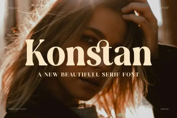
Heavy soft serif with rounded transitions and a warm weight
Konstan is a heavy serif in which the stems swell, the transitions round off and the serifs soften, so a single name reads as a warm printed label rather than as a sharp headline.
Ideas for this font
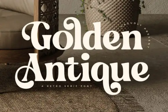
Retro serif with bulbous ball terminals and a swash tail
Golden Antique is a retro serif in which the stems swell, the terminals turn into balls and the final letter drops a swash, so a two-word title reads as a 1970s record sleeve rather than as a classical serif.
Ideas for this font
Same independent foundry
Allow optional Google Analytics to measure visits and catalogue actions. Your search words and notes are not included. Privacy & storage