Modern Grotesque Body

Konstan + Monure
Creates crisp high-hierarchy contrast beneath Konstan headlines across menus, websites and labels.
Inspect Monure specimenDisclosure: MakerFileHub may earn a commission from qualifying purchases via paid links on this page. How our links work.
Heavy soft serif with rounded transitions and a warm weight
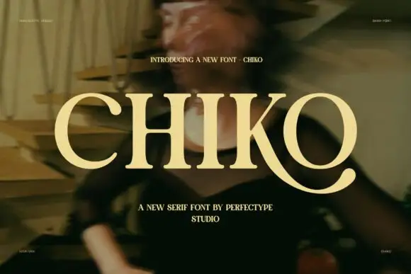
Konstan is a heavy serif in which the stems swell, the transitions round off and the serifs soften, so a single name reads as a warm printed label rather than as a sharp headline.
Paid link
Get this fontProject & layout blueprintsAt-a-glance maker compatibility
Sturdy stroke walls and open counters weed cleanly on adhesive vinyl, HTV apparel film, and cut cardstock.
Visual anatomy & craft review
The K opens a wide junction, the o stays a fat round bowl, the n keeps two thick shoulders, the s holds a heavy spine, the t sets a short bar and the a closes a small eye, all at a bold weight with rounded bracketing and a soft, almost drawn edge. The softness is the character: nothing is sharp, which is why the sample sets one name in cream over a warm photograph. Because the counters stay open and the weight is even, the face reads from 22 pt and holds a poster at 200 pt, and it prints well on uncoated stock. The lit portrait, the small caps in the corners and the caption beneath are presentation; the cream display name is the face.
Heavy · Soft serif · Warm
Two-font hierarchy recipes
Tested contrast partners — pairing Konstan with grounded secondary typography.
Konstan + Monure
Creates crisp high-hierarchy contrast beneath Konstan headlines across menus, websites and labels.
Inspect Monure specimen
Konstan + Autography
Adds a warm human signature touch for 1-to-3-word callouts without competing against structured serif capitals.
Inspect Autography specimenPractical applications
Concrete hierarchy, scale and production guidance tailored to Konstan’s stroke geometry.
The heavy soft serif gives a roaster a warm mark, and the rounded bowls hold a short brand name at 22 pt on a kraft label printed in one ink.
Hierarchy & layout recipe
Print a 70 by 45 mm label: set the brand name at 22 pt, set the roast level in a 7 pt sans beneath, and keep 5 mm from the die so the soft serifs are not clipped by the cut.
Pre-production check
Soft serifs printed on kraft can look blurred; check the label proof and keep the word at 22 pt or above.
The warm weight suits a food feature, and the soft stems hold a title at 80 pt over the calmer part of a photograph on the page.
Hierarchy & layout recipe
Print an A4 opener: set the title at 80 pt across the upper half, set the standfirst in a 10 pt serif beneath, and keep 22 mm of clearance so the rounded serifs have air.
Pre-production check
A warm heavy serif over a busy photograph looks muddy; check the proof and move the title onto the flattest area of the image.
The soft weight reads from a counter, and the heavy stems keep a two-word shop name clear at 60 mm on a painted board in one colour.
Hierarchy & layout recipe
Paint a 700 by 250 mm board: set the name at 60 mm, keep 30 mm of border, and use a flat brush so the rounded transitions stay even across the whole line.
Pre-production check
A loaded brush fills the rounded transitions and the word clots; check the board and thin the paint slightly before the second coat.
Technical & licence verification
Confirm included OTF/TTF/WOFF formats, full glyph tables and licence coverage on the live store page before batch production.
Closest visual alternatives
Matched across letterform anatomy, stroke behaviour and craft applications.
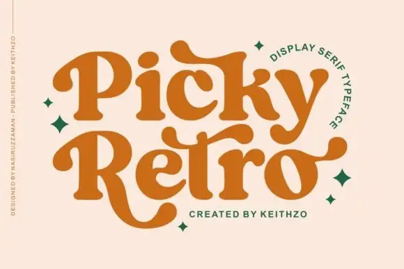
Curved retro serifs with extended terminals
Picky Retro is a chunky retro display serif in burnt orange: fat bracketed strokes, curved serifs that drop below the baseline, and long ball terminals that turn the P and the R into flourishes.
Ideas for this font
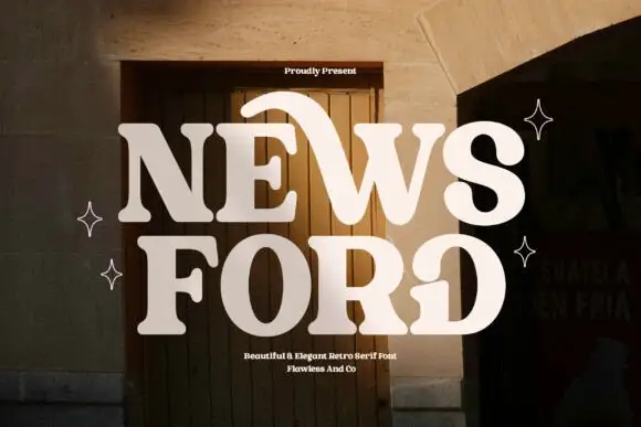
Retro serif with sweeping curved details
News Ford is a retro serif in cream over a warm doorway photograph: fat letters with a moderate contrast, curved details that sweep out of the W and the O, and rounded serifs, with small capital lines above and below.
Ideas for this font
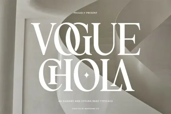
Elegant high-contrast serif with ligature detail
Vogue Chola is an elegant serif in cream on a warm sculptural interior: extreme contrast, fine square serifs, a long ligature between the first two letters, and a four-point star set into the counter of one letter.
Ideas for this font
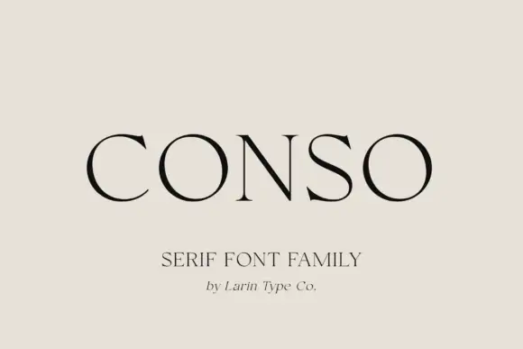
Broad thin capitals with near-circular bowls and short fine serifs
Conso Serif is a broad thin capital face in which the bowls close near circles, the stems stay light and the serifs finish short and fine, so a single name reads as a modern fashion masthead across an otherwise empty field.
Ideas for this font
Same independent foundry
Allow optional Google Analytics to measure visits and catalogue actions. Your search words and notes are not included. Privacy & storage