Editorial Serif Anchor

Wonderful Vintages + Augler
Anchors Wonderful Vintages's fluid strokes with crisp Roman proportions on wedding suites, headers and packaging.
Inspect Augler specimenDisclosure: MakerFileHub may earn a commission from qualifying purchases via paid links on this page. How our links work.
Ornate heavy vintage script
Wonderful Vintages is a plump connected retro script with ball terminals and rolling swashes, printed in coral red on a white sticker outline over a striped cream and blue ground.
Paid link
Get this fontProject & layout blueprintsAt-a-glance maker compatibility
Weld or Unite overlapping script joins into one continuous vector path before sending to the blade.
Visual anatomy & craft review
Wonderful sits above Vintages in the same heavy script, and each word carries a thick white cut-out outline and a soft drop shadow, so the lettering reads as a die-cut sticker rather than as ink on paper. The script is fully connected with fat rounded bowls, ball terminals on the entry and exit strokes and one long swash that runs out from the final s. Behind it the ground is a wide vertical stripe in cream and dusty blue, and three captions frame the words: a green arc above, a green band with the style name below and a credit line at the foot. The construction is a mid-century packaging script: it wants one colour plus white, it holds at signage size, and the sticker edge means it cannot be set tight against other elements.
A plump retro script with a sticker outline
Two-font hierarchy recipes
Tested contrast partners — pairing Wonderful Vintages with grounded secondary typography.
Wonderful Vintages + Augler
Anchors Wonderful Vintages's fluid strokes with crisp Roman proportions on wedding suites, headers and packaging.
Inspect Augler specimen
Wonderful Vintages + Base Edge
Keeps small-scale dates, URLs, nutrition facts and care instructions crisp and legible below script titles.
Inspect Base Edge specimenPractical applications
Concrete hierarchy, scale and production guidance tailored to Wonderful Vintages’s stroke geometry.
The script reads as a vintage drinks sign rather than as a wedding cliché, and one word plus a short line is enough for a bar card.
Hierarchy & layout recipe
Print a 400 by 300 mm board: set the bar name at 70 pt on one row, keep 22 mm of clear ground beneath before the list at 14 pt, and hold 20 mm of border so the sticker edge is not trimmed.
Pre-production check
The white outline disappears on a cream ground; print one board on the intended stock and check the edge before the set.
A retro script on a bottle says made in small quantities, and the coral red holds against dark glass better than a thin calligraphy.
Hierarchy & layout recipe
Print a 55 by 80 mm bottle label: set the house name at 16 pt on one row, keep 6 mm of clear ground beneath before the volume at 4.5 pt, and hold 4 mm from the swash to the die line.
Pre-production check
The final swash runs long on a narrow label; print one at the real size and check it clears the die before the order.
The plump script sets a nostalgic tone for a piece about old shops or family recipes, and the heavy weight survives newsprint.
Hierarchy & layout recipe
Print a 230 by 300 mm opener: set the section word at 80 pt on one row, keep 26 mm of clear ground beneath before the standfirst at 11 pt, and hold 18 mm of margin on both sides.
Pre-production check
Newsprint absorbs a white outline into the page; print one opener on the actual paper stock and check the edge before the issue.
Technical & licence verification
Confirm included OTF/TTF/WOFF formats, full glyph tables and licence coverage on the live store page before batch production.
Closest visual alternatives
Matched across letterform anatomy, stroke behaviour and craft applications.
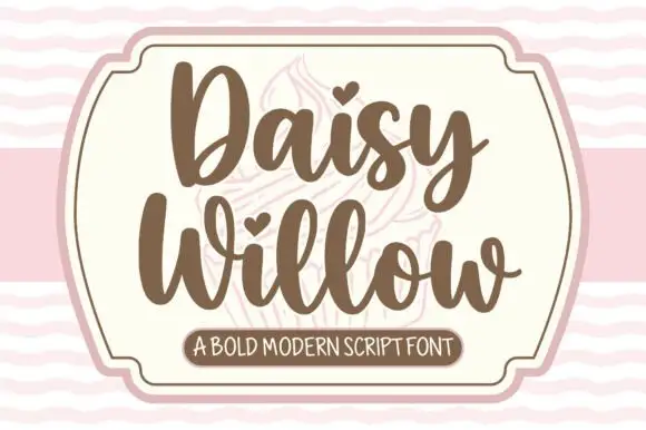
Bold modern script with heart tittles and a soft rounded baseline
Daisy Willow is a bold modern script with soft rounded strokes, generous loops and heart tittles, drawn so two stacked words sit evenly inside a framed panel.
Ideas for this font
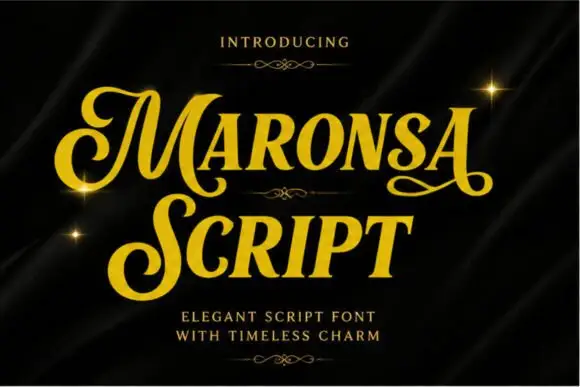
Metallic vintage script with swash capitals
Maronsa is a vintage script finished in gold on black drapery: heavy connected lower case, swash capitals on the M and the S, small drawn fleurons between the lines and sparkles catching the metallic edge.
Ideas for this font
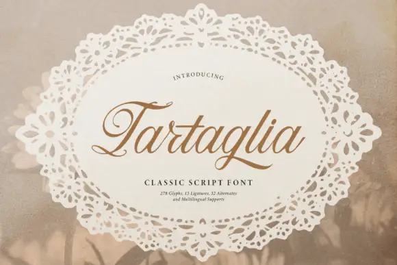
Slanted classic script with curled capitals
Tartaglia is a slanted classic script in gold-brown on a doily: high-contrast strokes, curled capitals with ball terminals and a ligature-rich alphabet, presented inside a lace oval.
Ideas for this font
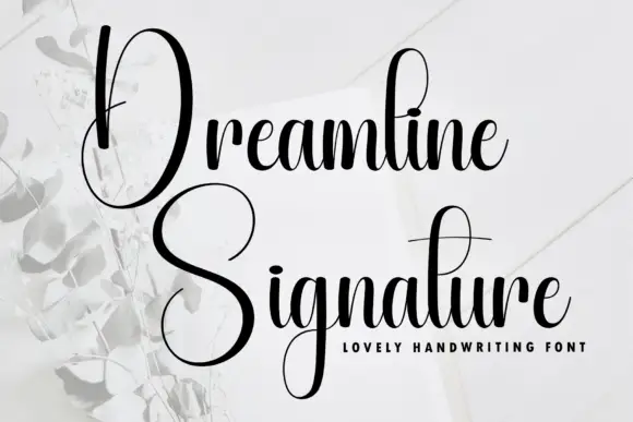
Tall narrow contrast calligraphy with double-height capitals
Dreamline is tall narrow calligraphy in which each word opens with a capital drawn at double the x-height, with fine joins and a small tightly packed lowercase beneath it.
Ideas for this font
Same independent foundry
Allow optional Google Analytics to measure visits and catalogue actions. Your search words and notes are not included. Privacy & storage



