Editorial Serif Anchor

Daisy Willow + Stanza
Anchors Daisy Willow's fluid strokes with crisp Roman proportions on wedding suites, headers and packaging.
Inspect Stanza specimenDisclosure: MakerFileHub may earn a commission from qualifying purchases via paid links on this page. How our links work.
Bold modern script with heart tittles and a soft rounded baseline
Daisy Willow is a bold modern script with soft rounded strokes, generous loops and heart tittles, drawn so two stacked words sit evenly inside a framed panel.
Paid link
Get this fontProject & layout blueprintsAt-a-glance maker compatibility
Weld or Unite overlapping script joins into one continuous vector path before sending to the blade.
Visual anatomy & craft review
The capital D opens as a tall loop that folds back over a heavy stem, and the letters after it keep that softness: the a and the o close into wide rounded bowls, the i and the W carry small hearts instead of dots, and the final w exits in a low rounded tail. The stroke is medium-heavy and never thins at the joins, which keeps the word solid at small sizes, and the terminals are fully rounded rather than cut. The baseline is level, the x-height generous, and the two words are stacked with the second set slightly wider so the block reads as a trapezoid. The pink striped ground and the brown frame are presentation, as is the small rounded label at the base; the script is the two words.
Bold · Soft · Modern
Two-font hierarchy recipes
Tested contrast partners — pairing Daisy Willow with grounded secondary typography.
Daisy Willow + Stanza
Anchors Daisy Willow's fluid strokes with crisp Roman proportions on wedding suites, headers and packaging.
Inspect Stanza specimen
Daisy Willow + Mansory
Keeps small-scale dates, URLs, nutrition facts and care instructions crisp and legible below script titles.
Inspect Mansory specimenPractical applications
Concrete hierarchy, scale and production guidance tailored to Daisy Willow’s stroke geometry.
The soft bold strokes print cleanly on a small label and the heart tittles give a short brand name a recognisable detail that survives being stamped in one colour.
Hierarchy & layout recipe
Set the brand at 14 pt on a 50 by 70 mm label, keep the scent in a 6 pt sans, and hold 5 mm of clearance so the final tail does not touch the label edge.
Pre-production check
Stamped labels swell slightly; test one impression on the actual stock and confirm the heart tittles still read as hearts rather than as dots.
The soft bold lettering reads across a lawn and keeps a warm tone that a formal script would not, which suits a celebration held outdoors.
Hierarchy & layout recipe
Set both names at 12 cm on a 600 by 800 mm board, set the date in the same face at 4 cm, and leave 10 cm of margin so the rounded terminals stay inside the painted area.
Pre-production check
Painted boards in daylight lose a medium stroke at 12 cm from a distance; check the board from five paces and take the names up one size if they thin.
The heart tittles carry the romantic register without an extra symbol, and the bold weight makes a short message readable at the size of a small card.
Hierarchy & layout recipe
Set the message at 20 pt on a 105 by 148 mm card, keep the sender's name in the same face at 11 pt at the foot, and hold 12 mm of clear space above so the capital loop has air.
Pre-production check
Cards with a heart detail near the trim can look clipped; check the proof at final size and inset the line by 4 mm if a tittle approaches the edge.
Technical & licence verification
Confirm included OTF/TTF/WOFF formats, full glyph tables and licence coverage on the live store page before batch production.
Closest visual alternatives
Matched across letterform anatomy, stroke behaviour and craft applications.
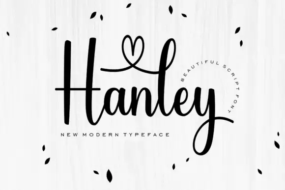
Modern upright script with a heart-shaped capital loop
Hanley is a modern script in which the capital rises into a heart-shaped loop, the body stays upright and the joins stay even, so a single name reads as something written on a card with a fine brush pen.
Ideas for this font
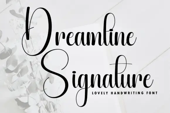
Tall narrow contrast calligraphy with double-height capitals
Dreamline is tall narrow calligraphy in which each word opens with a capital drawn at double the x-height, with fine joins and a small tightly packed lowercase beneath it.
Ideas for this font

Bold slanted script with a curled capital and heavy connected stems
Esmeralda is a bold slanted script in which the capital curls back over itself and the body runs in connected heavy stems with a steady forward lean.
Ideas for this font
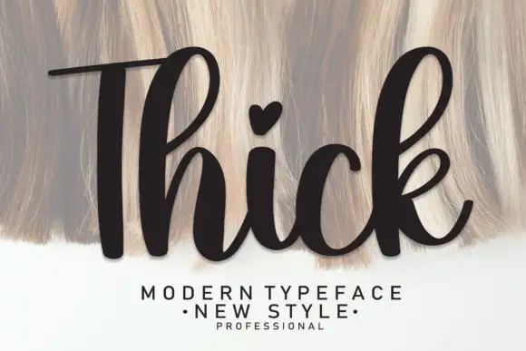
Heavy upright script with a heart dot
Thick is a heavy upright script in black over a pale textured ground: very fat even strokes, a tall narrow capital T drawn with a long bar, a heart in place of the dot on the i and a heavy leg on the k.
Same independent foundry
Allow optional Google Analytics to measure visits and catalogue actions. Your search words and notes are not included. Privacy & storage