Modern Grotesque Body

Spooky Witchy + Modern Heritage
Creates crisp high-hierarchy contrast beneath Spooky Witchy headlines across menus, websites and labels.
Inspect Modern Heritage specimenDisclosure: MakerFileHub may earn a commission from qualifying purchases via paid links on this page. How our links work.
Heavy playful serif
Spooky Witchy is a heavy serif in cream on near-black: broad uneven caps with wide slab feet, a curled K leg and slightly rotated letterforms, with a script line above and a mixed line beneath that names the style.
Paid link
Get this fontProject & layout blueprintsAt-a-glance maker compatibility
Sturdy stroke walls and open counters weed cleanly on adhesive vinyl, HTV apparel film, and cut cardstock.
Visual anatomy & craft review
The two words are stacked and the drawing is a heavy serif with deliberate irregularities: the feet are broad, the heights waver, and the K leg curls, which keeps a dark-themed face playful rather than grim. That construction suits the seasonal subject without needing bats or skulls in the letterforms, and the plate adds only two small bats as staging. Because the letters are heavy and the counters are open, the face works at poster size and on a shirt, and the cream on near-black is the contrast pairing the theme expects. The script line above and the serif line beneath are set in different faces at a fraction of the size, which shows the intended combination rather than a single cut in isolation.
Serif, heavy, playful, halloween
Two-font hierarchy recipes
Tested contrast partners — pairing Spooky Witchy with grounded secondary typography.
Spooky Witchy + Modern Heritage
Creates crisp high-hierarchy contrast beneath Spooky Witchy headlines across menus, websites and labels.
Inspect Modern Heritage specimen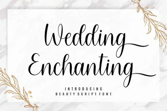
Spooky Witchy + Wedding Enchanting
Adds a warm human signature touch for 1-to-3-word callouts without competing against structured serif capitals.
Inspect Wedding Enchanting specimenPractical applications
Concrete hierarchy, scale and production guidance tailored to Spooky Witchy’s stroke geometry.
A heavy playful serif sets the season without a gimmick, and the open counters keep the title readable at a distance where a spiky face would clot.
Hierarchy & layout recipe
A2 poster: the title at 100 mm cap height, the details in a 16 mm serif, and the address at 10 mm. Keep 28 mm margins and print one colour on a dark stock with the type reversed out.
Pre-production check
Check the poster at five metres, where the uneven heights can read as bad setting; keep the waver subtle. Confirm the 10 mm address reads at three metres and that the title clears the trim.
A playful serif prints as one screen and reads as a costume shirt rather than a horror poster, which suits a family party.
Hierarchy & layout recipe
Print a 240 mm chest graphic: the slogan at 60 mm cap height, the year at 30 mm, and one ink on a dark shirt. Keep the thinnest stroke at 4 mm and place the graphic 80 mm below the collar.
Pre-production check
Check the screen at actual mesh, where a 4 mm stroke can fill; thicken it. Wash-test one shirt and confirm the letters stay legible after five cycles.
A heavy serif marks a seasonal window without an illustration, and the wide feet hold on a board painted in a single colour.
Hierarchy & layout recipe
Paint a 900 by 350 mm board: the shop at 100 mm cap height, the hours in a 22 mm serif, and a 5 mm border. Keep 25 mm margins and paint two colours on a dark board.
Pre-production check
Check the board at four metres, where the curled K can read as damage; keep the curl even. Confirm the 22 mm hours read at two metres and that the border clears the frame.
Technical & licence verification
Confirm included OTF/TTF/WOFF formats, full glyph tables and licence coverage on the live store page before batch production.
Closest visual alternatives
Matched across letterform anatomy, stroke behaviour and craft applications.
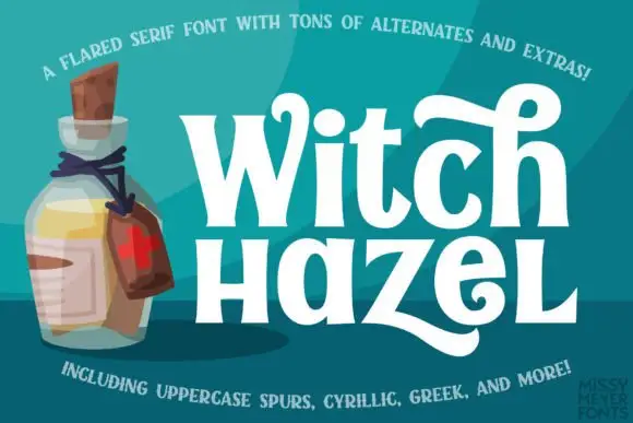
Flared mixed-case serifs with long curling terminals
Witch Hazel shows substantial white serif letters on teal beside an illustrated bottle, where the strokes flare before each serif, the bowls stay round, a tall h curls across the top and a broad z sweeps into a long low tail.
Ideas for this font
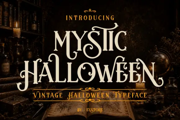
Curled tall mystic display serif
Mystic Halloween is a curled display serif in cream on a dark apothecary shelf: tall condensed capitals with hooked serifs, hairline flourishes in the counters, and a small inline detail on the thick stems.
Ideas for this font
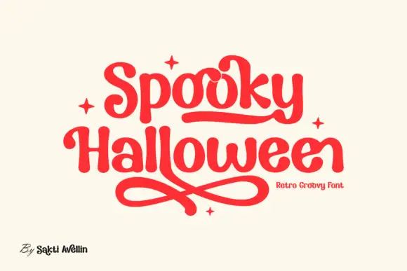
Rounded retro letters with looping underlines
Spooky Halloween uses soft heavy serif shapes rather than sharp or dripping forms, set in red on cream, with a rounded underline that runs under the first word, crossed loops sweeping beneath the second and four small four-point stars placed around the block.
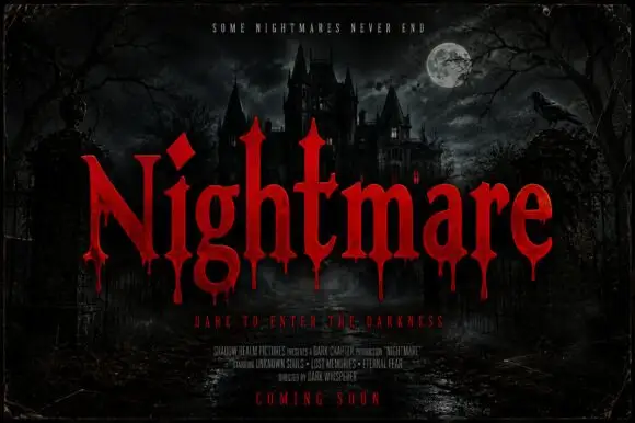
Pointed horror serifs with descending drips
Nightmare Bloodline is a horror display in red on a moonlit castle scene: tall pointed serifs, sharp shoulders and drops of blood falling from the lower terminals of the letters.
Ideas for this font
Same independent foundry
Allow optional Google Analytics to measure visits and catalogue actions. Your search words and notes are not included. Privacy & storage