Editorial Serif Anchor

White Lily + Kernova
Anchors White Lily's fluid strokes with crisp Roman proportions on wedding suites, headers and packaging.
Inspect Kernova specimenDisclosure: MakerFileHub may earn a commission from qualifying purchases via paid links on this page. How our links work.
Bright multicolour script on gingham
White Lily is a modern script in which every letter is a different bright colour inside a white outline, set on a pale blue gingham ground with drawn flowers, bees and suns.
Paid link
Get this fontProject & layout blueprintsAt-a-glance maker compatibility
Weld or Unite overlapping script joins into one continuous vector path before sending to the blade.
Visual anatomy & craft review
White sits above Lily, and each letter is a rounded script glyph with a thick white contour, coloured in a rainbow sequence from red through orange, pink, teal, blue and green so that the word reads as a row of coloured beads. The script is fully connected with fat bowls and high loops, the dots on the i are drawn as small hearts, and the whole line bounces a little. The ground is a pale blue gingham with a sun at each top corner, a bee beside the second word and a row of tulips and butterflies along the foot, and a gold-outlined pill at the bottom names the style. The face is a cheerful script for summer and children's products: the colour sequence is the design, so it works in print and on screen, and a one-colour version would lose the whole idea.
A rainbow script on a picnic cloth
Two-font hierarchy recipes
Tested contrast partners — pairing White Lily with grounded secondary typography.
White Lily + Kernova
Anchors White Lily's fluid strokes with crisp Roman proportions on wedding suites, headers and packaging.
Inspect Kernova specimen
White Lily + Furion
Keeps small-scale dates, URLs, nutrition facts and care instructions crisp and legible below script titles.
Inspect Furion specimenPractical applications
Concrete hierarchy, scale and production guidance tailored to White Lily’s stroke geometry.
The colours and the gingham ground say summer before the invitation is read, so one card carries a theme that would otherwise need decoration.
Hierarchy & layout recipe
Print a 120 by 120 mm square card: set the greeting at 30 pt across two rows, keep 14 mm of clear ground beneath before the details at 8.5 pt, and hold 12 mm of margin on all sides.
Pre-production check
Six bright colours in one small card can turn to noise; print one card on the actual machine and check the sequence before the batch.
A rainbow script on a picnic ground is what a child's summer invitation is expected to look like, and the illustration is already in the specimen.
Hierarchy & layout recipe
Print a 105 by 148 mm invitation: set the name at 34 pt on one row, keep 15 mm of clear ground beneath before the time and place at 9 pt, and hold 12 mm of margin on all sides.
Pre-production check
Bright inks on a home printer can look chalky; print one invitation on the actual machine and check the colours before the batch.
A colourful sticker on a cart is seen by people standing in a queue, and the rainbow sequence reads at arm's length without a second design element.
Hierarchy & layout recipe
Print a 90 mm round sticker: set the cart name at 20 pt on one row, keep 7 mm of clear ground between the contour and the rim, and leave 8 mm beneath for the street at 6 pt.
Pre-production check
Six colours on one small sticker compete for attention; print one on the real vinyl and check the sequence before the roll.
Technical & licence verification
Confirm included OTF/TTF/WOFF formats, full glyph tables and licence coverage on the live store page before batch production.
Closest visual alternatives
Matched across letterform anatomy, stroke behaviour and craft applications.
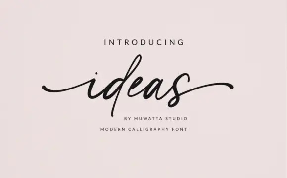
Fine slanted lowercase with long outer sweeps and a small x-height
Ideas is fine slanted lowercase script with a small x-height, tall narrow ascenders and long outer sweeps at both ends, so a single short word spreads across a wide measure.
Ideas for this font

Bold slanted script with a curled capital and heavy connected stems
Esmeralda is a bold slanted script in which the capital curls back over itself and the body runs in connected heavy stems with a steady forward lean.
Ideas for this font
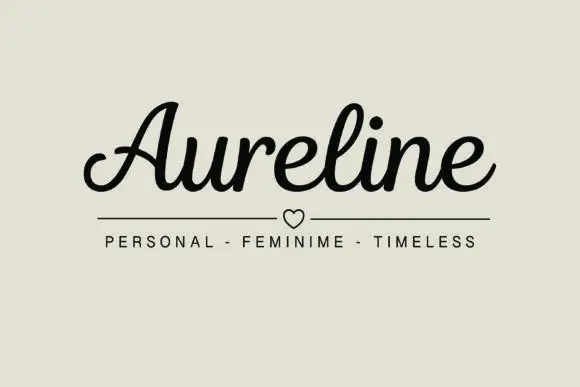
Rounded connected script with a curled capital entry and compact fit
Aureline is a rounded connected script in which the capital opens with a curl, the letters stay compact and the stroke runs at an even weight, so a name reads as a confident signature rather than as a decorative flourish.
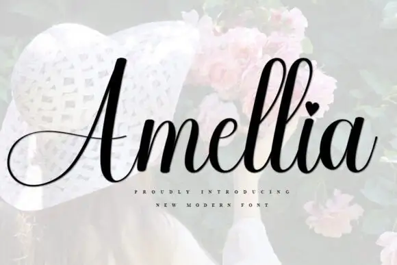
Slanted bridal script with heart tittle and long entry strokes
Amellia is a slanted cursive whose ascenders climb far above a small lowercase body, with a heart in place of the dot on the i and a capital that throws a long thin swash out to the left of the word.
Ideas for this font
Same independent foundry
Allow optional Google Analytics to measure visits and catalogue actions. Your search words and notes are not included. Privacy & storage