Editorial Serif Anchor

Romeo Wedding + Orvelia
Anchors Romeo Wedding's fluid strokes with crisp Roman proportions on wedding suites, headers and packaging.
Inspect Orvelia specimenDisclosure: MakerFileHub may earn a commission from qualifying purchases via paid links on this page. How our links work.
Fine connected wedding script
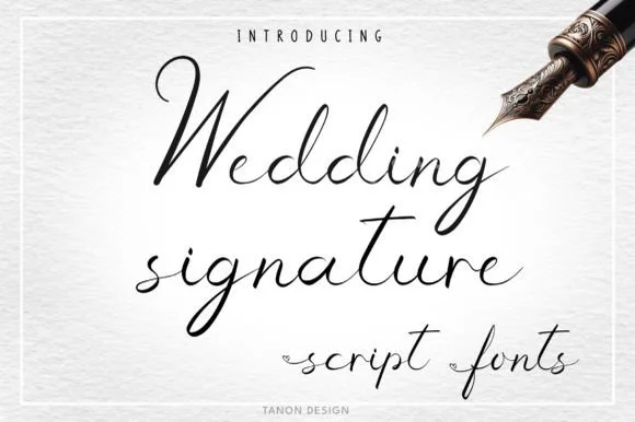
Romeo Wedding is a fine connected script in black on a striped pink ground: tall loops, long horizontal swashes, a fine consistent connector and a light weight, set in two lines with a small introducing line above, a script descriptor beneath and a credit at the foot, inside a fine rule.
Paid link
Get this fontProject & layout blueprintsAt-a-glance maker compatibility
Weld or Unite overlapping script joins into one continuous vector path before sending to the blade.
Visual anatomy & craft review
The plate is a soft specimen, and the two lines show how the script connects across a longer phrase, which is the honest test for a connected face. The drawing has tall loops and long horizontal swashes, so the words read as written with a light pen rather than as a digital script, and the fine connector means the face needs a generous size and leading. That construction sets a moderate size floor, because the connectors break first. The introducing line, the descriptor and the credit are product copy. It suits an invitation, a menu and a label for a wedding or a delicate product, and it should be set in mixed case on one or two lines only.
Script, wedding, fine, elegant
Two-font hierarchy recipes
Tested contrast partners — pairing Romeo Wedding with grounded secondary typography.
Romeo Wedding + Orvelia
Anchors Romeo Wedding's fluid strokes with crisp Roman proportions on wedding suites, headers and packaging.
Inspect Orvelia specimen
Romeo Wedding + Prime Nordic
Keeps small-scale dates, URLs, nutrition facts and care instructions crisp and legible below script titles.
Inspect Prime Nordic specimenPractical applications
Concrete hierarchy, scale and production guidance tailored to Romeo Wedding’s stroke geometry.
A fine script reads as a personal invitation, and the long swashes give the names a finish without an ornament. It suits a summer wedding.
Hierarchy & layout recipe
A5 invitation: the names at 30 pt, the request in a 9.5 pt serif, and the date at 8.5 pt caps. Keep 26 mm margins and letterpress one ink on a heavy, smooth card.
Pre-production check
Check the 30 pt names in letterpress, where a connector can sink; proof the plate first. Confirm the request reads at arm's length and that the swashes clear the trim.
A fine script heads a menu, and the light weight keeps the page quiet where a bold display would compete with the courses.
Hierarchy & layout recipe
A5 menu: the heading at 26 pt, the courses in a 10 pt serif, and the items at 9 pt. Keep 20 mm margins and keep the connectors above 0.3 mm at the heading size.
Pre-production check
Check the 26 pt heading, where a connector breaks; keep it above 0.3 mm. Confirm the 9 pt items read in hand and that the heading clears the column rule.
A fine script label reads as a personal house, and the light weight holds on a small die where a heavy script would clot.
Hierarchy & layout recipe
Print a 50 by 80 mm label: the house at 13 pt, the product at 8 pt, and the volume at 7 pt. Keep 5 mm inside the die and keep the connectors above 0.3 mm.
Pre-production check
Check the 13 pt house on the label, where a connector fills; keep it above 0.3 mm. Confirm the 7 pt volume reads in hand and that the label takes a fold.
Technical & licence verification
Confirm included OTF/TTF/WOFF formats, full glyph tables and licence coverage on the live store page before batch production.
Closest visual alternatives
Matched across letterform anatomy, stroke behaviour and craft applications.
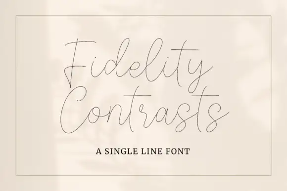
Very fine single-line signature script with long crossing strokes
Fidelity Contrasts is a very fine single-line script in which the strokes cross and run long, so a two-word phrase reads as a light wire drawing rather than a written line.
Ideas for this font
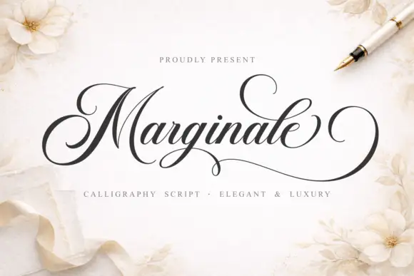
High-contrast calligraphy
Marginale is a high-contrast calligraphy script in black on a soft floral ground: a looped capital with a long terminal sweep, fine connecting hairlines, tall ascenders and wide descenders, set as one word with a small presenting line above and a tracked descriptor beneath.
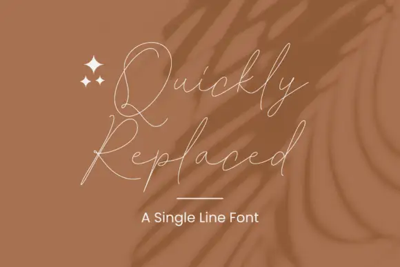
Hairline loosely joined script
Quickly Replaced is a single-line signature script drawn as a hairline: the letters are loosely joined, the ascenders are tall and narrow, and the whole signature is the width of a stroke rather than a shape.
Ideas for this font
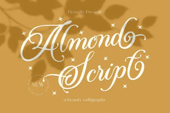
Thin slanted looping script
Almond Script opens with a large looped A and carries long fine ascenders through the word, where the terminal d curls upward, the S loops below its own line, small stars sit around the letters and a circular new-release stamp marks the corner of a warm ochre field.
Ideas for this font
Same independent foundry
Allow optional Google Analytics to measure visits and catalogue actions. Your search words and notes are not included. Privacy & storage