Modern Grotesque Body

Victorian Luxury + Clyne Sans
Creates crisp high-hierarchy contrast beneath Victorian Luxury headlines across menus, websites and labels.
Inspect Clyne Sans specimenDisclosure: MakerFileHub may earn a commission from qualifying purchases via paid links on this page. How our links work.
Victorian-style luxury serif
Victorian Luxury is a formal serif in white on a textured grey-green ground: high contrast, fine hairline serifs, tall narrow capitals with small spurs, and a thin gold frame around the specimen with ornamental filigree at the corners.
Paid link
Get this fontProject & layout blueprintsAt-a-glance maker compatibility
Sturdy stroke walls and open counters weed cleanly on adhesive vinyl, HTV apparel film, and cut cardstock.
Visual anatomy & craft review
The two words are stacked and offset to the left, which breaks the symmetry of the frame and makes the lockup feel like a printed title page rather than a badge. The drawing is a Victorian display serif: the stems are heavy, the hairlines are so fine that they read as pen lines, the serifs are thin and lightly bracketed, and the V and the L carry small spur details at the apex. The r, the a and the n stay narrow so the words fit inside the gold rule without crowding the frame, and the tracking is generous, which keeps each hairline separate. The ground is a dark, mottled surface, and the frame and filigree are drawn in gold at a lighter weight than the type, so the ornament frames the words without competing. The caption sits inside a ruled box at the foot, which completes the period look.
Victorian, elegant, contrasted, formal
Two-font hierarchy recipes
Tested contrast partners — pairing Victorian Luxury with grounded secondary typography.
Victorian Luxury + Clyne Sans
Creates crisp high-hierarchy contrast beneath Victorian Luxury headlines across menus, websites and labels.
Inspect Clyne Sans specimen
Victorian Luxury + Lovely
Adds a warm human signature touch for 1-to-3-word callouts without competing against structured serif capitals.
Inspect Lovely specimenPractical applications
Concrete hierarchy, scale and production guidance tailored to Victorian Luxury’s stroke geometry.
A Victorian serif sets a formal ceremony in a period register, and the fine hairlines give an invitation the look of engraving rather than digital printing.
Hierarchy & layout recipe
A5 portrait: the names at 28 pt, the details in a 9 pt serif, and a 0.4 pt rule inside a 15 mm margin. Keep the ornament to one small flourish at the head and print letterpress in one ink on a heavy cotton stock.
Pre-production check
Check the hairlines at 28 pt on the cotton stock, where a stroke under 0.3 mm will not hold a letterpress impression; use foil or digital for the finest parts. Confirm the 9 pt details stay legible and that the frame clears the trim by 15 mm.
A Victorian label signals age and provenance, and the fine drawing survives foil stamping, which is how this kind of mark usually reaches a bottle.
Hierarchy & layout recipe
Print a 70 by 110 mm label: the name at 22 pt, the expression in an 8 pt serif, and a 0.3 pt gold rule inside a 4 mm margin. Keep the foil limited to the name and the rule so the ornament does not overwhelm the small label.
Pre-production check
Check the foil at 22 pt, where hairline serifs can break; thicken the thin parts for the die. Confirm the 8 pt expression reads on the bottle's curve and that the gold rule stays inside the die line on all sides.
A formal serif gives a title page the authority of a nineteenth-century edition, and the frame and ornament can be printed in a second ink for very little cost.
Hierarchy & layout recipe
Set the title at 60 pt on a 140 by 216 mm page, the author in 12 pt, and the imprint in 8 pt caps, all inside a 0.4 pt frame at 18 mm. Keep the frame aligned to the type block rather than the page so the ornament reads as part of the setting.
Pre-production check
Check the frame alignment at proof, where a 1 mm drift between the rule and the type block is visible on a bound page. Confirm the 8 pt imprint reads at arm's length and that the hairlines hold on the chosen book stock.
Technical & licence verification
Confirm included OTF/TTF/WOFF formats, full glyph tables and licence coverage on the live store page before batch production.
Closest visual alternatives
Matched across letterform anatomy, stroke behaviour and craft applications.
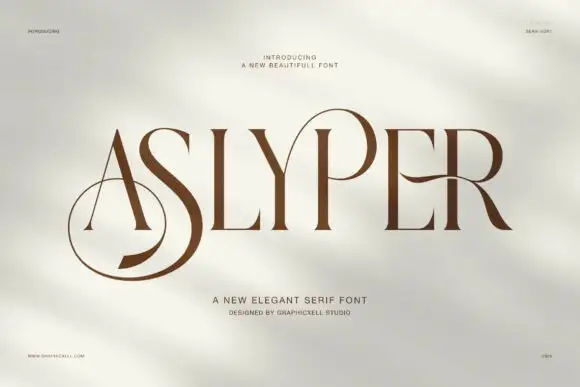
Contrasting capitals with an oversized low S loop and open P bowl
Aslyper shows brown capitals on a pale mottled field: heavy diagonal and curved strokes meet very fine serifs, the initial A opens a tall triangular counter and the S sweeps far below the main line while the P bowl rises into a large rounded loop.
Ideas for this font

High-contrast display serif with sculpted curves and tucked swash legs
Orvelia is a high-contrast display serif in which the stems alternate thick and hairline weights, the R, V and A end in curved swash legs and the bowls stay sculpted, so a name reads as a crest for a perfume box or a masthead.
Ideas for this font

Swashed vintage editorial serif with a slanted italic companion
Majestic Letters is a vintage editorial serif in which the capitals carry curled swashes, the contrast runs high and a slanted italic companion is supplied, so a title page can mix upright and leaning forms from one family.
Ideas for this font
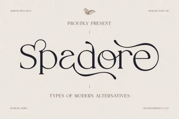
Modern serif with expressive alternates
Spadore is a modern serif in navy on cream with an adventurous set of alternates: a flat-topped e, a curled l that flicks upward, and an a whose bowl opens, all sitting on a moderate-contrast skeleton with soft serifs.
Ideas for this font
Same independent foundry
Allow optional Google Analytics to measure visits and catalogue actions. Your search words and notes are not included. Privacy & storage



