Modern Grotesque Body

Spadore + Bargain Condensed
Creates crisp high-hierarchy contrast beneath Spadore headlines across menus, websites and labels.
Inspect Bargain Condensed specimenDisclosure: MakerFileHub may earn a commission from qualifying purchases via paid links on this page. How our links work.
Modern serif with expressive alternates
Spadore is a modern serif in navy on cream with an adventurous set of alternates: a flat-topped e, a curled l that flicks upward, and an a whose bowl opens, all sitting on a moderate-contrast skeleton with soft serifs.
Paid link
Get this fontProject & layout blueprintsAt-a-glance maker compatibility
Crisp hairline serifs shine on stationery, foil stamping, and packaging; add slight offset for small decals.
Visual anatomy & craft review
The name is set in one line at the centre of the page, and the face reads as a contemporary serif until the eye reaches the individual letters: the e has a nearly horizontal top bar rather than a curved aperture, the d and the o keep a slight contrast between thick and thin, and the final e trails a swash out of the letter rather than stopping. The alternates are the product here, which the caption names explicitly, so the specimen is built to show how far a designer can push a word without leaving the family. Tracking is normal for a serif, which means the quirks do the work rather than the spacing, and the whole word sits inside a large cream field with a small butterfly ornament above and four corner labels naming the maker and the series. The restraint around the specimen is deliberate: everything except the word is set in a light, wide-tracked serif at small size.
Modern, quirky, contrasted, flexible
Two-font hierarchy recipes
Tested contrast partners — pairing Spadore with grounded secondary typography.
Spadore + Bargain Condensed
Creates crisp high-hierarchy contrast beneath Spadore headlines across menus, websites and labels.
Inspect Bargain Condensed specimen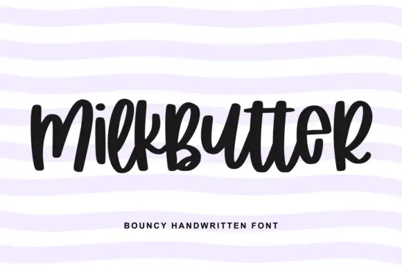
Spadore + Milkbutter
Adds a warm human signature touch for 1-to-3-word callouts without competing against structured serif capitals.
Inspect Milkbutter specimenPractical applications
Concrete hierarchy, scale and production guidance tailored to Spadore’s stroke geometry.
A modern serif with expressive alternates gives a small studio a wordmark that looks drawn rather than picked from a list, and the quirks stay readable at label size.
Hierarchy & layout recipe
Set the name at 32 pt with the flat-topped e and the curled l enabled, track it at 30 units, and place the studio line in a 9 pt light serif 8 mm below with a 0.5 pt rule between. Keep the mark one colour for stamps and clay impressions.
Pre-production check
Check the alternates at 32 pt and again at 14 mm for the clay stamp, where the curled l can read as an i; disable the alternate for the stamp version. Confirm the flat top of the e survives a rubber stamp, and that the rule does not touch the letter tails.
The alternates let a feature title carry personality without a second typeface, which keeps a design journal's typographic voice consistent across the issue.
Hierarchy & layout recipe
Set the title at 90 pt across 200 mm, enable the alternate a and the curled l, and set the standfirst in the same family at 12 pt with normal tracking. Keep 25 mm between the title and the standfirst so the swash tails have air.
Pre-production check
Check the swash tail of the final letter against the trailing space, where it can run into the folio on the right. Confirm the alternates do not change the word's overall width so much that the title no longer fits the measure, and proof the hairlines at 90 pt.
A soft serif with one quirky alternate reads as personal rather than corporate, which suits an outdoor ceremony where a formal didone would feel stiff.
Hierarchy & layout recipe
Print a 500 by 300 mm board: the names at 90 mm cap height with the flat-topped e enabled, the date in a 20 mm serif beneath, and a 2 mm border at 25 mm. Keep the whole board to two colours so the quirks of the letterforms read from a distance.
Pre-production check
Check the alternates at banner size, where a flat-topped e can look like a printing error to a guest standing far away; keep the standard e for signage and the alternate for print. Confirm the 20 mm date reads at three metres and that the border clears the trim.
Technical & licence verification
Confirm included OTF/TTF/WOFF formats, full glyph tables and licence coverage on the live store page before batch production.
Closest visual alternatives
Matched across letterform anatomy, stroke behaviour and craft applications.
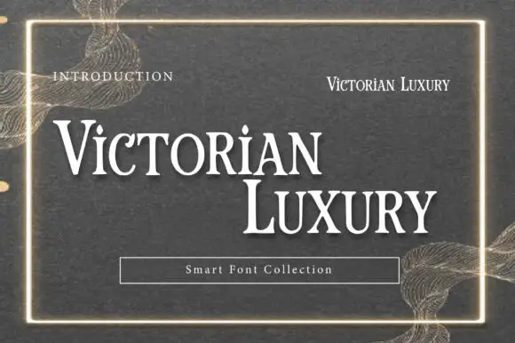
Victorian-style luxury serif
Victorian Luxury is a formal serif in white on a textured grey-green ground: high contrast, fine hairline serifs, tall narrow capitals with small spurs, and a thin gold frame around the specimen with ornamental filigree at the corners.
Ideas for this font
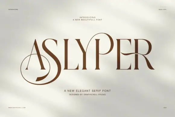
Contrasting capitals with an oversized low S loop and open P bowl
Aslyper shows brown capitals on a pale mottled field: heavy diagonal and curved strokes meet very fine serifs, the initial A opens a tall triangular counter and the S sweeps far below the main line while the P bowl rises into a large rounded loop.
Ideas for this font

High-contrast display serif with sculpted curves and tucked swash legs
Orvelia is a high-contrast display serif in which the stems alternate thick and hairline weights, the R, V and A end in curved swash legs and the bowls stay sculpted, so a name reads as a crest for a perfume box or a masthead.
Ideas for this font
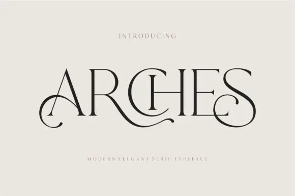
Decorative ligature serif
Arches sets one word in dark ink on a warm neutral field, where wide flat serifs sit on hairline cross strokes, the A climbs to a sharp apex, the R leg sweeps into a long horizontal tail that runs beneath the following letters and the S closes with an extended curl.
Ideas for this font
Same independent foundry
Allow optional Google Analytics to measure visits and catalogue actions. Your search words and notes are not included. Privacy & storage