Modern Grotesque Body

Aslyper + Noar
Creates crisp high-hierarchy contrast beneath Aslyper headlines across menus, websites and labels.
Inspect Noar specimenDisclosure: MakerFileHub may earn a commission from qualifying purchases via paid links on this page. How our links work.
Contrasting capitals with an oversized low S loop and open P bowl
Aslyper shows brown capitals on a pale mottled field: heavy diagonal and curved strokes meet very fine serifs, the initial A opens a tall triangular counter and the S sweeps far below the main line while the P bowl rises into a large rounded loop.
Paid link
Get this fontProject & layout blueprintsAt-a-glance maker compatibility
Sturdy stroke walls and open counters weed cleanly on adhesive vinyl, HTV apparel film, and cut cardstock.
Visual anatomy & craft review
The thick strokes turn at sharp angles into hairlines, the A holds a tall triangle, the S drops a long low curve and the P lifts an oversized bowl above its stem. The two extreme loops are the character: one letter falls and another rises, so a short word is framed above and below, which is why the sample sets one name alone. Because both loops travel, keep 24 mm above and 24 mm below from 30 pt, and check the A apex in a new word before printing.
Contrast · Low S loop · Open bowl
Two-font hierarchy recipes
Tested contrast partners — pairing Aslyper with grounded secondary typography.
Aslyper + Noar
Creates crisp high-hierarchy contrast beneath Aslyper headlines across menus, websites and labels.
Inspect Noar specimen
Aslyper + Bunglon
Adds a warm human signature touch for 1-to-3-word callouts without competing against structured serif capitals.
Inspect Bunglon specimenPractical applications
Concrete hierarchy, scale and production guidance tailored to Aslyper’s stroke geometry.
The rising and falling loops frame a cover title, and the heavy capitals hold a short name at 62 pt on a coated cover in one ink. The two loops also keep a cover from needing a second element.
Hierarchy & layout recipe
Print an A4 cover: set the title at 62 pt in capitals, keep 26 mm above for the P bowl and 26 mm below for the S loop, and set the contents at 9 pt in a serif along the outer margin.
Pre-production check
A loop printed into a contents line collides with it; check the proof and keep 20 mm between the loop and any text.
The contrasting caps suit a bottle label, and the fine serifs stay readable at 22 pt on a 50 mm panel in one metallic ink. The open bowl gives a bottle its one large curve.
Hierarchy & layout recipe
Print a 50 by 65 mm label: set the brand at 22 pt in capitals, keep 8 mm beneath for the S loop, and set the volume in a 6 pt caps at the foot with 4 mm of clear ground. Keep the volume line small.
Pre-production check
Metallic ink on fine serifs breaks up at 18 pt; check the plate proof and keep the brand at 20 pt or above. Ask for a plate proof at final size.
The heavy contrast gives a garden suite presence, and the open bowls keep two names readable at 24 pt on heavy card stock. The heavy contrast also keeps a small card formal.
Hierarchy & layout recipe
Print a 130 by 180 mm card: set the names at 24 pt in capitals, keep 20 mm beneath the S loop before the venue line at 9 pt, and keep 16 mm of clear card at each end. Keep the names on one row where the card allows.
Pre-production check
A long S loop printed across a card rule looks like a fault; check the proof and keep the loop off any line. Test the S loop on one card first.
Technical & licence verification
Confirm included OTF/TTF/WOFF formats, full glyph tables and licence coverage on the live store page before batch production.
Closest visual alternatives
Matched across letterform anatomy, stroke behaviour and craft applications.
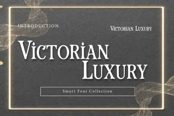
Victorian-style luxury serif
Victorian Luxury is a formal serif in white on a textured grey-green ground: high contrast, fine hairline serifs, tall narrow capitals with small spurs, and a thin gold frame around the specimen with ornamental filigree at the corners.
Ideas for this font

Tall light capitals with long overlapping crossbars
Beach Dates is a tall light capital face in which the C and D open broad curves, the serifs taper finely and the H crossbar reaches left into the C while the T bar stretches across the row below, so two stacked words lock into one form.
Ideas for this font
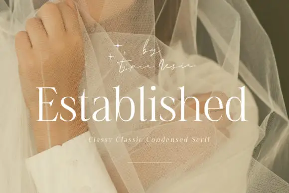
Fine condensed mixed case with long straight ascenders
Established shows light white serif letters with narrow rounded bowls and tall upright stems, where the thin horizontal strokes and small serifs keep a long word visually delicate, and the title overlays a pale portrait behind translucent fabric with a small script credit above.
Ideas for this font
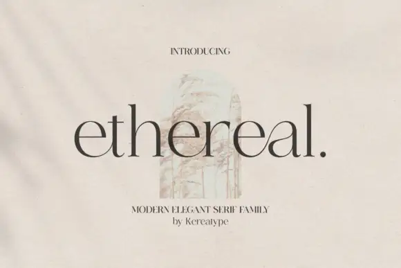
Fine lowercase serif with broad open bowls and tall ascenders
Ethereal shows dark lowercase letters with high contrast, thin joins and broad circular bowls, where tall h and l stems rise well above the rounded e forms and a small full stop ends the title.
Same independent foundry
Allow optional Google Analytics to measure visits and catalogue actions. Your search words and notes are not included. Privacy & storage