Editorial Serif Anchor

Hello Honey + Gorga
Anchors Hello Honey's fluid strokes with crisp Roman proportions on wedding suites, headers and packaging.
Inspect Gorga specimenDisclosure: MakerFileHub may earn a commission from qualifying purchases via paid links on this page. How our links work.
Broad slanted connected script with thick even strokes and open loops
Hello Honey is a broad slanted script in which the strokes stay thick through every join, the loops stay open and the letters lean together, so a phrase reads as one confident pen line.
Paid link
Get this fontProject & layout blueprintsAt-a-glance maker compatibility
Weld or Unite overlapping script joins into one continuous vector path before sending to the blade.
Visual anatomy & craft review
The capital H opens with a broad looped stem and the letters after it keep the same load: the e closes an open bowl, the double l rises into two round loops, the o holds a wide counter and the n keeps a full shoulder. Weight varies only slightly between downstrokes and joins, which keeps the line reading as written rather than drawn, and the slant stays consistent across both words. Because the loops are open and the stroke is broad, the face holds at 18 pt on a small label and reads at 60 pt on a sign without changing character. The tail of the last letter finishes in a short hook rather than a long flourish. The pink ground, the white ink, the scroll ornaments, the roses and the notebook are presentation; the script is the two words.
Broad · Slanted · Connected
Two-font hierarchy recipes
Tested contrast partners — pairing Hello Honey with grounded secondary typography.
Hello Honey + Gorga
Anchors Hello Honey's fluid strokes with crisp Roman proportions on wedding suites, headers and packaging.
Inspect Gorga specimen
Hello Honey + Bargain Condensed
Keeps small-scale dates, URLs, nutrition facts and care instructions crisp and legible below script titles.
Inspect Bargain Condensed specimenPractical applications
Concrete hierarchy, scale and production guidance tailored to Hello Honey’s stroke geometry.
The broad connected line fills a card with two words at 26 pt and still reads as handwriting, which is what a warm invitation needs.
Hierarchy & layout recipe
Print a 148 by 105 mm card: set both words at 26 pt across the centre, set the date in an 8 pt caps serif below, and keep 16 mm of margin so the loop of the second capital stays inside the trim.
Pre-production check
A broad script at 26 pt can crowd a narrow card; check the proof at final size and keep the phrase to four words so the loops stay open.
The connected weight reads on a small label at 12 pt and gives a plain jar a hand-lettered character that a sans would flatten.
Hierarchy & layout recipe
Print a 45 by 70 mm label: set the brand at 12 pt, set the scent in a 5 pt caps sans beneath, and leave 6 mm of margin so the looped capital is not cut by the die corner.
Pre-production check
A curved jar compresses the outer letters; check one labelled jar and keep the brand short enough to sit on the flat centre of the label.
The broad stroke reads at 12 cm across an aisle and holds up in a printed or painted treatment, which is what a stall needs from its board.
Hierarchy & layout recipe
Print a 700 by 450 mm board: set the stall name at 12 cm across the upper half, set the prices in a 4 cm sans below, and leave 9 cm of border so the hooked tail finishes inside the panel.
Pre-production check
A broad script painted over a dark board loses its joins; check the board under the market's lighting and choose a light ground for the lettering.
Technical & licence verification
Confirm included OTF/TTF/WOFF formats, full glyph tables and licence coverage on the live store page before batch production.
Closest visual alternatives
Matched across letterform anatomy, stroke behaviour and craft applications.
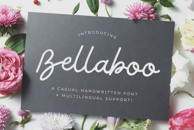
Broad casual looped handwriting
Bellaboo is a broad casual script with wide rounded bowls, tall parallel l stems and a relaxed baseline that keeps the word feeling written rather than drawn.
Ideas for this font
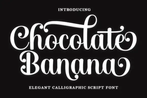
Ornate calligraphic script with ball terminals and curls
Chocolate Banana is an ornate calligraphic script in which the capitals flare, the terminals finish in balls and the connectors curl, so a two-word title reads as a sign painted for a sweet shop.
Ideas for this font
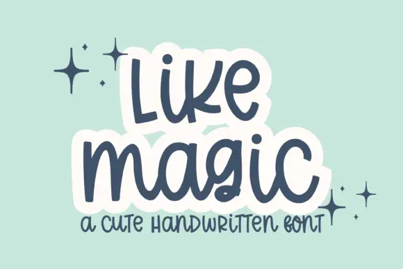
Cute rounded handwritten script
Like Magic is a cute handwritten script in navy on mint: soft rounded strokes, a large x-height, a bouncy baseline and a drawn white panel behind each word that turns the lettering into a sticker.
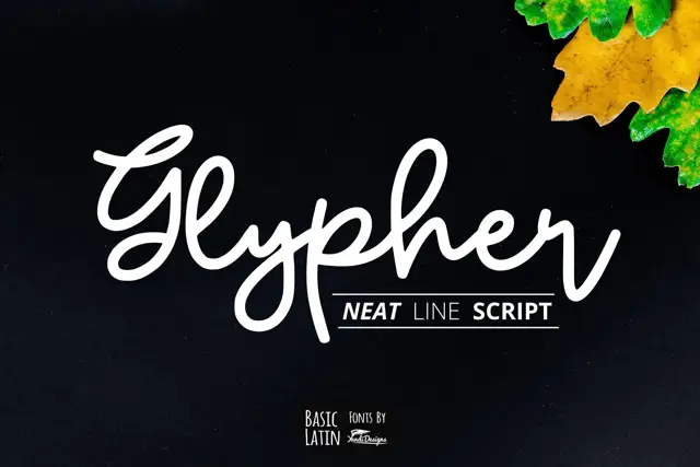
Rounded line-like joined script
Glypher is a rounded monoline joined script with a looping G, tall l and h ascenders that nearly double the x-height, and a high dot over the i.
Ideas for this font
Allow optional Google Analytics to measure visits and catalogue actions. Your search words and notes are not included. Privacy & storage