Editorial Serif Anchor

Bellaboo + Auretha
Anchors Bellaboo's fluid strokes with crisp Roman proportions on wedding suites, headers and packaging.
Inspect Auretha specimenDisclosure: MakerFileHub may earn a commission from qualifying purchases via paid links on this page. How our links work.
Broad casual looped handwriting
Bellaboo is a broad casual script with wide rounded bowls, tall parallel l stems and a relaxed baseline that keeps the word feeling written rather than drawn.
Paid link
Get this fontProject & layout blueprintsAt-a-glance maker compatibility
Weld or Unite overlapping script joins into one continuous vector path before sending to the blade.
Visual anatomy & craft review
Set white on a slate card among flowers, the letters keep an almost even weight with slightly thicker downstrokes, so the face reads as a marker rather than a nib. The B and the double l form two tall parallel stems that carry most of the height, the o and a keep generous counters, and the joins sit at mid-height, so the word spreads horizontally instead of stacking vertically. The tittle is a small solid dot placed high, and the exit stroke finishes with a short upward flick rather than a long tail, which is what keeps the sample tidy on a rectangular card. The flowers and the slate texture are photographic context.
Casual · Looped · Relaxed
Two-font hierarchy recipes
Tested contrast partners — pairing Bellaboo with grounded secondary typography.
Bellaboo + Auretha
Anchors Bellaboo's fluid strokes with crisp Roman proportions on wedding suites, headers and packaging.
Inspect Auretha specimen
Bellaboo + Cenura
Keeps small-scale dates, URLs, nutrition facts and care instructions crisp and legible below script titles.
Inspect Cenura specimenPractical applications
Concrete hierarchy, scale and production guidance tailored to Bellaboo’s stroke geometry.
A broad relaxed script reads as warm rather than formal, which suits an outdoor celebration where guests arrive in daylight.
Hierarchy & layout recipe
Set the greeting at 4-inch height on an A1 board, keep it to two words on one line, and leave 12 cm beneath the baseline for the names in a plain serif.
Pre-production check
Outdoor light blows out thin strokes quickly, so check the sign in direct sunlight at the time of day the event actually starts.
The casual weight sits comfortably beside a stamped or handwritten flavour note, which is what small-batch packaging usually carries.
Hierarchy & layout recipe
Keep the script at 12 pt on a 60 by 40 mm label, set the flavour in a plain hand-printed face at 8 pt beneath it, and leave 4 mm between the two lines of type.
Pre-production check
At 12 pt the wide bowls still read clearly; below that the a and o begin to close, especially on kraft board.
Even weight and open bowls keep the script legible at sticker size, where a high-contrast calligraphic face would disappear entirely.
Hierarchy & layout recipe
Print at 1.2-inch width on a 2-inch round sticker, keep the phrase to two words at most, and centre the artwork optically rather than by its bounding box.
Pre-production check
Small stickers lose the exit flick first, so do not rely on the tail for the visual balance of the composition.
Technical & licence verification
Confirm included OTF/TTF/WOFF formats, full glyph tables and licence coverage on the live store page before batch production.
Closest visual alternatives
Matched across letterform anatomy, stroke behaviour and craft applications.
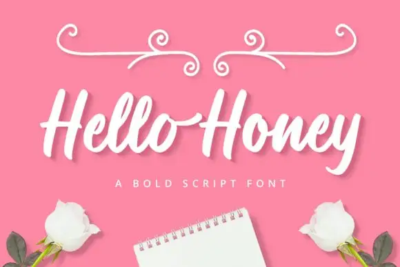
Broad slanted connected script with thick even strokes and open loops
Hello Honey is a broad slanted script in which the strokes stay thick through every join, the loops stay open and the letters lean together, so a phrase reads as one confident pen line.
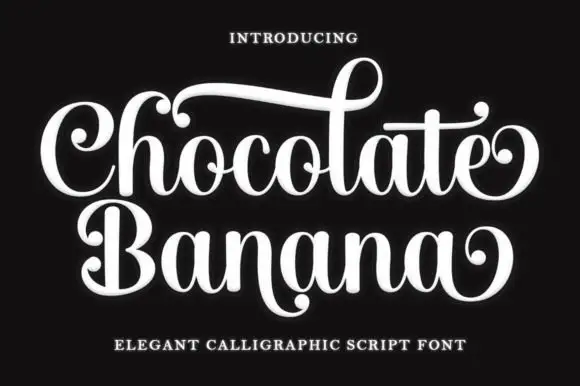
Ornate calligraphic script with ball terminals and curls
Chocolate Banana is an ornate calligraphic script in which the capitals flare, the terminals finish in balls and the connectors curl, so a two-word title reads as a sign painted for a sweet shop.
Ideas for this font
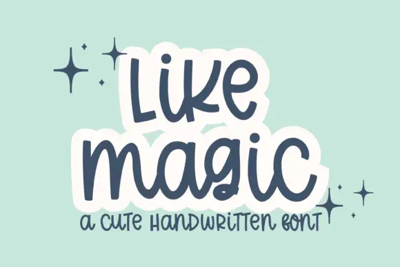
Cute rounded handwritten script
Like Magic is a cute handwritten script in navy on mint: soft rounded strokes, a large x-height, a bouncy baseline and a drawn white panel behind each word that turns the lettering into a sticker.
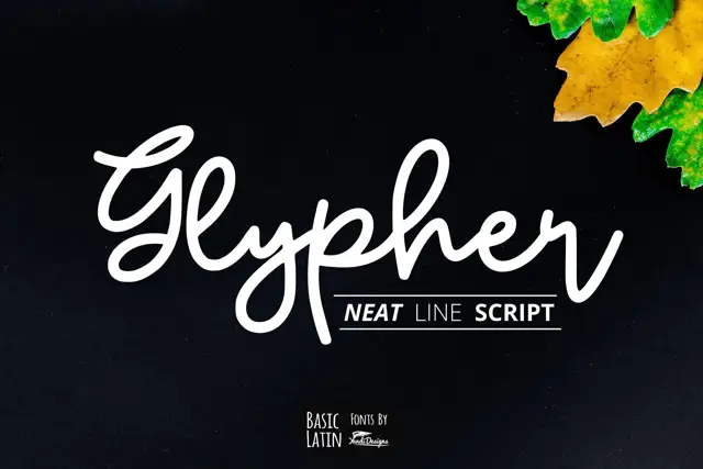
Rounded line-like joined script
Glypher is a rounded monoline joined script with a looping G, tall l and h ascenders that nearly double the x-height, and a high dot over the i.
Ideas for this font
Same independent foundry
Allow optional Google Analytics to measure visits and catalogue actions. Your search words and notes are not included. Privacy & storage