Editorial Serif Anchor

Aneisha + Wolles Elegant Modern Serif
Anchors Aneisha's fluid strokes with crisp Roman proportions on wedding suites, headers and packaging.
Inspect Wolles Elegant Modern Serif specimenDisclosure: MakerFileHub may earn a commission from qualifying purchases via paid links on this page. How our links work.
Fine joined script with an open triangular capital
Aneisha is a fine joined script whose capital A opens into a wide triangle and hands the rest of the word to even, thin, connected strokes that stay level on the line.
Paid link
Get this fontProject & layout blueprintsAt-a-glance maker compatibility
Weld or Unite overlapping script joins into one continuous vector path before sending to the blade.
Visual anatomy & craft review
The A is the only letter with any height to it: two thin legs meet at a point, a crossbar sits at mid-height, and the right leg continues straight into the n without a break. From there the lowercase runs wide and open with large apertures, short joins and a consistent hairline, and the final a releases a long tail that lifts away to the right rather than curling back. Weight stays even and light throughout, so the word depends on contrast with the ground, and here that contrast comes from a pink watercolour wash sitting behind the capital alone, which separates the A from the letters it leads. The light sans introducing line above and the plain caption below are a second and third face, and the wash is background, not part of the alphabet.
Airy · Modern · Joined
Two-font hierarchy recipes
Tested contrast partners — pairing Aneisha with grounded secondary typography.
Aneisha + Wolles Elegant Modern Serif
Anchors Aneisha's fluid strokes with crisp Roman proportions on wedding suites, headers and packaging.
Inspect Wolles Elegant Modern Serif specimen
Aneisha + Homies
Keeps small-scale dates, URLs, nutrition facts and care instructions crisp and legible below script titles.
Inspect Homies specimenPractical applications
Concrete hierarchy, scale and production guidance tailored to Aneisha’s stroke geometry.
A fine joined script keeps a long guest list legible on small cards, and the open A lets a name beginning with a vowel start the line without a heavy block at the edge.
Hierarchy & layout recipe
Set each name at 18 pt on a 90 by 45 mm card, keep the table number in a light sans at 7 pt at the foot, and leave 8 mm between the final tail and the card edge so the tail is never trimmed by the guillotine.
Pre-production check
Print a sheet of twelve at once and check the hairlines: at 18 pt the joins are the first to drop out on a cheap laser printer.
Thin joined lettering presses into a pot or stamps onto a paper band without a heavy impression, and the open capital gives the mark a light, handmade start rather than a solid block.
Hierarchy & layout recipe
Keep the studio name at 30 mm wide on a paper band, hold the mark 5 mm clear of the band edge, and set the maker's initials in a plain sans at the back of the band so the script stays the only decorative element.
Pre-production check
On a thrown pot the band wraps a curve; check the tail at the seam, because a long exit stroke can cross its own start.
A light joined script suits a short personal message where the writing is meant to look like the sender's hand and not like a printed greeting.
Hierarchy & layout recipe
Set the greeting at 20 pt on an A6 card, keep the message in the same face at 11 pt or switch to a plain text face, and leave the bottom third clear for a handwritten signature in ink.
Pre-production check
An ink signature and a hairline script sit at similar weights; check the printed greeting does not disappear beside the pen line at the foot.
Technical & licence verification
Confirm included OTF/TTF/WOFF formats, full glyph tables and licence coverage on the live store page before batch production.
Closest visual alternatives
Matched across letterform anatomy, stroke behaviour and craft applications.

Tall connected script with a long y descender and open round bowls
Hello Honey is a tall connected script in which the ascenders rise high, the bowls stay round and the y drops a descender that runs far below the line before curling away.
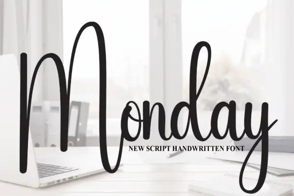
Tall script with an oversized narrow M
Monday is a tall script in black over a photograph of a desk: a very tall narrow capital M drawn as two long strokes with a shallow valley between, a compact connected body and a y whose descender curls below the word.
Ideas for this font
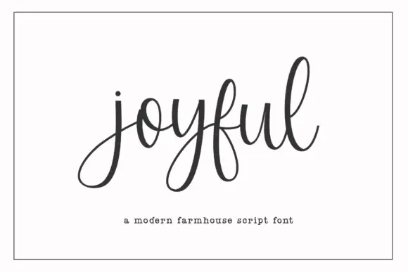
Modern farmhouse script with open descenders and long exit tails
Joyful Script is a modern farmhouse script with light even strokes, wide open descenders and long exit tails, drawn so a single word sits evenly across a wide card.
Ideas for this font
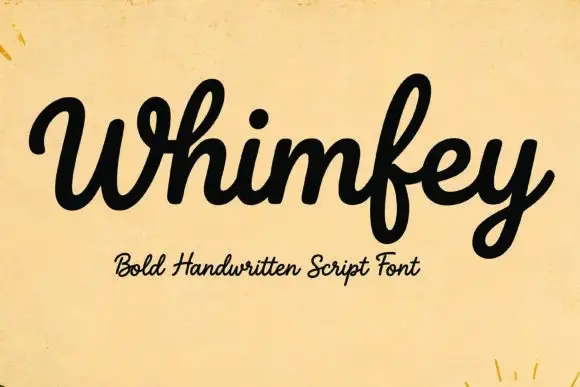
Bold handwritten script
Whimfey is a bold handwritten script in black on aged yellow paper: fat even strokes, a high x-height, short ascenders and a tight rhythm that reads as a confident everyday hand.
Ideas for this font
Allow optional Google Analytics to measure visits and catalogue actions. Your search words and notes are not included. Privacy & storage