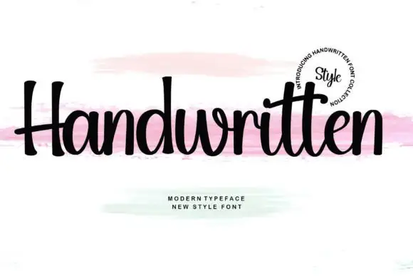
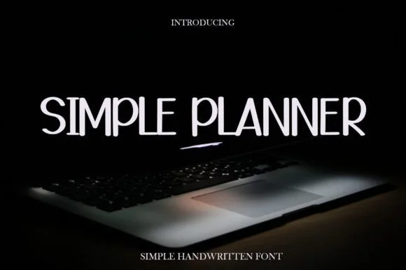
Editorial Serif Anchor

Thick + The Avenue Editorial
Anchors Thick's fluid strokes with crisp Roman proportions on wedding suites, headers and packaging.
Inspect The Avenue Editorial specimenDisclosure: MakerFileHub may earn a commission from qualifying purchases via paid links on this page. How our links work.
Heavy rounded separate print
Thick is a very heavy rounded hand-drawn sans: fat monoline stems, small round counters and blunt terminals, drawn separately and set in solid black against a pale architectural photograph.
Paid link
Get this fontProject & layout blueprintsAt-a-glance maker compatibility
Weld or Unite overlapping script joins into one continuous vector path before sending to the blade.
Visual anatomy & craft review
Thick fills the middle of the card in a single word, and every letter is built the same way: a wide even stroke with a rounded end, a small circular counter and a slight irregularity that shows it was drawn rather than constructed. The x-height is tall, the ascenders barely rise above it, and the k and c are almost as wide as the T, so the word reads as a solid block of ink with four small windows in it. The ground is a photograph of pale walls in perspective, and two letter-spaced captions above and below give the style and the file type. The face is a friendly heavy print for packaging, stickers and headlines that need to be legible at a glance: it should be set large, it holds up in one colour, and because the strokes are so fat it cannot be used for anything longer than a few words.
A fat rounded hand-drawn print
Two-font hierarchy recipes
Tested contrast partners — pairing Thick with grounded secondary typography.
Thick + The Avenue Editorial
Anchors Thick's fluid strokes with crisp Roman proportions on wedding suites, headers and packaging.
Inspect The Avenue Editorial specimen
Thick + Furion
Keeps small-scale dates, URLs, nutrition facts and care instructions crisp and legible below script titles.
Inspect Furion specimenPractical applications
Concrete hierarchy, scale and production guidance tailored to Thick’s stroke geometry.
One fat word on a kraft bag does the whole job at a market, and the rounded forms look hand-made rather than printed, which suits a stall that sells by the slice.
Hierarchy & layout recipe
Print a 55 by 40 mm label: set the stall name at 14 pt on one row, keep 5 mm of clear ground beneath before the day at 4.5 pt, and hold 4 mm from the widest stroke to the die line.
Pre-production check
Fat counters fill in on textured kraft; print one label on the real paper and check the e before the order.
A heavy rounded word reads from the far end of a corridor, and the friendly shape matters more than efficiency in a primary school.
Hierarchy & layout recipe
Print a 300 by 200 mm sign: set the class name at 70 pt on one row, keep 20 mm of clear ground beneath before the teacher's name at 14 pt, and hold 18 mm of border on all sides.
Pre-production check
A tall x-height at 70 pt can look top-heavy on a wide sign; print one and check the optical balance before the set.
One heavy word sets a quote apart from a column of serif without a rule or a tint, and the rounded edges soften what would otherwise shout.
Hierarchy & layout recipe
Print a 230 by 300 mm spread: set the pull word at 60 pt on one row, keep 18 mm of clear ground beneath before the body text at 10.5 pt, and hold 20 mm of margin at the outer edge.
Pre-production check
A very heavy word beside body text can dominate the page; print one spread and check the hierarchy reads before the issue.
Technical & licence verification
Confirm included OTF/TTF/WOFF formats, full glyph tables and licence coverage on the live store page before batch production.
Closest visual alternatives
Matched across letterform anatomy, stroke behaviour and craft applications.
Tall rounded monoline hand
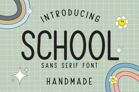
School is a tall rounded monoline face in charcoal on a pale green grid: capitals with long oval O bowls, a curved L foot and an even stroke, with a curved line above, a tracked line and a plain word beneath, plus two small rainbow doodles and daisies in the corners.
Ideas for this font
Informal tall hand with soft shadow
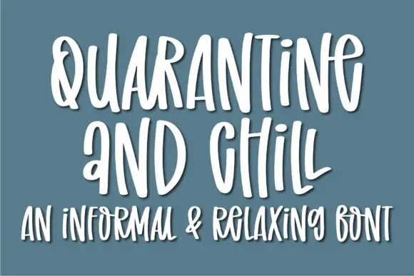
Quarantine and Chill is an informal handwritten display in white on slate blue: tall narrow letters, uneven spacing and a soft shadow that lifts the strokes off the ground, with a second line in the same hand.
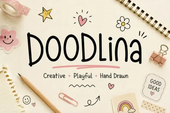
Tall narrow hand-drawn letters with uneven weights and a level baseline
Doodlina is tall narrow hand-drawn lettering in which the letters keep a level baseline but vary in weight, so a word reads as something drawn with a felt tip rather than written with a pen.
Ideas for this font
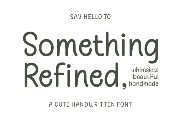
Gentle rounded handwritten print
Something Refined is a gentle rounded handwritten print in charcoal on cream: tall ascenders, open round bowls and a slight forward tilt, calm enough to set a short paragraph.
Ideas for this font
Same independent foundry
Allow optional Google Analytics to measure visits and catalogue actions. Your search words and notes are not included. Privacy & storage