Neutral Sans Workhorse

Groovy Chunky + Godthem
Lets Groovy Chunky own the focal silhouette while handling secondary copy, sizing and subheads cleanly.
Inspect Godthem specimenDisclosure: MakerFileHub may earn a commission from qualifying purchases via paid links on this page. How our links work.
Soft pastel seventies groovy display with swollen bowls and rounded terminals
Groovy Chunky is a seventies display face in which the bowls swell, the terminals round off and the letters lean into each other, so a word reads as a shop sign from a decade that trusted curves.
Paid link
Get this fontProject & layout blueprintsAt-a-glance maker compatibility
Sturdy stroke walls and open counters weed cleanly on adhesive vinyl, HTV apparel film, and cut cardstock.
Visual anatomy & craft review
The G opens as a broad crescent with a heavy inner stroke, the r swells at the shoulder, the double o closes two full bowls, the v holds two deep valleys and the y drops a heavy curved tail, all at a heavy weight with fully rounded ends and a slight lean. The swelling is what gives the face its period character: strokes widen at the middle rather than staying even, which is how a brush sign reads. The fit is tight, so a two-word lockup builds a soft block at 60 pt, and the counters stay open at 24 pt. Because the forms are simple and generous, the face takes pastel inks and slight per-letter colour without breaking. The cream ground, the pastel fills, the sparkles and the two caption lines are presentation; the typeface is the two words.
Groovy · Swollen · Seventies
Two-font hierarchy recipes
Tested contrast partners — pairing Groovy Chunky with grounded secondary typography.
Groovy Chunky + Godthem
Lets Groovy Chunky own the focal silhouette while handling secondary copy, sizing and subheads cleanly.
Inspect Godthem specimen
Groovy Chunky + Aureline
Grounds bold display lettering with classic typographic authority on posters, badges and apparel.
Inspect Aureline specimenPractical applications
Concrete hierarchy, scale and production guidance tailored to Groovy Chunky’s stroke geometry.
The swollen letters read at 12 cm on a painted or printed sign, and the period curves do the branding work without an illustration or a badge.
Hierarchy & layout recipe
Print a 700 by 400 mm board: set the shop name at 12 cm across the upper half, set the opening hours in a 4 cm sans below, and leave 9 cm of border so the heavy tails stay clear of the frame.
Pre-production check
Pastel ink on a bright board loses contrast outdoors; check the sign in daylight and darken the ink rather than thickening the strokes.
The groovy weight gives an invitation its decade voice at 30 pt, and the soft counters keep the date line readable when it sits beneath.
Hierarchy & layout recipe
Print a 148 by 105 mm card: set the greeting at 30 pt across the upper half, set the date and address in a 9 pt sans beneath, and keep 15 mm of margin so the curved tail does not touch the trim.
Pre-production check
A heavy tail under a date line crowds it; check the proof at final size and lift the greeting by 3 mm rather than shrinking the date.
The period weight reads at 13 pt on a bottle label, and the generous bowls keep a flavour word legible on a curved surface.
Hierarchy & layout recipe
Print a 55 by 80 mm label: set the flavour at 13 pt, set the volume in a 5 pt caps sans beneath, and keep 6 mm of margin so the swollen bowls stay on the flat of the label.
Pre-production check
A curved label compresses the outer letters of a heavy face; check a labelled bottle and keep the flavour word short enough to stay flat.
Technical & licence verification
Confirm included OTF/TTF/WOFF formats, full glyph tables and licence coverage on the live store page before batch production.
Closest visual alternatives
Matched across letterform anatomy, stroke behaviour and craft applications.
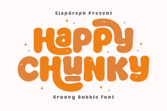
Extra-plump groovy bubble letters with tucked curl terminals
Happy Chunky is an extra-plump bubble display in which the stems balloon, the counters shrink to small openings, the terminals tuck into curls and the letters almost touch, so a short phrase reads as one sticker-ready block.
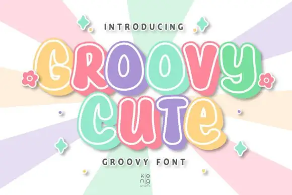
Rounded groovy forms with irregular bowls and inset edging
Groovy Cute shows thick soft letters with varied case-like shapes and uneven widths, where the lower u and e have smaller bodies than the large rounded capitals around them, pastel faces carry fine pale inset contours and a substantial lower-right offset adds depth.
Ideas for this font
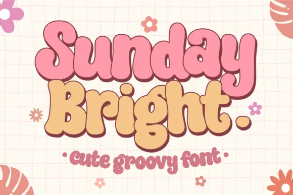
Soft joined-looking groovy forms
Sunday Bright is a soft groovy display in pink and cream on a pale grid: fat rounded letters that appear joined, a low waist, tall loops and a full stop drawn as a circle, presented as a pair of stacked words in two colours.
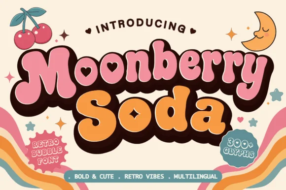
Plump retro bubble with heart-shaped interior counters
Moonberry Soda is a plump retro bubble display in which the round bowls hide heart-shaped counters, the silhouettes stay thick and soft and the alternates add playful variants, so a short word reads as a kawaii sticker.
Ideas for this font
Same independent foundry
Allow optional Google Analytics to measure visits and catalogue actions. Your search words and notes are not included. Privacy & storage