Modern Grotesque Body

Struvia + Swaraga
Creates crisp high-hierarchy contrast beneath Struvia headlines across menus, websites and labels.
Inspect Swaraga specimenDisclosure: MakerFileHub may earn a commission from qualifying purchases via paid links on this page. How our links work.
Spurred high-contrast gothic serif
Struvia is a spurred high-contrast display in bone cream on a dark scene: mixed case with a curling S, pointed terminals, fine joins and sharp spurs on the verticals, set as one large word above a small line, a second line and a row of three small blocks, with a red moon, bats and stone gargoyles framing the sheet.
Paid link
Get this fontProject & layout blueprintsAt-a-glance maker compatibility
Crisp hairline serifs shine on stationery, foil stamping, and packaging; add slight offset for small decals.
Visual anatomy & craft review
The plate is a full concert poster, and the type has to hold over a busy illustration, which it does because the stems are heavy and the joins are the only fine element. The drawing is a high-contrast display with spurs on the verticals and a curling S, so the face reads as a Victorian poster cut rather than as a blackletter, and the spurs give each stem a hooked foot that catches the eye. That construction sets a moderate size floor, because the joins close first. The three blocks along the foot show the face carrying ordinary information at small size, which is useful evidence that it can set more than a title. The framing illustration is staging, and the small lines are product copy.
Serif, gothic, high-contrast, dramatic
Two-font hierarchy recipes
Tested contrast partners — pairing Struvia with grounded secondary typography.
Struvia + Swaraga
Creates crisp high-hierarchy contrast beneath Struvia headlines across menus, websites and labels.
Inspect Swaraga specimen
Struvia + Easy Handwriting
Adds a warm human signature touch for 1-to-3-word callouts without competing against structured serif capitals.
Inspect Easy Handwriting specimenPractical applications
Concrete hierarchy, scale and production guidance tailored to Struvia’s stroke geometry.
A spurred display sets a concert bill, and the heavy stems hold over an illustrated scene where a fine serif would disappear.
Hierarchy & layout recipe
A2 poster: the band at 110 mm cap height, the venue in a 16 mm serif, and the doors at 11 mm. Keep 30 mm margins and print two colours on a dark stock with the type reversed out.
Pre-production check
Check the A2 at five metres, where a join can break; keep it above 2 mm. Confirm the 11 mm doors read at two metres and that the title clears the red moon behind it.
A spurred serif frames a period cover, and the curling S gives a short title a drawn detail at display size. The S draws the eye down.
Hierarchy & layout recipe
Set the title at 90 mm cap height across 180 mm, the author in a 12 pt serif, and the imprint at 8 pt. Print two colours on a textured stock and keep 22 mm margins at the head.
Pre-production check
Check the title at 90 mm, where a spur can clot; keep the counters open. Confirm the 8 pt imprint survives lamination and that the title clears the trim by 12 mm.
A spurred sign reads as a venue rather than a shop, and the pointed terminals hold under a light box at night. It reads as a venue.
Hierarchy & layout recipe
Cut 900 by 320 mm vinyl: the venue at 110 mm cap height, the line in a 20 mm serif, and a 4 mm contour. Keep 25 mm margins and apply to a clean pane at dusk.
Pre-production check
Check the cut at 110 mm, where a 4 mm spur can tear on weeding; widen it to 6 mm. Confirm the 20 mm line reads at two metres and that the spurs clear the frame.
Technical & licence verification
Confirm included OTF/TTF/WOFF formats, full glyph tables and licence coverage on the live store page before batch production.
Closest visual alternatives
Matched across letterform anatomy, stroke behaviour and craft applications.
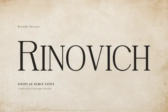
Narrow traditional serif
Rinovich is a narrow traditional serif in black on aged paper across a wooden surface: tall caps with fine bracketed serifs, a much taller initial R and a tight but even spacing, with a small line at the upper left and two lines beneath naming the style and the studio.
Ideas for this font
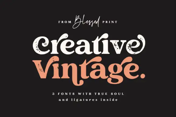
Distressed curled vintage serif
Creative Vintage is a high-contrast serif in which the terminals curl into swash shapes, the C turns inward, the t finishes in a broad low hook and scattered distressed marks break the fill, so a title reads as a worn printed label.
Ideas for this font

High-contrast display serif with sculpted curves and tucked swash legs
Orvelia is a high-contrast display serif in which the stems alternate thick and hairline weights, the R, V and A end in curved swash legs and the bowls stay sculpted, so a name reads as a crest for a perfume box or a masthead.
Ideas for this font
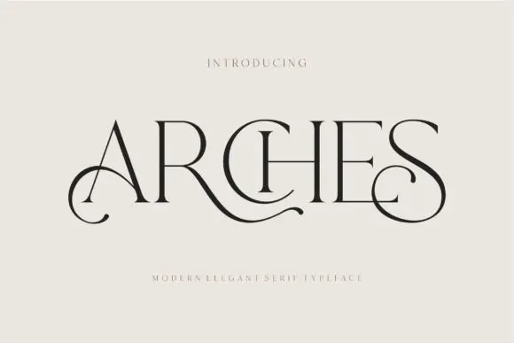
Decorative ligature serif
Arches sets one word in dark ink on a warm neutral field, where wide flat serifs sit on hairline cross strokes, the A climbs to a sharp apex, the R leg sweeps into a long horizontal tail that runs beneath the following letters and the S closes with an extended curl.
Ideas for this font
Same independent foundry
Allow optional Google Analytics to measure visits and catalogue actions. Your search words and notes are not included. Privacy & storage



