Modern Grotesque Body

Rinovich + Clyne Sans
Creates crisp high-hierarchy contrast beneath Rinovich headlines across menus, websites and labels.
Inspect Clyne Sans specimenDisclosure: MakerFileHub may earn a commission from qualifying purchases via paid links on this page. How our links work.
Narrow traditional serif
Rinovich is a narrow traditional serif in black on aged paper across a wooden surface: tall caps with fine bracketed serifs, a much taller initial R and a tight but even spacing, with a small line at the upper left and two lines beneath naming the style and the studio.
Paid link
Get this fontProject & layout blueprintsAt-a-glance maker compatibility
Sturdy stroke walls and open counters weed cleanly on adhesive vinyl, HTV apparel film, and cut cardstock.
Visual anatomy & craft review
The word spans the plate and the drawing is a traditional serif at a narrow width: the stems are fine, the serifs are bracketed, and the initial R is drawn taller than the rest, which gives the line a classical asymmetry rather than a mechanical evenness. That construction is what makes the face read as old book work rather than as a modern revival, and the specimen sets it large enough that the bracketing is visible. The aged paper and the wooden background are staging that place the face in its intended context, and the two lines beneath are set in a small serif at a fraction of the size. Because the contrast is moderate, the face also works at text sizes, and the plate suggests that by keeping the small lines legible.
Serif, traditional, narrow, quiet
Two-font hierarchy recipes
Tested contrast partners — pairing Rinovich with grounded secondary typography.
Rinovich + Clyne Sans
Creates crisp high-hierarchy contrast beneath Rinovich headlines across menus, websites and labels.
Inspect Clyne Sans specimen
Rinovich + Esmeralda
Adds a warm human signature touch for 1-to-3-word callouts without competing against structured serif capitals.
Inspect Esmeralda specimenPractical applications
Concrete hierarchy, scale and production guidance tailored to Rinovich’s stroke geometry.
A narrow serif sets a long text in a compact measure, which is what a small-format edition needs, and the bracketed serifs keep a page calm.
Hierarchy & layout recipe
B-format interior: the body at 10 pt with 14.5 pt leading, the chapter heads at 18 pt, and 62 characters per line. Print one ink on a cream stock with 20 mm margins.
Pre-production check
Check a full page at 10 pt, where a narrow serif can overrun the measure; adjust the tracking. Confirm the leading holds the column and that the running head stays distinct.
A traditional serif reads as a printed edition, and the narrow skeleton lets a title and an imprint fit a small sticker without wrapping.
Hierarchy & layout recipe
Print a 60 by 40 mm label: the title at 11 pt, the author at 8 pt, and the price at 6 pt. Keep 3 mm inside the die and print one ink on a textured stock.
Pre-production check
Check the 11 pt title on a textured label, where fine serifs can fill; keep the size above 9 pt. Confirm the 6 pt price reads at arm's length and that the label peels cleanly.
A traditional serif suits a couple who want print rather than calligraphy, and the narrow width holds a long venue name on one line.
Hierarchy & layout recipe
A5 invitation: the names at 24 pt, the request in a 10 pt serif at 14.5 pt leading, and the date at 9 pt caps. Keep 22 mm margins and print one ink on a cream card.
Pre-production check
Check the 10 pt request on uncoated card, where a bracketed serif can fill; test one sheet on the stock. Confirm the names read at arm's length and that the date clears the trim.
Technical & licence verification
Confirm included OTF/TTF/WOFF formats, full glyph tables and licence coverage on the live store page before batch production.
Closest visual alternatives
Matched across letterform anatomy, stroke behaviour and craft applications.
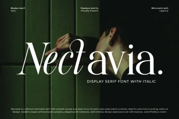
Minimalist display serif with italic
Nectavia is a refined minimalist serif in white over a dark green portrait: moderate contrast, smooth curves, a clean stem and sharp serifs, set in title case on one line with a small italic line beneath and three tracked notes across the top.
Ideas for this font
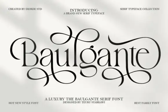
Tall high-contrast serif with looping figure-eight extensions in regular and slant
Baulgante is an elegant high-contrast serif in which the stems stay narrow, the bowls round broadly and repeated figure-eight extensions loop above and below the line, and the family ships in regular and slant so a suite can shift its axis.
Ideas for this font
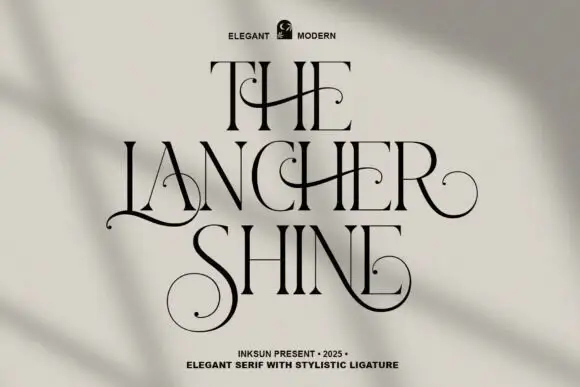
Fine serif with curled strokes
The Lancher Shine is a fine serif in black on pale greige: tall narrow capitals with hairline stems, and long curled strokes that leave the letters and cross the lines horizontally, one above and one below, with tracked lines at the head and foot and a soft shadow falling across the wall.
Ideas for this font
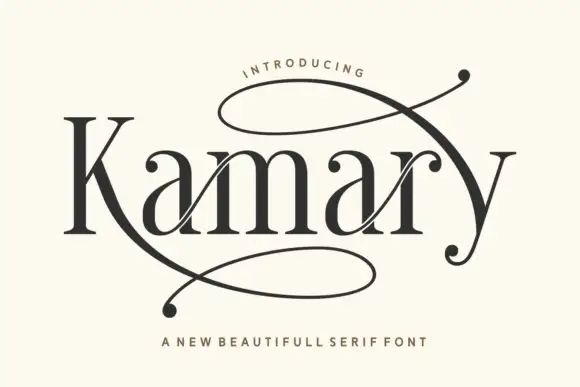
Fine serif mixed case framed by huge figure-eight extensions
Kamary shows black contrasting letters with tall stems and broad rounded bowls: the K leg stretches into a large loop below the word and an upper extension sweeps across the final y, leaving visible space on the cream cover for both swashes.
Ideas for this font
Same independent foundry
Allow optional Google Analytics to measure visits and catalogue actions. Your search words and notes are not included. Privacy & storage