Neutral Sans Workhorse

Spooky Town + Bareum
Lets Spooky Town own the focal silhouette while handling secondary copy, sizing and subheads cleanly.
Inspect Bareum specimenDisclosure: MakerFileHub may earn a commission from qualifying purchases via paid links on this page. How our links work.
Playful rounded monoline display with curls
Spooky Town is a playful rounded display in mustard and cream on a navy Halloween scene: an even monoline stroke, wide rounded bowls, curls at the ends of the S and the y, and a bounce that lifts alternate letters off the baseline.
Paid link
Get this fontProject & layout blueprintsAt-a-glance maker compatibility
Sturdy stroke walls and open counters weed cleanly on adhesive vinyl, HTV apparel film, and cut cardstock.
Visual anatomy & craft review
Both words are set at the same width and stacked, and the drawing is a friendly monoline rather than a horror face: the stroke is uniform, the terminals roll into small curls, and the letters bounce so the baseline reads as a wave. The O and the W stay wide and round, the y drops a long curved tail, and the capitals and lowercase share a height, which is what makes the pair read as hand-lettered signage. Because the stroke is even and fairly thin, the face holds at label sizes as well as at poster sizes, and the two colours separate the lines without any outline. The ground is a flat navy illustration of a graveyard, a moon and bare trees, and the caption sits in a ribbon banner, so the whole page reads as a seasonal graphic rather than a type sample.
Playful, rounded, monoline, seasonal
Two-font hierarchy recipes
Tested contrast partners — pairing Spooky Town with grounded secondary typography.
Spooky Town + Bareum
Lets Spooky Town own the focal silhouette while handling secondary copy, sizing and subheads cleanly.
Inspect Bareum specimen
Spooky Town + The Bilstein Editorial
Grounds bold display lettering with classic typographic authority on posters, badges and apparel.
Inspect The Bilstein Editorial specimenPractical applications
Concrete hierarchy, scale and production guidance tailored to Spooky Town’s stroke geometry.
A rounded seasonal display sets a friendly Halloween tone that suits families, and the monoline stroke reads clearly on a small card where a textured face would look muddy.
Hierarchy & layout recipe
A6 card: the phrase at 30 pt, the details in a 9 pt rounded sans beneath, and a small web illustration in one corner. Keep 12 mm margins and print two colours on a cream stock so the bounce reads as hand lettering.
Pre-production check
Check the 30 pt phrase on the card, where the curls can touch the neighbouring letter; open the tracking slightly. Confirm the 9 pt details keep a 4.5:1 contrast and that the tail of the y clears the trim by 6 mm.
A playful face keeps an October birthday light rather than frightening, and the monoline construction prints cleanly at banner scale where a textured face would disappear.
Hierarchy & layout recipe
Print 900 by 400 mm: the name at 140 mm cap height, the age in a 30 mm rounded sans, and a 6 mm border. Keep 30 mm margins so the bounce stays inside the sheet, and print two flat colours on a mid-toned ground.
Pre-production check
Check the banner at five metres, where the thin stroke can lose contrast on a busy ground; put the type on a flat panel. Confirm the 30 mm age reads at three metres and that the border does not crowd the curls.
A friendly monoline display attracts children without being scary, and the even weight photocopies far better than a textured or drippy face at the same size.
Hierarchy & layout recipe
A4 print: the headline at 60 mm, the details in a 12 mm rounded sans, and the illustration kept to a small web. Keep the palette to two colours so a school copier reproduces the curls and the bounce without filling them in.
Pre-production check
Check the A4 on a copier, where a thin curl can break; print at the highest quality and thicken the stroke if needed. Confirm the 12 mm details read from two metres and that the headline still parses at half size on a phone screen.
Technical & licence verification
Confirm included OTF/TTF/WOFF formats, full glyph tables and licence coverage on the live store page before batch production.
Closest visual alternatives
Matched across letterform anatomy, stroke behaviour and craft applications.
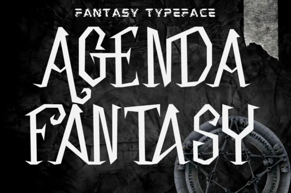
Angular blade-hooked dark-fantasy & Halloween display
Agenda Fantasy is a creepy, razor-angled dark-fantasy display font hooking jagged scythe spurs onto tall Gothic-inspired capitals.
Ideas for this font
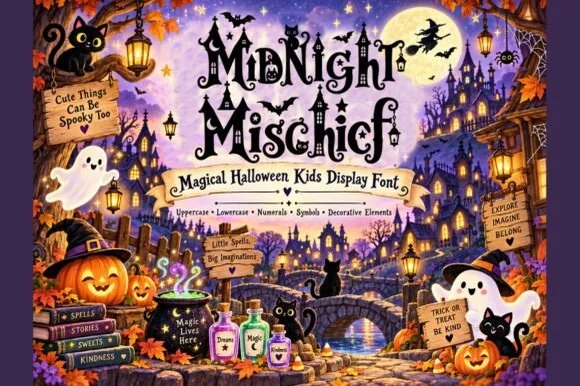
Whimsical witchy storybook Halloween font with curls, stars & spiders
Midnight Mischief is an enchanted children's Halloween display font curling fairy-tale serif stems with hanging spiders, stars, and moons! (Full charset + elements).
Ideas for this font
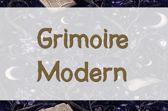
Organic cozy-witch & apothecary display serif (TTF)
Grimoire Modern is a warm, hand-softened high-contrast serif blending mystical apothecary curves with friendly modern legibility (TTF).
Ideas for this font
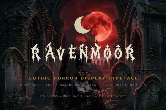
Dripping gothic horror display
Ravenmoor is a gothic horror display in bone white on a crimson moonlit graveyard: jagged stems, drips falling from every baseline, points that extend into long spikes, with a tracked subtitle and a specification line beneath in small caps.
Ideas for this font
Same independent foundry
Allow optional Google Analytics to measure visits and catalogue actions. Your search words and notes are not included. Privacy & storage