Neutral Sans Workhorse

Spooky + Limited Coffee
Lets Spooky own the focal silhouette while handling secondary copy, sizing and subheads cleanly.
Inspect Limited Coffee specimenDisclosure: MakerFileHub may earn a commission from qualifying purchases via paid links on this page. How our links work.
Split-initial pumpkin emblem
Spooky is an emblem design on white: a grinning pumpkin at the crown, a split-initial S inside a circle below it, curling symmetric scrolls at each side, a band across the middle that carries the word in serif capitals and a small bat hanging beneath.
Paid link
Get this fontProject & layout blueprintsAt-a-glance maker compatibility
Sturdy stroke walls and open counters weed cleanly on adhesive vinyl, HTV apparel film, and cut cardstock.
Visual anatomy & craft review
The plate is a crest rather than a specimen, and it is composed as one object: the pumpkin, the initial, the scrolls and the band are locked together, so the mark is a design to be used whole rather than a face to be set. The initial is a script S and the band is set in a serif, which shows the set has more than one voice. That construction sets a moderate size floor, because the pumpkin face and the scroll curls close first, and the blush-to-purple gradient is a treatment rather than a feature of the drawing. It suits a seasonal logo, a sign and a sticker, and it is best used centred where its symmetry can be read.
Decorative, emblem, monogram, halloween
Two-font hierarchy recipes
Tested contrast partners — pairing Spooky with grounded secondary typography.
Spooky + Limited Coffee
Lets Spooky own the focal silhouette while handling secondary copy, sizing and subheads cleanly.
Inspect Limited Coffee specimen
Spooky + Cervelique
Grounds bold display lettering with classic typographic authority on posters, badges and apparel.
Inspect Cervelique specimenPractical applications
Concrete hierarchy, scale and production guidance tailored to Spooky’s stroke geometry.
A pumpkin emblem names the season in one mark, and the symmetric scrolls hold a stall sign from a distance. The emblem reads at distance.
Hierarchy & layout recipe
Print a 300 mm round sign: the emblem at 280 mm, two colours on a white board, and a hanging hole at the crown. Keep 15 mm of clear space around the scrolls.
Pre-production check
Check the sign at three metres, where the pumpkin face can close; keep the eyes above 6 mm. Confirm the word band reads at two metres and that the gradient prints without banding.
An emblem sticker finishes a bag, and the locked composition survives a die cut where a loose ornament would not. The lockup survives a die cut.
Hierarchy & layout recipe
Print a 90 by 90 mm sticker: the emblem at 80 mm, two colours on a white vinyl, and a 3 mm bleed. Keep the die 5 mm outside the scroll tips and print at 300 dpi.
Pre-production check
Check the sticker at actual size, where a scroll tip can touch the die; keep 5 mm clearance. Confirm the sticker peels cleanly and that the pumpkin face stays crisp.
An emblem carries a card without an illustration, and the split initial lets a host add one letter. It needs no illustration.
Hierarchy & layout recipe
A6 card: the emblem at 60 mm at the head, the details in a 9.5 pt sans, and the date at 8.5 pt. Keep 15 mm margins and print two colours on a cream card.
Pre-production check
Check the 60 mm emblem at home-print resolution, where the scroll curls can close; keep them above 0.6 mm. Confirm the details read at arm's length and that the card folds flat.
Technical & licence verification
Confirm included OTF/TTF/WOFF formats, full glyph tables and licence coverage on the live store page before batch production.
Closest visual alternatives
Matched across letterform anatomy, stroke behaviour and craft applications.

Sharp angular blackletter with fractured serifs and kept lowercase counters
Blade Gothic is a blackletter display in which the strokes break into sharp angles, the serifs fracture and the vertical rhythm stays clean, so a title reads as medieval lettering that still resolves at headline scale.
Ideas for this font
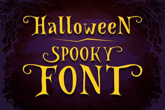
Narrow spooky serifs with curled ends
Halloween Spooky shows tall high-contrast letters with pointed serif tips and long curling terminals, and the enlarged F and T extend horizontally across the lowest word of the composition.
Ideas for this font
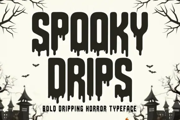
Bold dripping horror display
Spooky Drips is a bold dripping display in near-black on a bone ground: very heavy condensed letters with long viscous drips running from the baseline and the counters, flat terminals and a squared top, framed by bare branches and a row of haunted houses along the foot.
Ideas for this font
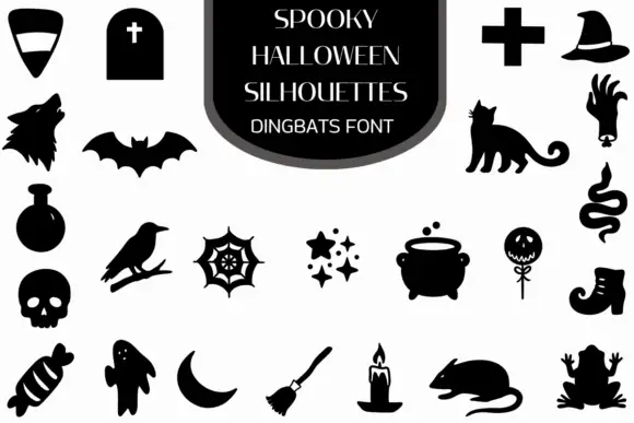
Halloween silhouette dingbats
Spooky Halloween is a dingbat set on a white ground: solid black silhouettes with small white cut-outs, arranged in rows around a dark central panel that names the set — a tombstone, a cross, a hat, a wolf, a bat, a cat, a potion, a crow, a web, a cauldron, a skull, a boot, a ghost, a moon, a candle, a rat and a frog.
Ideas for this font
Same independent foundry
Allow optional Google Analytics to measure visits and catalogue actions. Your search words and notes are not included. Privacy & storage