Neutral Sans Workhorse

Spooky + Homies
Lets Spooky own the focal silhouette while handling secondary copy, sizing and subheads cleanly.
Inspect Homies specimenDisclosure: MakerFileHub may earn a commission from qualifying purchases via paid links on this page. How our links work.
Bold groovy bubble display with faces
Spooky is a bold groovy display in lilac-purple on a pale lavender ground: fat rounded letters that swell and narrow, jack-o-lantern faces cut into three of them, and a bounce that lifts alternate characters, so the word reads as a seventies novelty rather than as a horror face.
Paid link
Get this fontProject & layout blueprintsAt-a-glance maker compatibility
Sturdy stroke walls and open counters weed cleanly on adhesive vinyl, HTV apparel film, and cut cardstock.
Visual anatomy & craft review
The word is set once, large, and the drawing is a groovy display at heavy weight: the strokes swell through the middle, the counters are small and round, and the letters lean into each other so the word reads as one mass with faces punched through it. Three of the letters carry carved smiles and triangle eyes, which turns the word into a row of characters without extra artwork, and the bounce keeps the baseline lively. The fills are flat and the ground is a single pastel, so the two-colour separation stays simple, and the specimen adds a small ghost, a candy corn and a black cat around the lockup. Beneath it, a second line and a paragraph in a different quirky face explain the contents, which is the language of a commercial listing rather than a type specimen.
Groovy, bold, playful, seasonal
Two-font hierarchy recipes
Tested contrast partners — pairing Spooky with grounded secondary typography.
Spooky + Homies
Lets Spooky own the focal silhouette while handling secondary copy, sizing and subheads cleanly.
Inspect Homies specimen
Spooky + Rosemode
Grounds bold display lettering with classic typographic authority on posters, badges and apparel.
Inspect Rosemode specimenPractical applications
Concrete hierarchy, scale and production guidance tailored to Spooky’s stroke geometry.
A groovy face with built-in smiles reads as a party rather than a scare, and the fat letters hold at poster size where a novelty face with thin details would fail.
Hierarchy & layout recipe
A2 portrait: the word at 150 mm cap height, the details in a 14 mm quirky sans, and the times at 12 mm. Keep 30 mm margins, print two flat colours, and place the small ghost and cat icons away from the details.
Pre-production check
Check the poster at five metres, where the carved faces can read as damage; keep the counter size above 10 mm. Confirm the 12 mm times read at three metres and that the icons do not crowd the lockup.
A groovy seasonal face makes an October birthday playful, and the heavy rounded letters reproduce cleanly on a home printer where a textured face would look muddy.
Hierarchy & layout recipe
A6 card: the name at 30 pt, the details in a 9 pt quirky sans, and a 3 mm border. Keep 12 mm margins, print two colours, and keep the smile counters at least 4 mm wide so they survive a home print.
Pre-production check
Check the 30 pt name, where the smallest counter can fill; open the letter spacing. Confirm the 9 pt details keep a 4.5:1 contrast and that the carved faces are still visible at 50 percent on a phone screen.
A groovy label stands out on a shelf of dark Halloween packaging, and the flat two-colour construction keeps a small confectioner's run affordable.
Hierarchy & layout recipe
Print a 60 by 80 mm label: the product at 16 pt, the flavour in a 7 pt sans, and the weight at 6 pt. Keep 5 mm clear inside the die and place the smiles away from the smallest text so nothing reads as a printing error.
Pre-production check
Check the 16 pt product name, where a carved counter can look like a defect at label size; use plain letters for the smallest line. Confirm the 6 pt weight reads on the shelf and that the label clears the die on all sides.
Technical & licence verification
Confirm included OTF/TTF/WOFF formats, full glyph tables and licence coverage on the live store page before batch production.
Closest visual alternatives
Matched across letterform anatomy, stroke behaviour and craft applications.
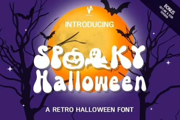
70s groovy ghost & jack-o'-lantern counter font (+ Bonus Outline & Icons!)
Spooky Halloween (by NPNaay) is a 1970s groovy display pack hiding cute ghosts & jack-o'-lanterns inside letter bowls—PLUS a Bonus Outline & Icon version!
Ideas for this font
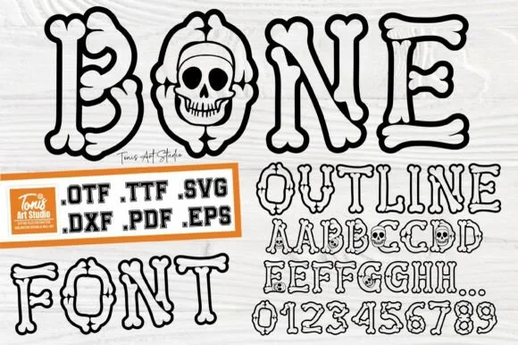
Cartoon hollow bone & grinning-skull Halloween alphabet (.OTF .TTF .SVG .DXF .PDF .EPS)!
Bone Outline builds every letter and '0–9' numeral out of cartoon skeleton bones—complete with a grinning skull inside 'O'—in OTF, TTF, SVG, DXF, PDF & EPS!
Ideas for this font
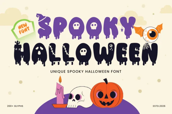
200+ glyph melting-ooze, witch-hat & haunted-castle horror alphabet
Spooky Halloween (by Umitype) is a loaded 200+ glyph Halloween display font crowning melting slime letters with witch hats, haunted castles, skulls & eyeballs!
Ideas for this font
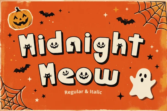
Jack-o'-lantern & peeking black-cat counter Halloween font (Regular & Italic)
Midnight Meow is an adorable chunky Halloween display duo ('Regular & Italic') hiding carved jack-o'-lantern faces and peeking black-cat ears right inside the letter counters!
Ideas for this font
Allow optional Google Analytics to measure visits and catalogue actions. Your search words and notes are not included. Privacy & storage