Editorial Serif Anchor

Simple Boho + Rosemode
Anchors Simple Boho's fluid strokes with crisp Roman proportions on wedding suites, headers and packaging.
Inspect Rosemode specimenDisclosure: MakerFileHub may earn a commission from qualifying purchases via paid links on this page. How our links work.
Thick monoline brush script
Simple Boho is a thick monoline brush script in black on white: heavily rounded strokes, a steep bounce, exaggerated loops on the S and the B, and a descender on the p that curls back under the word.
Paid link
Get this fontProject & layout blueprintsAt-a-glance maker compatibility
Weld or Unite overlapping script joins into one continuous vector path before sending to the blade.
Visual anatomy & craft review
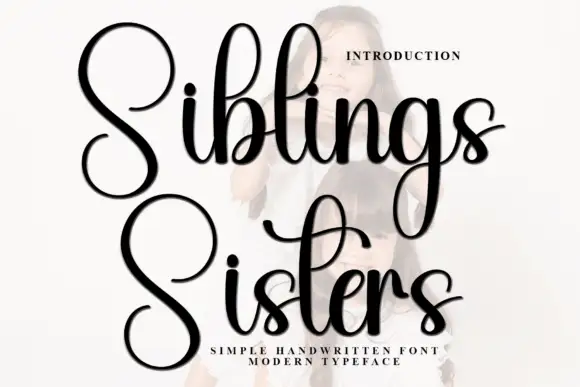
The two words are set large and stacked, and the drawing is a bold monoline brush: the stroke is uniformly thick with soft rounded ends, the loops of the S and the B are wide and open, and the m and the o sit tight together so the word reads as a single gesture. The bounce is pronounced, with the b of the first word dropping well below the line of the o, and the second word steps in and rises at the end, which keeps the lockup from looking like two typed lines. Because the stroke is thick, the face holds at small sizes better than a fine script, but the loops start to close below about 16 pt. The ground is plain white with a photograph of green leaves at the edges, and the descriptor is small tracked capitals at the foot, which frames the script as a home-studio product rather than a formal stationery face.
Bold, brushy, casual, rounded
Two-font hierarchy recipes
Tested contrast partners — pairing Simple Boho with grounded secondary typography.
Simple Boho + Rosemode
Anchors Simple Boho's fluid strokes with crisp Roman proportions on wedding suites, headers and packaging.
Inspect Rosemode specimen
Simple Boho + Memoir Slang
Keeps small-scale dates, URLs, nutrition facts and care instructions crisp and legible below script titles.
Inspect Memoir Slang specimenPractical applications
Concrete hierarchy, scale and production guidance tailored to Simple Boho’s stroke geometry.
A thick monoline script stays legible on a small wrapper where a fine calligraphy turns to grey, and the bounce gives it the hand-made tone a craft seller wants.
Hierarchy & layout recipe
Print a 60 by 45 mm wrap label: the word at 16 pt, the scent in a 7 pt sans caps beneath, and the weight in 6 pt at the base. Keep 4 mm of clear space inside the trim so the descender of the p never reaches the cut.
Pre-production check
Check the p descender at 16 pt against the trim, where the curl will be cut off if the label is trimmed 1 mm short. Confirm the 6 pt weight stays legible on the curved bar and that the black holds contrast on a natural paper stock.
A bold script cuts cleanly in card and reads as decoration by itself, so a topper needs no shape behind the word, and the round strokes survive handling.
Hierarchy & layout recipe
Cut the word 80 mm wide from 2 mm card: keep every stroke at least 5 mm wide, thicken the p descender to 4 mm, and mount on two 50 mm sticks behind the o and the h. Leave 6 mm of card above the tallest loop.
Pre-production check
Check the cut file at actual size, where the tight join between the m and the o will fall apart in 2 mm card; separate the letters slightly for the cut version. Confirm the topper sits level on the sticks and that no loop dips below the cake's top edge.
A thick script reads as a hand-lettered shop sign, which suits a florist's window, and the even stroke works in vinyl, paint and foil without redrawing.
Hierarchy & layout recipe
Set the name at 40 pt for the window decal and build a 20 pt version for the card by trimming the outer loops. Keep the mark one colour and always place it at least 50 mm from the glass edge so the cut is not visible.
Pre-production check
Check the vinyl weeding at 40 pt, where a loop under 4 mm will tear; thicken or simplify the loop for the decal. Confirm the 20 pt card version still reads as the same word and that the mark holds at 120 px wide on a phone screen.
Technical & licence verification
Confirm included OTF/TTF/WOFF formats, full glyph tables and licence coverage on the live store page before batch production.
Closest visual alternatives
Matched across letterform anatomy, stroke behaviour and craft applications.
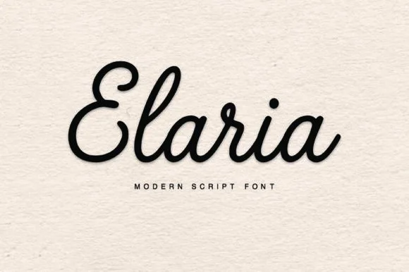
Plump rounded monoline-cord retro script (Ultra vinyl-friendly!)
Elaria is a thick, smooth monoline-cord script with rounded pen ends and open loops—engineered to weed like a dream on Cricut vinyl and HTV!
Ideas for this font
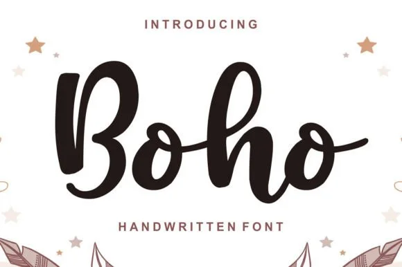
Chunky bouncy bohemian brush-marker script
Boho (by Lisna.Craft) is a thick, welcoming brush-marker script (not a rigid block display) featuring rounded loops and joyful baseline bounce.
Ideas for this font
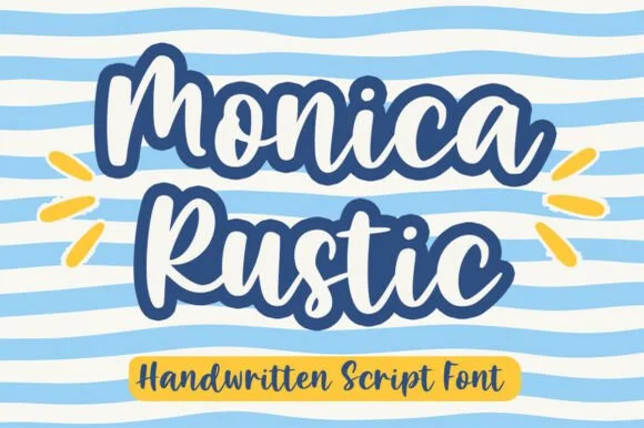
Bold handwritten script with a heavy outline
Monica Rustic is a handwritten script in navy and white on pale blue: fat connected letters with an inline and a heavy dark outline, a bouncy baseline and wide loops, set as two stacked words with a tracked caption in a yellow pill.
Ideas for this font
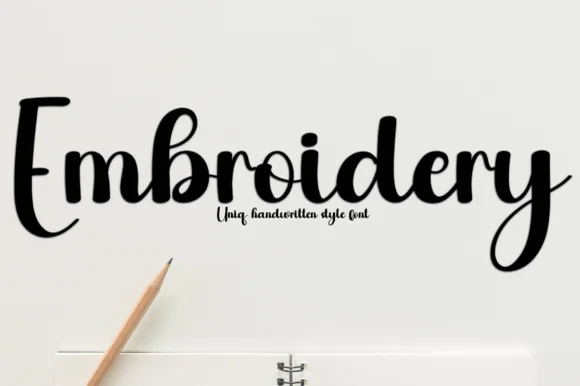
Plump upright bouncy marker-brush script
Embroidery (by Preketek texs) is a thick, playful handwritten brush script featuring solid filled loops and fast-weeding Cricut curves.
Ideas for this font
Same independent foundry
Allow optional Google Analytics to measure visits and catalogue actions. Your search words and notes are not included. Privacy & storage