Neutral Sans Workhorse

Silent Scream + Montreal
Lets Silent Scream own the focal silhouette while handling secondary copy, sizing and subheads cleanly.
Inspect Montreal specimenDisclosure: MakerFileHub may earn a commission from qualifying purchases via paid links on this page. How our links work.
Spiked metal logo display
Silent Scream is a metal logo face in red on black: spiked letterforms that break into symmetrical flame shapes, strokes that thin to points, and a second gothic cut used for the caption, all set against a chain-link ground.
Paid link
Get this fontProject & layout blueprintsAt-a-glance maker compatibility
Fine grain and micro-texture excel in 300 DPI print, sublimation, and screen print rather than small vinyl weeding.
Visual anatomy & craft review
The two words are stacked and each letter is drawn as an aggressive shape rather than a normal skeleton: the stems taper into long curved spikes that reach sideways and the counters are closed by crossing spikes, so the word reads as a logo mass rather than as text. Symmetry is the organising principle, which means the letters are not spaced on a baseline but arranged so that the spikes of adjacent letters interlock, and the pair only works as a combined graphic. A gothic capital face is used for the introduction and the caption, which provides contrast and confirms the metal register without repeating the spike motif. The ground is a dark chain-link texture, and the red against black gives the shape its only contrast, so the specimen is monochrome apart from the ink choice.
Metal, spiked, aggressive, symmetric
Two-font hierarchy recipes
Tested contrast partners — pairing Silent Scream with grounded secondary typography.
Silent Scream + Montreal
Lets Silent Scream own the focal silhouette while handling secondary copy, sizing and subheads cleanly.
Inspect Montreal specimen
Silent Scream + Kernova
Grounds bold display lettering with classic typographic authority on posters, badges and apparel.
Inspect Kernova specimenPractical applications
Concrete hierarchy, scale and production guidance tailored to Silent Scream’s stroke geometry.
A spiked logo face sets a metal night before a single band name is read, and the symmetric arrangement makes a strong graphic at poster scale where a normal alphabet would look tame.
Hierarchy & layout recipe
A2 portrait: the logo at 180 mm wide, the line-up in a 14 mm gothic cut, and the date at 30 mm. Keep the logo on flat black with at least 30 mm of clear space around the spikes so they do not touch the type beneath.
Pre-production check
Check the spikes at full size, where points under 1 mm break off in print; thicken the tips for the poster. Confirm the 14 mm line-up reads at two metres and that no spike crosses the date line or the trim.
A spiked display gives a zine cover immediate credibility with its audience, and the single ink keeps a short photocopied run affordable.
Hierarchy & layout recipe
Set the logo at 120 mm wide on an A5 cover, the issue number in a 9 pt gothic at the foot, and a 4 mm border. Print one ink on a dark stock so the spikes read as the only form on the page.
Pre-production check
Check the logo after photocopying, where thin spikes can drop out; print from a laser original and thicken the thinnest points. Confirm the 9 pt issue number survives the copy and that the border does not close at the trim.
A spiked logo translates into an embroidered patch, and the symmetric construction means the digitising can follow the spikes without redrawing the mark.
Hierarchy & layout recipe
Embroider a 90 mm patch: the logo at 60 mm wide with no spike thinner than 1.5 mm of stitch, a 2 mm satin border, and the band name in a 4 mm gothic beneath. Keep the patch to three thread colours so the shape stays readable on a dark jacket.
Pre-production check
Check the digitised file for spikes under 1.5 mm, which will break or fill in; simplify the three narrowest points for embroidery. Confirm the 4 mm band name is legible in thread and that the satin border clears the outermost spikes.
Technical & licence verification
Confirm included OTF/TTF/WOFF formats, full glyph tables and licence coverage on the live store page before batch production.
Closest visual alternatives
Matched across letterform anatomy, stroke behaviour and craft applications.
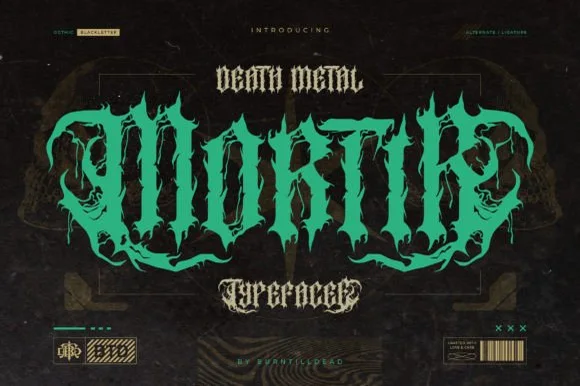
Twisted thorny death-metal blackletter with hooked spurs and long tails
Mortir is a death-metal blackletter in which the gothic skeleton is twisted, the stems sprout thorns and the descenders run long, so a word reads as a brutal logotype with blackletter bones still visible.
Ideas for this font
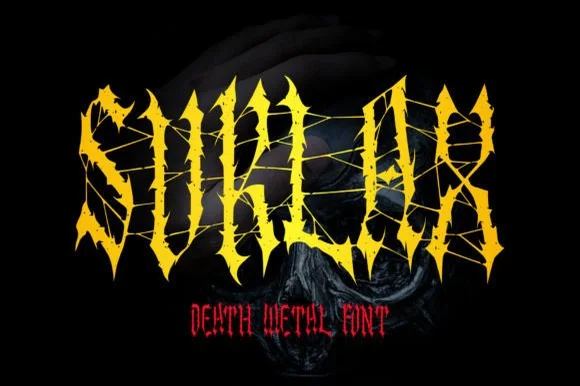
Web-strung & thorn-spiked death-metal blackletter
Suklax is a jagged death-metal blackletter stretching cobweb-thin tension threads between heavy, thorn-spiked gothic capitals.
Ideas for this font
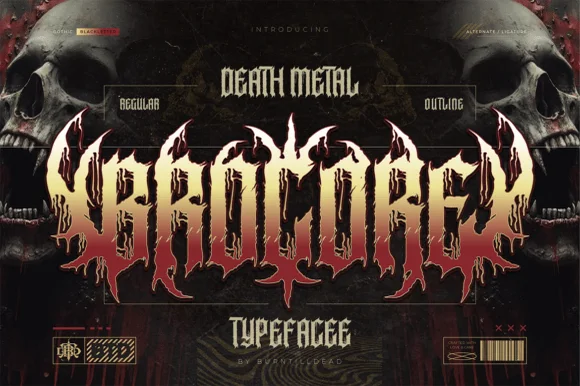
Spiky underground death-metal blackletter (Regular & Outline)
Brocore is an extreme death-metal blackletter family (Regular & Outline) bristling with jagged root spikes, horn canopies, and symmetrical emblem balance.
Ideas for this font
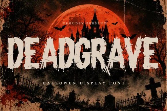
Splintered zombie-claw & graveyard slasher horror display
Deadgrave is a menacing, splintered horror display typeface ripping jagged claw gashes along the bottom edges of heavy graveyard capitals!
Ideas for this font
Same independent foundry
Allow optional Google Analytics to measure visits and catalogue actions. Your search words and notes are not included. Privacy & storage