Neutral Sans Workhorse

Deadgrave + Lemon Milk Pro FTR
Lets Deadgrave own the focal silhouette while handling secondary copy, sizing and subheads cleanly.
Inspect Lemon Milk Pro FTR specimenDisclosure: MakerFileHub may earn a commission from qualifying purchases via paid links on this page. How our links work.
Splintered zombie-claw & graveyard slasher horror display
Deadgrave is a menacing, splintered horror display typeface ripping jagged claw gashes along the bottom edges of heavy graveyard capitals!
Paid link
Get this fontProject & layout blueprintsAt-a-glance maker compatibility
Fine grain and micro-texture excel in 300 DPI print, sublimation, and screen print rather than small vinyl weeding.
Visual anatomy & craft review
Deadgrave is a heavy graveyard display in bone-white capitals whose bottom edges are ripped by jagged claw gashes, drawn as part of the silhouette rather than as a texture layer. The caps are wide and blunt, so the word stays readable while the gashes give it a shredded base, and the faces are simple enough to survive a vinyl cut. Because the gashes sit on the lower edge, the layout needs the baseline to breathe; tight leading will overlap them. It needs roughly 25 mm for the rips to read as deliberate, and it is a poster and merch face.
Splintered-tombstone · Blood-moon-horror · Jagged-brush
Two-font hierarchy recipes
Tested contrast partners — pairing Deadgrave with grounded secondary typography.
Deadgrave + Lemon Milk Pro FTR
Lets Deadgrave own the focal silhouette while handling secondary copy, sizing and subheads cleanly.
Inspect Lemon Milk Pro FTR specimen
Deadgrave + The Avenue Editorial
Grounds bold display lettering with classic typographic authority on posters, badges and apparel.
Inspect The Avenue Editorial specimenPractical applications
Concrete hierarchy, scale and production guidance tailored to Deadgrave’s stroke geometry.
Shredded lower edges read as a slashed sign, which is the visual promise a haunt poster makes. Blunt caps keep the attraction name legible from the queue.
Hierarchy & layout recipe
Poster A2, word 260 mm with 20 mm below the baseline for the gashes, times 24/30 pt, 30 mm margins. Sign 900 x 400 mm, word 180 mm. Tee print 280 x 320 mm, word 200 mm.
Pre-production check
Gashes that hang below the baseline get clipped when a poster is cropped to a fixed frame. Declare the artwork box, and check one printed poster inside its frame before hanging the set.
A shredded silhouette reads as a printed horror sleeve rather than a font sample, and the readable caps keep a title identifiable at thumbnail size. One ink suits a small label's budget.
Hierarchy & layout recipe
Sleeve 312 x 312 mm plus 3 mm bleed, word 180 mm with 20 mm below the baseline, credits 7 pt. Zine A5, header 40 mm, body 8.5/12 pt, 12 mm margins. Flyer A5, word 120 mm, date 10/13 pt, 12 mm margins.
Pre-production check
Streaming thumbnails render at 55 px, where gashes close into a solid bar. Check the title at that size, and keep the word to two syllables so the silhouette stays recognisable.
The face works as a badge, so a small label can put one mark across a tee, a sticker and a window. Blunt caps hold inside a square die.
Hierarchy & layout recipe
Window decal 400 x 300 mm, word 160 mm, 15 mm cut margin. Sticker 80 x 60 mm, word 16 mm, 3 mm die margin. Hangtag 60 x 120 mm, word 18 mm, 5 mm hole clearance.
Pre-production check
Stickers cut close to the gashes leave thin shoulders that peel first. Use a rounded-rectangle die with 3 mm clearance, and pull one sticker from the backing to check adhesion before ordering a sheet.
Technical & licence verification
Confirm included OTF/TTF/WOFF formats, full glyph tables and licence coverage on the live store page before batch production.
Closest visual alternatives
Matched across letterform anatomy, stroke behaviour and craft applications.
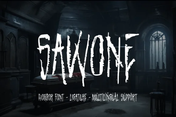
Splintered dry-brush slasher horror display
Sawone is a tall, jagged horror display font drawn with dry Procreate brush strokes, splintered vertical drips, and nervous angular tension.
Ideas for this font
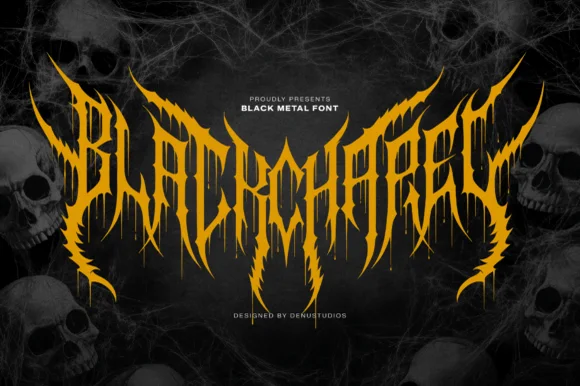
Spiked black-metal sigil lettering with ragged edges and dripping points
Blackchapel is an extreme-metal sigil face in which the letters merge into a spiked mass, the stems split into thorns and the bottoms run into drips, so a word reads as a band logo rather than as readable type.
Ideas for this font
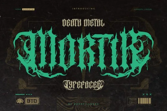
Twisted thorny death-metal blackletter with hooked spurs and long tails
Mortir is a death-metal blackletter in which the gothic skeleton is twisted, the stems sprout thorns and the descenders run long, so a word reads as a brutal logotype with blackletter bones still visible.
Ideas for this font
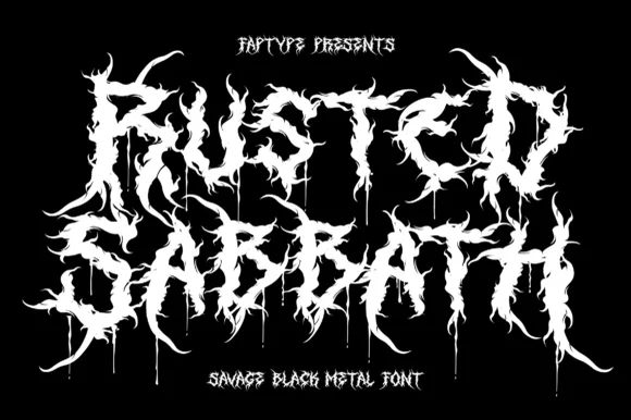
Savage black metal capitals built from spiked, dripping strokes
Rusted Sabbath is a black metal display alphabet in which the stems split into spikes, the counters disappear and the tops of the letters run into flame-like hooks, so a band name reads as a sigil before it reads as words.
Ideas for this font
Allow optional Google Analytics to measure visits and catalogue actions. Your search words and notes are not included. Privacy & storage