Modern Grotesque Body

Senior Western + Cultivo
Creates crisp high-hierarchy contrast beneath Senior Western headlines across menus, websites and labels.
Inspect Cultivo specimenDisclosure: MakerFileHub may earn a commission from qualifying purchases via paid links on this page. How our links work.
Layered western slab
Senior Western is a layered western slab in red and black on aged cream: heavy slabs with notched corners, an inner line inside each stroke, a hard offset shadow, and a frame of hats, stars and a desert silhouette, so the pair reads as a rodeo poster rather than a modern slab.
Paid link
Get this fontProject & layout blueprintsAt-a-glance maker compatibility
Fine grain and micro-texture excel in 300 DPI print, sublimation, and screen print rather than small vinyl weeding.
Visual anatomy & craft review
The two words are stacked in two colours, and the drawing is a western slab with an inline: the serifs are blocks, the stems are notched, and a thin line runs inside each stroke, which is the detail that makes the letters read as routed timber rather than printed type. A hard shadow sits behind both lines at the same offset, so the pair reads as one plate rather than as two experiments. Spacing is tight and the widths are even, so the block fills the centre of the frame. The frame is a period composition — a hat either side, stars in the corners, an oval rule above and a desert scene at the foot — all in the same two inks, which is what makes the plate feel like a printed rodeo bill.
Western, layered, vintage, bold
Two-font hierarchy recipes
Tested contrast partners — pairing Senior Western with grounded secondary typography.
Senior Western + Cultivo
Creates crisp high-hierarchy contrast beneath Senior Western headlines across menus, websites and labels.
Inspect Cultivo specimen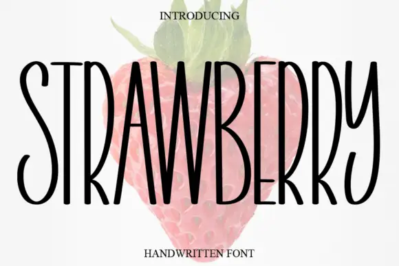
Senior Western + Strawberry
Adds a warm human signature touch for 1-to-3-word callouts without competing against structured serif capitals.
Inspect Strawberry specimenPractical applications
Concrete hierarchy, scale and production guidance tailored to Senior Western’s stroke geometry.
A layered western slab reads as a painted rodeo sign, and the inline and shadow give a fascia depth that a flat slab cannot.
Hierarchy & layout recipe
Paint a 1,800 by 600 mm board: the name at 200 mm cap height, a 8 mm inline, a 10 mm shadow, and the hours in a 30 mm sans. Keep 50 mm margins and paint two colours on a dark board.
Pre-production check
Check the inline at 8 mm, where a narrower line reads as damage; keep it above 6 mm. Confirm the 30 mm hours read at five metres and that the shadow does not merge with the frame.
A western slab sets a theme without a costume, and the two inks print at home while keeping the inline visible on a small card.
Hierarchy & layout recipe
A6 card: the phrase at 30 pt, the details in a 9 pt sans, and a 4 mm frame. Keep 12 mm margins and print two colours on an aged cream card so the inline stays open at card size.
Pre-production check
Check the 30 pt phrase, where the inline can close; keep the size above 26 pt. Confirm the 9 pt details keep a 4.5:1 contrast and that the frame does not cut the descenders.
A layered slab gives a programme the look of a printed bill, and the frame from the family carries the whole cover without a photograph.
Hierarchy & layout recipe
Set the title at 95 mm cap height across 230 mm, the subtitle in a 12 pt slab, and the year at 9 pt caps. Print two inks on an aged stock and let the desert silhouette run along the foot.
Pre-production check
Check the title at thumbnail size, where the inline can blur into the fill; keep the contrast between the two colours. Confirm the 9 pt year survives lamination and that the title clears the silhouette.
Technical & licence verification
Confirm included OTF/TTF/WOFF formats, full glyph tables and licence coverage on the live store page before batch production.
Closest visual alternatives
Matched across letterform anatomy, stroke behaviour and craft applications.
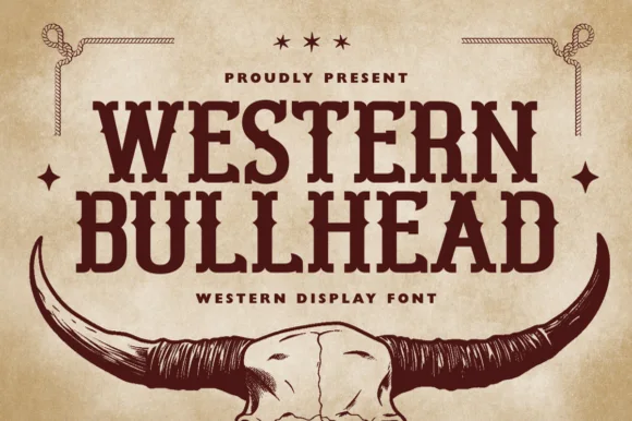
Western display slab with skull mark
Western Bullhead is a western display slab in dark brown on aged tan: heavy bracketed serifs, spurred stems, a notched crossbar and a tight even spacing, presented above a longhorn skull illustration with rope corners, so the pair reads as a ranch brand rather than a modern serif.
Ideas for this font
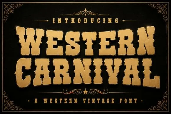
Ornamental western display
Western Carnival is an ornamental western display in gold on black: swollen tuscan serifs, spurred stems, a flared waist and a bevelled highlight, framed by a hairline border with corner flourishes and a rule with a star, so the plate reads as a fairground poster.
Ideas for this font
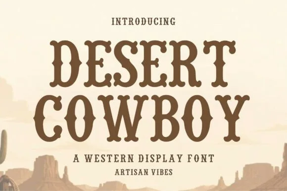
Hand-hewn organic Wood-Type Western slab serif
Desert Cowboy is a warm, hand-hewn Western slab serif softening classic saloon spurs and bracketed feet with organic carved edges.
Ideas for this font
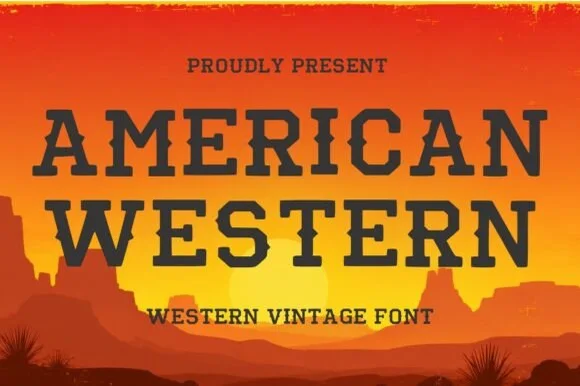
Clean classic Wide-West saloon spurred slab serif
American Western is a clean, wide-stance frontier slab serif pairing generous open counters with crisp diamond waist spurs.
Ideas for this font
Same independent foundry
Allow optional Google Analytics to measure visits and catalogue actions. Your search words and notes are not included. Privacy & storage