High-Contrast Display Serif

Secret Cantena + Auretha
Pairs sculptural editorial warmth with Secret Cantena's clean modern geometry.
Inspect Auretha specimenDisclosure: MakerFileHub may earn a commission from qualifying purchases via paid links on this page. How our links work.
Handwritten serif paired with a script
Secret Cantena is a duo in cream on deep olive: a handwritten serif with a swashy S and a curled t forms the first word, a heavier serif sets the second, and a thin script line beneath carries the description, so the pair covers a title and a subtitle in one family voice.
Paid link
Get this fontProject & layout blueprintsAt-a-glance maker compatibility
Weld or Unite overlapping script joins into one continuous vector path before sending to the blade.
Visual anatomy & craft review
The two words sit on separate lines with different sizes, and the upper one shows the handwritten cut: the stems are slightly uneven, the S opens with an entry swash, the C swells, and the t ends in a curl that lifts off the baseline. The second word uses the companion serif, which is heavier and more regular, so the pair reads as a title and subtitle rather than as one face. Beneath them a script line in a lighter hand names the style, and the three registers share a warm, slightly soft finish rather than a sharp digital edge. The ground is a dark olive photograph of a woman holding dried flowers, and the cream type sits on the darker fabric, so the warm palette carries the contrast.
Duo, handwritten, warm, editorial
Two-font hierarchy recipes
Tested contrast partners — pairing Secret Cantena with grounded secondary typography.
Secret Cantena + Auretha
Pairs sculptural editorial warmth with Secret Cantena's clean modern geometry.
Inspect Auretha specimen
Secret Cantena + Hello Honey
Introduces organic movement on pull-quotes, signatures and gift tags.
Inspect Hello Honey specimenPractical applications
Concrete hierarchy, scale and production guidance tailored to Secret Cantena’s stroke geometry.
A handwritten serif gives a rustic suite warmth without the loopiness of a script, and the companion script covers the detail line, so one family sets the whole card.
Hierarchy & layout recipe
A5 card: the names at 30 pt in the handwritten cut, the venue and time in the script at 10 pt, and the date in a 9 pt cap line. Keep 20 mm margins and print one ink on a cream stock so the swash reads as pen work.
Pre-production check
Check the swashy S at 30 pt on the card, where the entry stroke can run into the margin; inset the names. Confirm the 10 pt script line keeps a 4.5:1 contrast and that the 9 pt date reads at arm's length.
A handwritten serif gives a home-fragrance label a made-in-small-batches feel, and the script line carries the scent name without a second typeface.
Hierarchy & layout recipe
Print a 60 mm round label: the brand at 16 pt in the handwritten cut, the scent in the script at 8 pt, and the weight in 6.5 pt. Keep 4 mm of clear label inside the die so the swashes are never cut.
Pre-production check
Check the 16 pt brand on the jar, where the uneven stems can look like a printing fault at small sizes; use the companion serif below 12 pt. Confirm the 6.5 pt weight reads on the curve and that the script stays outside the die line.
A handwritten serif gives a food feature an editorial warmth, and the pair lets a long subtitle sit in the script beneath a short title without a third font.
Hierarchy & layout recipe
Set the title at 80 pt across 160 mm, the subtitle in the script at 14 pt beneath, and the standfirst in a 10 pt serif below that. Keep 20 mm between the title and the script so the swashes do not touch.
Pre-production check
Check the title at 80 pt over the photograph, where a warm cream can lose contrast on the subject's clothing; move the type to the darker band. Confirm the 14 pt script reads at arm's length and that the standfirst is not orphaned.
Technical & licence verification
Confirm included OTF/TTF/WOFF formats, full glyph tables and licence coverage on the live store page before batch production.
Closest visual alternatives
Matched across letterform anatomy, stroke behaviour and craft applications.
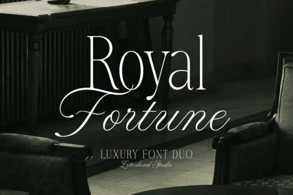
High-contrast luxury serif & fine copperplate script duo
Royal Fortune is a refined luxury font duo pairing a tall, razor-thin high-contrast editorial serif with a poised copperplate calligraphy script.
Ideas for this font
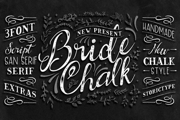
4-part wedding chalkboard family (Script, Sans, Serif & Extras)
BrideChalk is a comprehensive hand-lettered chalkboard system bundling a shaded calligraphy Script, tall Sans Serif, classic Serif, and chalk Extras.
Ideas for this font
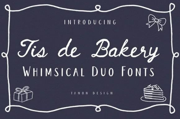
Whimsical cafe monoline script + quirky tall serif/sans duo
Tis De Bakery is a charming bistro font duo pairing a relaxed monoline cursive script with a tall, whimsical semi-serif uppercase font!
Ideas for this font
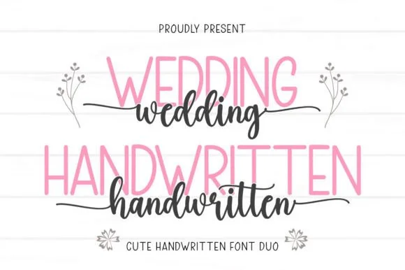
Tall slender sans & tailed calligraphy script duo
Wedding Handwritten pairs a tall, narrow rounded sans-serif with a lively thick-thin calligraphy script sporting symmetrical side tails.
Ideas for this font
Same independent foundry
Allow optional Google Analytics to measure visits and catalogue actions. Your search words and notes are not included. Privacy & storage