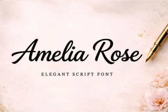
Modern Grotesque Body

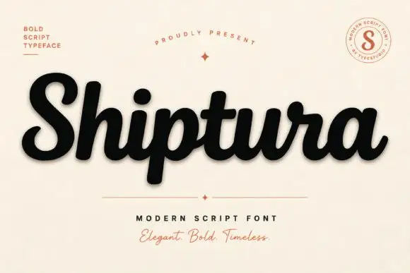
Second Block + Furion
Creates crisp high-hierarchy contrast beneath Second Block headlines across menus, websites and labels.
Inspect Furion specimenDisclosure: MakerFileHub may earn a commission from qualifying purchases via paid links on this page. How our links work.
Tall condensed slab
Second Block is a tall condensed slab in near-black on an aged cream sheet: capitals with clipped bowls, gently rounded feet, blunt serifs and a heavy even stroke, set in two lines with a plain credit beneath.
Paid link
Get this fontProject & layout blueprintsAt-a-glance maker compatibility
Sturdy stroke walls and open counters weed cleanly on adhesive vinyl, HTV apparel film, and cut cardstock.
Visual anatomy & craft review
The plate is plain and that suits a workhorse display: two words, one credit, an aged ground and nothing else, so the letterforms and the fit are the only subjects. The drawing is a tall condensed slab with clipped bowls and rounded feet, so the face reads as a printed bill rather than as an editorial slab, and the condensed fit lets a long word hold a narrow format. That construction sets a moderate size floor, because the clipped bowls close first. The aged cream ground is staging, and the credit beneath is product copy. Because the letters are tall and heavy, the face suits a poster, a sign and a package, and it works best at a size where the serifs read rather than at caption size.
Slab, condensed, tall, poster
Two-font hierarchy recipes
Tested contrast partners — pairing Second Block with grounded secondary typography.
Second Block + Furion
Creates crisp high-hierarchy contrast beneath Second Block headlines across menus, websites and labels.
Inspect Furion specimen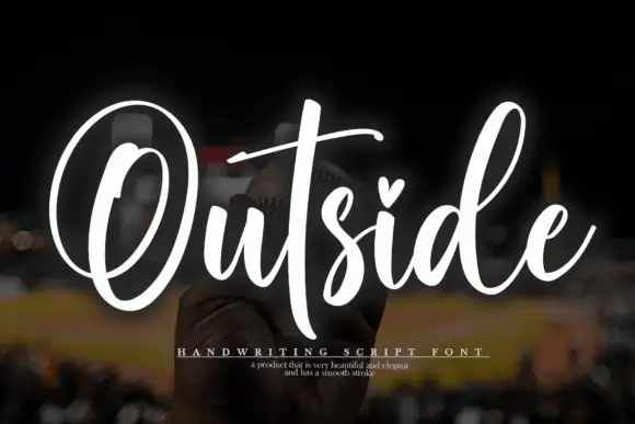
Second Block + Outside
Adds a warm human signature touch for 1-to-3-word callouts without competing against structured serif capitals.
Inspect Outside specimenPractical applications
Concrete hierarchy, scale and production guidance tailored to Second Block’s stroke geometry.
A tall condensed slab reads as a printed fight bill, and the heavy stroke holds at street distance. The weight holds at street level.
Hierarchy & layout recipe
A1 poster: the night at 220 mm cap height, the card in a 24 mm slab, and the venue at 12 mm. Keep 28 mm margins and print two colours on a light stock.
Pre-production check
Check the A1 at six metres, where a clipped bowl can close; keep it above 5 mm. Confirm the 12 mm venue reads at two metres and that the card clears the title.
A condensed slab reads as a painted shop sign, and the heavy serifs hold on a window in vinyl at night. It reads as a painted sign.
Hierarchy & layout recipe
Cut 900 by 320 mm vinyl: the shop at 110 mm cap height, the hours in a 22 mm slab, and a 4 mm contour. Keep 22 mm margins and apply to a clean pane at dusk.
Pre-production check
Check the cut at 110 mm, where a 4 mm serif can tear on weeding; widen it to 6 mm. Confirm the 22 mm hours read at two metres and that the contour clears the frame.
A condensed slab fills a cover with one word, and the heavy construction holds at thumbnail size. It holds at thumbnail size.
Hierarchy & layout recipe
Set the title at 110 mm cap height across 175 mm, the subtitle in a 9 pt slab, and the year at 7 pt. Print two colours on a matte stock and keep 20 mm margins at the head.
Pre-production check
Check the title at 110 mm, where a bowl can fill; keep it above 4 mm. Confirm the 7 pt year survives lamination and that the title clears the trim.
Technical & licence verification
Confirm included OTF/TTF/WOFF formats, full glyph tables and licence coverage on the live store page before batch production.
Closest visual alternatives
Matched across letterform anatomy, stroke behaviour and craft applications.

Tall narrow athletic blocks with sharp square feet
Atletico sets white condensed capitals over a close monochrome boxing photograph: long upright strokes end in firm square slabs, the E arms and T top run wide against narrow counters and the title stays solid with no inset contour or chipped texture.
Ideas for this font
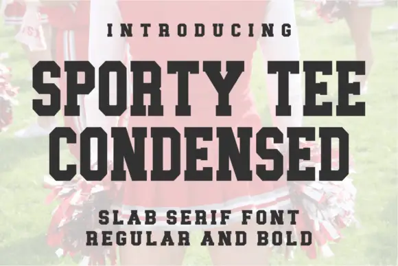
Condensed slab in regular and bold
Sporty Tee Condensed is a condensed slab serif in black on a pale sports photograph: heavy narrow capitals with thick flat serifs and tight fitting, offered in a regular and a bold weight and shown as two stacked lines.
Ideas for this font
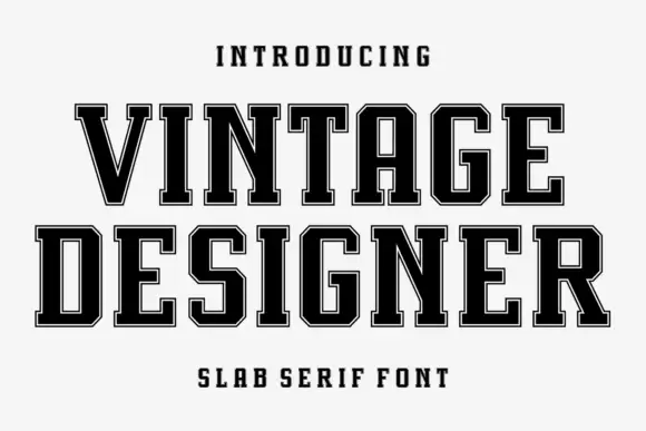
Angular collegiate slab with inset border
Vintage Designer is a narrow angular collegiate slab in black with a fine inset border on white: tall caps with heavy square slabs, chamfered corners and a light contour running inside the edge, with tracked caps above and a caption beneath.
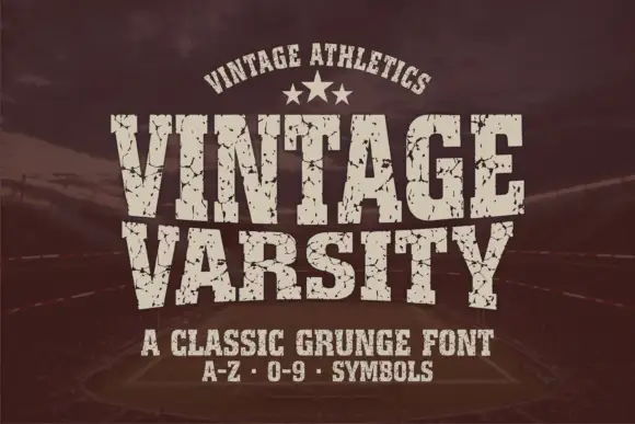
Condensed athletic capitals with cracked wear and heavy flat slabs
Vintage Varsity is a condensed athletic capital alphabet with heavy flat slabs and a cracked wear texture, so a short word reads as a printed team jersey from decades ago.
Ideas for this font
Same independent foundry
Allow optional Google Analytics to measure visits and catalogue actions. Your search words and notes are not included. Privacy & storage