High-Contrast Display Serif

Schoolhouse + The Avenue Editorial
Pairs sculptural editorial warmth with Schoolhouse's clean modern geometry.
Inspect The Avenue Editorial specimenDisclosure: MakerFileHub may earn a commission from qualifying purchases via paid links on this page. How our links work.
Heavy narrow rounded sans
Schoolhouse is a heavy narrow sans shown in pastel lilac, navy, pink and mint on white: mixed case with long oval bowls, softly uneven rounded shoulders and a slightly loose rhythm, set in two lines beside a fan of coloured pencils and a small studio badge.
Paid link
Get this fontProject & layout blueprintsAt-a-glance maker compatibility
Sturdy stroke walls and open counters weed cleanly on adhesive vinyl, HTV apparel film, and cut cardstock.
Visual anatomy & craft review
The plate stages the face with the object that names it: a fan of coloured pencils runs down the left edge, and the two lines of type take the colour of the pencils, so the sheet reads as a classroom poster. The drawing is a heavy narrow sans with long oval bowls and softly uneven shoulders, so the face reads as friendly rather than as a mechanical grotesque, and the narrow width fits a long word in a small space. That construction sets a moderate size floor, because the oval bowls close first. The pencils and the badge are staging. Because the letters are heavy and rounded, the face suits a school sign, a label and a shirt, and the colour change is a device rather than a feature of the type.
Sans serif, heavy, narrow, friendly
Two-font hierarchy recipes
Tested contrast partners — pairing Schoolhouse with grounded secondary typography.
Schoolhouse + The Avenue Editorial
Pairs sculptural editorial warmth with Schoolhouse's clean modern geometry.
Inspect The Avenue Editorial specimen
Schoolhouse + Easy Handwriting
Introduces organic movement on pull-quotes, signatures and gift tags.
Inspect Easy Handwriting specimenPractical applications
Concrete hierarchy, scale and production guidance tailored to Schoolhouse’s stroke geometry.
A friendly heavy face reads as a classroom, and the narrow width fits a long room name on a door plate. It reads as a classroom door.
Hierarchy & layout recipe
A4 plate: the class at 50 mm cap height, the teacher at 16 mm, and two colours on a light card with a matte laminate. Keep 25 mm margins and mount the plate at child height.
Pre-production check
Check the plate at 50 mm, where an oval bowl can look blobby; keep the counters open. Confirm the 16 mm name reads at two metres and that the laminate survives a wipe.
A heavy rounded face reads as a child's card, and the pastel colours keep the weight from looking severe. The pastels soften the weight.
Hierarchy & layout recipe
A6 card: the greeting at 26 pt, the details in a 10 pt sans, and the date at 9 pt. Keep 15 mm margins, print two colours on a white card and leave 12 mm at the foot for the address line.
Pre-production check
Check the 26 pt greeting at home-print resolution, where an oval bowl can fill; keep the counters open. Confirm the 10 pt details keep a 4.5:1 contrast and that the card folds flat.
A rounded heavy label reads as a bookshop for children, and the narrow letters fit a long name on a small poster. It reads as a children's shop.
Hierarchy & layout recipe
A3 poster: the shop at 70 mm cap height, the hours at 24 mm, and two colours on a light stock. Keep 25 mm margins, print at 150 dpi or above and leave a 20 mm clear strip at the foot for a tear-off.
Pre-production check
Check the poster at three metres, where a heavy bowl can merge with the next letter; keep 3 mm spacing. Confirm the hours read at two metres and that the poster hangs at adult eye height.
Technical & licence verification
Confirm included OTF/TTF/WOFF formats, full glyph tables and licence coverage on the live store page before batch production.
Closest visual alternatives
Matched across letterform anatomy, stroke behaviour and craft applications.

Heavy rounded school sans
School Bold shows heavy upright sans capitals with rounded corners and tall oval counters: the C opening stays broad and the B closes two small rounded bowls, while the cover adds a white edge and a deep offset shadow.
Ideas for this font
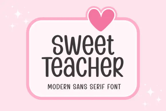
Tall informal rounded sans
Sweet Teacher is a tall informal sans in charcoal on a white rounded panel: narrow uprights with rounded terminals, uneven body widths, a large x-height and a light bounce, with a drawn heart above the panel and sparkles at the corners.
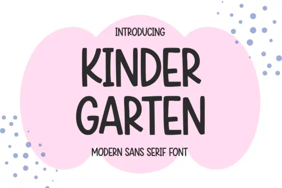
Narrow informal capitals with rounded ends and an open angled K
Kindergarten shows dark capitals split into KINDER and GARTEN over a pink cloud-like patch, where rounded ends and slightly changing widths soften the tall stems, the K and R carry open angled legs and the G keeps a short inward bar.

Geometric sans with a variable weight range
Prime Nordic is a geometric sans in white on charcoal, set as two lines of the same name: the first in a light cut and the second in a heavy one, with a small badge tucked at the shoulder stating nine weights and two notes in the corners about the variable file and the language support.
Same independent foundry
Allow optional Google Analytics to measure visits and catalogue actions. Your search words and notes are not included. Privacy & storage