Editorial Serif Anchor

Sanswhimsy + Papillon Serif – Elegant Modern Luxury
Anchors Sanswhimsy's fluid strokes with crisp Roman proportions on wedding suites, headers and packaging.
Inspect Papillon Serif – Elegant Modern Luxury specimenDisclosure: MakerFileHub may earn a commission from qualifying purchases via paid links on this page. How our links work.
Bowed hand-drawn capital
Sanswhimsy is a hand-drawn heavy capital face in cream on teal: uneven letters with lightly bowed stems, a raised middle on the M, a wobbly baseline and rounded ends, framed by drawn fern fronds at both sides with two plain lines at the foot.
Paid link
Get this fontProject & layout blueprintsAt-a-glance maker compatibility
Weld or Unite overlapping script joins into one continuous vector path before sending to the blade.
Visual anatomy & craft review
The two words are stacked and the drawing is a heavy capital face with deliberate unevenness: the stems bow, the M lifts at the centre, and the letters sit on a wandering baseline, so the block reads as drawn with a marker rather than as a system sans. That construction sets a moderate size floor and makes the face suit a phrase rather than a paragraph, which the plate admits by setting two short words. The fern fronds are supplied ornament that frames the block, and the two plain lines at the foot name the studio and the style. Because the letters are heavy and warm, the face suits a sign, a shirt and a card for a business that wants a human voice, and the uneven baseline means a buyer should set it by eye rather than trust the default spacing.
Handwritten, drawn, playful, warm
Two-font hierarchy recipes
Tested contrast partners — pairing Sanswhimsy with grounded secondary typography.
Sanswhimsy + Papillon Serif – Elegant Modern Luxury
Anchors Sanswhimsy's fluid strokes with crisp Roman proportions on wedding suites, headers and packaging.
Inspect Papillon Serif – Elegant Modern Luxury specimen
Sanswhimsy + Montreal
Keeps small-scale dates, URLs, nutrition facts and care instructions crisp and legible below script titles.
Inspect Montreal specimenPractical applications
Concrete hierarchy, scale and production guidance tailored to Sanswhimsy’s stroke geometry.
A hand-drawn capital reads as human rather than corporate, which suits a cafe that wants to feel local. A cafe should feel local, not franchised.
Hierarchy & layout recipe
Paint a 900 by 350 mm board: the cafe at 100 mm cap height, the hours in a 22 mm sans, and a 5 mm rule. Keep 25 mm margins and paint two colours on a primed board.
Pre-production check
Check the board at five metres, where a bowed stem can look like a mistake; keep the bow even. Confirm the 22 mm hours read at two metres and that the rule survives rain.
A drawn face signals making rather than theory, and the heavy strokes read at a corridor distance. A craft club sells on making, not theory.
Hierarchy & layout recipe
A3 poster: the club at 70 mm cap height, the times in a 20 mm sans, and the room at 12 mm. Keep 25 mm margins and print two colours on a light stock. Keep 30 mm above the poster for the rail.
Pre-production check
Check the A3 at three metres, where the uneven baseline can look careless; keep the drift deliberate. Confirm the 12 mm room reads at two metres and that the poster sits at eye height.
A drawn card matches a handmade present, and the two colours print cleanly at home. A card should match the present it comes with.
Hierarchy & layout recipe
A6 card: the greeting at 24 pt, the details in a 9.5 pt sans, and the date at 8.5 pt. Keep 15 mm margins and print two colours on a cream card. Leave 16 mm at the foot for the address line.
Pre-production check
Check the 24 pt greeting at home-print resolution, where a rounded end can fill; keep it above 0.6 mm. Confirm the 9.5 pt details keep a 4.5:1 contrast and that the card folds flat.
Technical & licence verification
Confirm included OTF/TTF/WOFF formats, full glyph tables and licence coverage on the live store page before batch production.
Closest visual alternatives
Matched across letterform anatomy, stroke behaviour and craft applications.
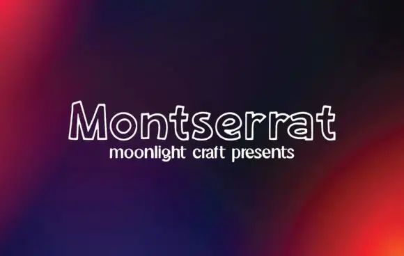
Outline handwritten sans
Montserrat is an outline handwritten sans in white on a dark gradient: unfilled letters drawn with a single rounded line, a small x-height and wide open counters that let the background read through the word.
Ideas for this font
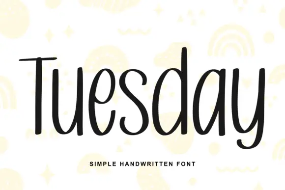
Simple unjoined handwriting with a light bounce
Tuesday is a simple handwritten face in black on white: a monoline, unjoined hand with tall ascenders, circular bowls and a slight bounce along the line, shown over pale yellow doodles of rainbows, stars and squiggles.
Ideas for this font
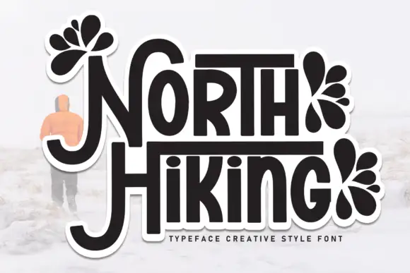
Display
North Hiking is a bold display face drawn as a sticker: rounded capitals with a heavy dark fill and a thick white contour, decorated with black leaf and petal fans, with a soft drop shadow behind the whole word.
Ideas for this font
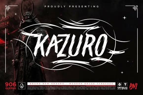
Sharp slanted brush capitals with cut terminals and a wide flourish frame
Kazuro is a sharp slanted brush alphabet in capitals, with strokes that end in hard cut angles and a flourish frame of thin sweeping lines drawn around the word.
Ideas for this font
Allow optional Google Analytics to measure visits and catalogue actions. Your search words and notes are not included. Privacy & storage