Editorial Serif Anchor

Sample Alphabet + Orvelia
Anchors Sample Alphabet's fluid strokes with crisp Roman proportions on wedding suites, headers and packaging.
Inspect Orvelia specimenDisclosure: MakerFileHub may earn a commission from qualifying purchases via paid links on this page. How our links work.
Heavy looped display script
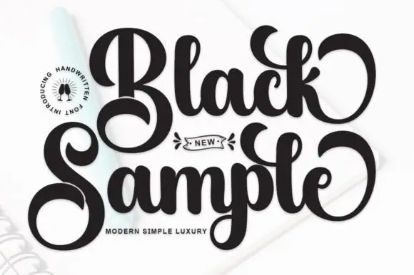
Sample Alphabet is a heavy rounded script in black on a pale ground, over a faint oversized alphabet in the background: thick strokes, tight joins, exaggerated looping terminals, a small round badge at the upper left and a plain descriptor beneath.
Paid link
Get this fontProject & layout blueprintsAt-a-glance maker compatibility
Weld or Unite overlapping script joins into one continuous vector path before sending to the blade.
Visual anatomy & craft review
The plate is a plain specimen with a faint background alphabet, and the badge at the upper left names the style without competing. The drawing is a heavy script with tight joins and exaggerated looping terminals, so the two words read as a retro logotype rather than as handwriting, and the loops give the display real width. That construction sets a moderate size floor, because the joins close first. The badge and the descriptor are product copy. It suits a logotype, a card and a shirt for a retro or a food subject, and it is best used for one or two words rather than a sentence, since the heavy weight makes a long line tiring.
Script, heavy, retro, display
Two-font hierarchy recipes
Tested contrast partners — pairing Sample Alphabet with grounded secondary typography.
Sample Alphabet + Orvelia
Anchors Sample Alphabet's fluid strokes with crisp Roman proportions on wedding suites, headers and packaging.
Inspect Orvelia specimen
Sample Alphabet + Hermano
Keeps small-scale dates, URLs, nutrition facts and care instructions crisp and legible below script titles.
Inspect Hermano specimenPractical applications
Concrete hierarchy, scale and production guidance tailored to Sample Alphabet’s stroke geometry.
A heavy script reads as a diner, and the loops give a short name a mark that survives on a sign and a menu alike. It holds on a sign and a menu.
Hierarchy & layout recipe
Set the mark at 16 pt on a menu, 95 mm on a window and 11 pt on a napkin, keeping the loops intact. Keep two colours and clear space equal to the x-height.
Pre-production check
Check the 11 pt napkin mark, where a loop can fill; keep the size above 13 pt. Confirm the window mark reads at eight metres and that the loops clear the frame.
A heavy script names a retro party, and the loops give a short greeting a finish that a plain sans cannot. It suits a retro register.
Hierarchy & layout recipe
A6 card: the greeting at 30 pt, the details in a 10 pt sans, and the date at 9 pt. Keep 15 mm margins, print two colours on a cream card and leave 12 mm at the foot for the address.
Pre-production check
Check the 30 pt greeting at home-print resolution, where a join fills; keep it above 1.2 mm. Confirm the details read at arm's length and that the card folds flat.
A heavy script prints as a coffee bar, and the thick strokes hold on a shirt where a fine script would break up. It reads as a coffee bar.
Hierarchy & layout recipe
Print a 250 mm chest graphic: the bar at 55 mm x-height, the year at 24 mm, and two inks on a light shirt. Keep the joins at 3 mm and place the graphic 80 mm below the collar.
Pre-production check
Check the screen at actual mesh, where a 3 mm join can fill; widen it to 4 mm. Wash-test one shirt and confirm the loops stay open after five cycles.
Technical & licence verification
Confirm included OTF/TTF/WOFF formats, full glyph tables and licence coverage on the live store page before batch production.
Closest visual alternatives
Matched across letterform anatomy, stroke behaviour and craft applications.
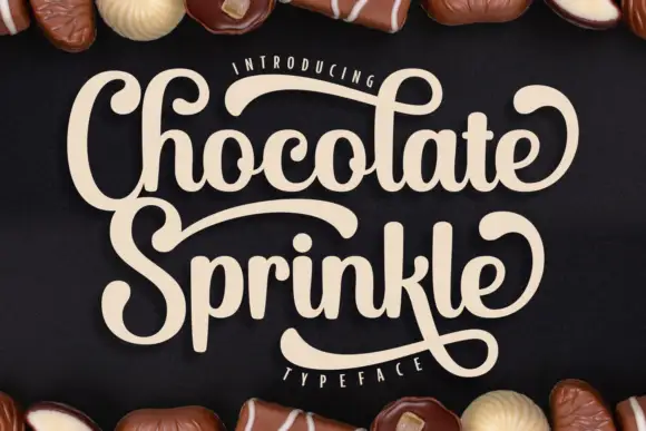
Heavy curled display script
Chocolate Sprinkle shows heavy joined lettering with tall looped h and l forms, where the S sweeps above the second word and the k returns beneath its own baseline.
Ideas for this font
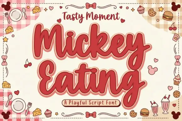
Fat retro script with an offset
Mickey Eating is a fat retro script in deep red with a cream keyline and a dark offset: thick rounded strokes, tight loops and a bouncy baseline, presented on a candy sheet full of drawn food.
Ideas for this font
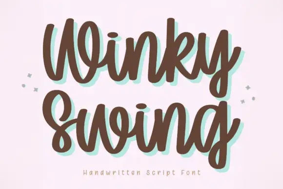
Bold handwriting with a coloured drop shadow
Winky Swing is a bold handwritten script in brown on cream: fat rounded letters with open loops, a tilted baseline and a mint shadow offset behind them, with two small sparkles either side and a tracked caption below.
Ideas for this font
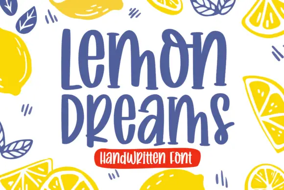
Quirky handwritten display
Lemon Dreams is a quirky handwritten display in navy on cream, surrounded by drawn lemons: a tall irregular hand with a straight-legged a, an open e and a hooked y, set in two lines with a small caps line above and a red banner beneath naming the category.
Ideas for this font
Same independent foundry
Allow optional Google Analytics to measure visits and catalogue actions. Your search words and notes are not included. Privacy & storage