Editorial Serif Anchor

Mickey Eating + Mewah
Anchors Mickey Eating's fluid strokes with crisp Roman proportions on wedding suites, headers and packaging.
Inspect Mewah specimenDisclosure: MakerFileHub may earn a commission from qualifying purchases via paid links on this page. How our links work.
Fat retro script with an offset
Mickey Eating is a fat retro script in deep red with a cream keyline and a dark offset: thick rounded strokes, tight loops and a bouncy baseline, presented on a candy sheet full of drawn food.
Paid link
Get this fontProject & layout blueprintsAt-a-glance maker compatibility
Weld or Unite overlapping script joins into one continuous vector path before sending to the blade.
Visual anatomy & craft review
The two words are stacked and each is set large, and the face is a display script built for packaging: the M opens with a heavy loop, the c and the k are round and tight, the e closes into a small bowl and the y drops a tail that curls back under the word, while the whole phrase bounces up and down so the pair reads as lettering rather than type. The stroke is very heavy and even, a cream keyline separates the red from the ground and a dark shadow sits behind the letters at a fixed offset, which gives the block depth without a gradient. Around it a drawn border carries a cupcake, a burger, cheese, cherries, a milkshake and mouse-ear motifs on a checked ground. Mickey Eating is a playful script for sweets packaging, party goods and children's products, and it needs short words at a large size.
A candy-coloured script with a heavy offset
Two-font hierarchy recipes
Tested contrast partners — pairing Mickey Eating with grounded secondary typography.
Mickey Eating + Mewah
Anchors Mickey Eating's fluid strokes with crisp Roman proportions on wedding suites, headers and packaging.
Inspect Mewah specimen
Mickey Eating + Montreal
Keeps small-scale dates, URLs, nutrition facts and care instructions crisp and legible below script titles.
Inspect Montreal specimenPractical applications
Concrete hierarchy, scale and production guidance tailored to Mickey Eating’s stroke geometry.
A candy-coloured script with a keyline does the work of an illustration on a small card, and the thick strokes read at a glance for young guests.
Hierarchy & layout recipe
Print a 120 by 120 mm square card: set the greeting at 30 pt over two lines, keep 14 mm of clear ground beneath before the details at 9 pt, and hold 13 mm of margin on all four sides.
Pre-production check
Two fat lines crowd a square card; print one at the finished size and check the space between the lines before the batch.
A heavy script with a keyline is legible at shelf distance, and the playful tone fits a product that is bought on impulse rather than planned.
Hierarchy & layout recipe
Print a 60 by 60 mm label: set the shop name at 15 pt on one line, keep 6 mm of clear ground beneath before the weight at 4.5 pt, and hold 5 mm of margin on all four sides.
Pre-production check
A keyline can eat the counters at fifteen points; print one label on the real stock and check the e before the order.
Fat rounded letters cut cleanly from card, and the keyline doubles as the cutting path when a topper is made by hand at home.
Hierarchy & layout recipe
Print a 200 by 100 mm topper plate: set the greeting at 84 pt on one line, keep 12 mm of clear bridge between letters, and leave 6 mm outside the keyline for the cutting path.
Pre-production check
Narrow bridges snap when a topper is handled; print one, cut it and test the joins before the batch.
Technical & licence verification
Confirm included OTF/TTF/WOFF formats, full glyph tables and licence coverage on the live store page before batch production.
Closest visual alternatives
Matched across letterform anatomy, stroke behaviour and craft applications.
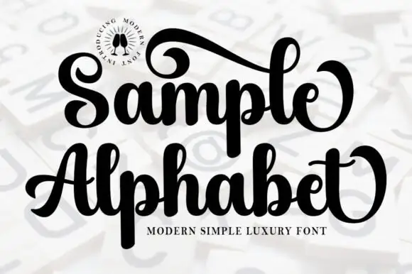
Heavy looped display script
Sample Alphabet is a heavy rounded script in black on a pale ground, over a faint oversized alphabet in the background: thick strokes, tight joins, exaggerated looping terminals, a small round badge at the upper left and a plain descriptor beneath.
Ideas for this font
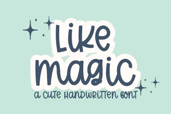
Cute rounded handwritten script
Like Magic is a cute handwritten script in navy on mint: soft rounded strokes, a large x-height, a bouncy baseline and a drawn white panel behind each word that turns the lettering into a sticker.
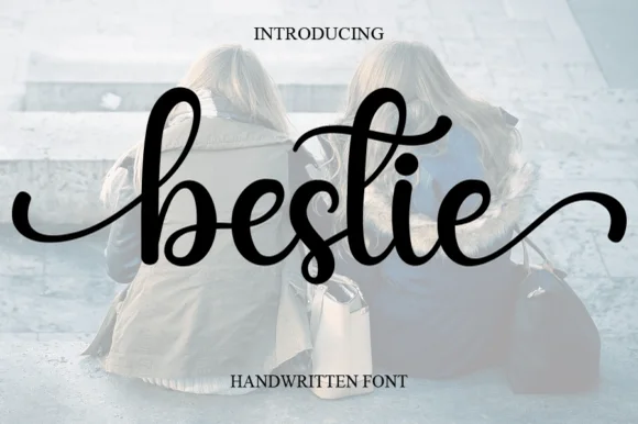
Bouncy bold brush-pen cursive with long entry and exit strokes
Bestie is a bouncy bold brush-pen cursive with swelling strokes, a baseline that rises and falls and long entry and exit strokes that leave the word on both sides.
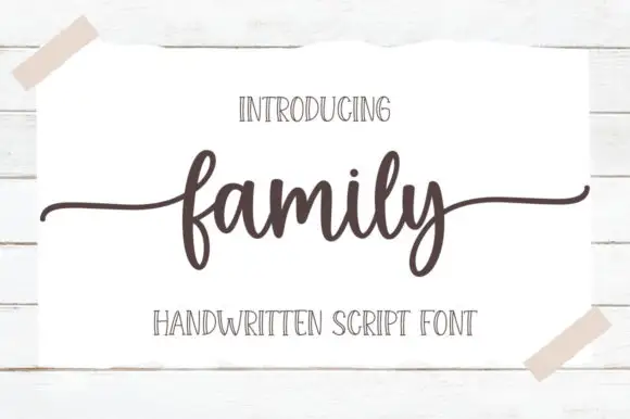
Low connected script with wide flat tails and a compact body
Family is a low connected script in which the body sits close to the baseline, the stroke stays even and both ends run out as wide flat tails, so a short word reads as a caption signed across a card.
Ideas for this font
Same independent foundry
Allow optional Google Analytics to measure visits and catalogue actions. Your search words and notes are not included. Privacy & storage