Neutral Sans Workhorse

Red Hot + Hermano
Lets Red Hot own the focal silhouette while handling secondary copy, sizing and subheads cleanly.
Inspect Hermano specimenDisclosure: MakerFileHub may earn a commission from qualifying purchases via paid links on this page. How our links work.
Flame-topped display
Red Hot is a display face in which every capital carries flame shapes rising from its top, filled with an orange-to-yellow gradient, on a near-black ground, set as one large line with two plain lines above and beneath and a thin frame around the sheet.
Paid link
Get this fontProject & layout blueprintsAt-a-glance maker compatibility
Sturdy stroke walls and open counters weed cleanly on adhesive vinyl, HTV apparel film, and cut cardstock.
Visual anatomy & craft review
The gradient and the flames are the product: the letters are ordinary weights with fire drawn on top, and the plate shows the effect at a size where each flame is a distinct shape. That construction sets a large size floor, because the flame tips are the first thing to disappear, and the solid fill means the face needs a colour decision rather than a texture. The black ground and the thin frame are staging. The two plain lines are product copy that name the collection and the studio. Because the effect is fixed, the face is a theme device for a poster, a shirt and a title, and a buyer should test the smallest size before using it for anything long, since the flames will merge into a solid bar.
Decorative, flames, loud, display
Two-font hierarchy recipes
Tested contrast partners — pairing Red Hot with grounded secondary typography.
Red Hot + Hermano
Lets Red Hot own the focal silhouette while handling secondary copy, sizing and subheads cleanly.
Inspect Hermano specimen
Red Hot + Alerigue
Grounds bold display lettering with classic typographic authority on posters, badges and apparel.
Inspect Alerigue specimenPractical applications
Concrete hierarchy, scale and production guidance tailored to Red Hot’s stroke geometry.
A flame display names the product in the lettering, and the gradient reads at distance where a flat colour would look plain.
Hierarchy & layout recipe
A2 poster: the festival at 100 mm cap height, the times in a 22 mm sans, and the gate at 11 mm. Keep 30 mm margins and print three colours on a dark stock so the flames separate.
Pre-production check
Check the A2 at five metres, where a flame tip can vanish; keep it above 2 mm. Confirm the 11 mm gate reads at two metres and that the frame clears the trim.
A flame display prints as club kit, and the gradient holds on a dark shirt where a flat orange would read as a stain. The gradient sells the heat.
Hierarchy & layout recipe
Print a 250 mm chest graphic: the club at 60 mm cap height, the year at 26 mm, and three inks on a dark shirt. Keep the smallest flame tip at 4 mm and place the graphic 80 mm below the collar.
Pre-production check
Check the screen at actual mesh, where a 4 mm tip can fill; enlarge it. Wash-test one shirt and confirm the gradient edge stays clean after five cycles.
A flame face sets an outdoor party, and the effect carries a short greeting without an illustration. The flames carry the theme.
Hierarchy & layout recipe
A6 card: the greeting at 26 pt, the details in a 9.5 pt sans, and the date at 8.5 pt. Keep 15 mm margins and print three colours on a dark card. Leave 14 mm at the foot for the time and the address line.
Pre-production check
Check the 26 pt greeting at home-print resolution, where the flames can merge into a bar; keep the tips above 1.2 mm. Confirm the details keep a 4.5:1 contrast and that the card folds flat.
Technical & licence verification
Confirm included OTF/TTF/WOFF formats, full glyph tables and licence coverage on the live store page before batch production.
Closest visual alternatives
Matched across letterform anatomy, stroke behaviour and craft applications.
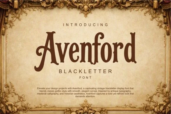
Smooth vintage Victorian blackletter
Avenford softens traditional gothic blackletter with smooth Victorian curves and open counters, presented for heritage labels, coffee roasters and book covers, where rounded arch transitions and a graceful sweeping crossbar on the A replace the spiked angles of a stricter gothic.
Ideas for this font
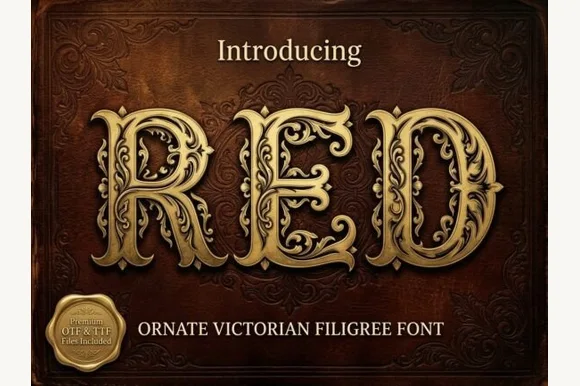
Ornate Victorian capitals with filigree
Red is an ornate Victorian display face in gold on a dark red damask ground: capitals built from heavy stems wrapped in filigree scrollwork, with small leaves and curls growing out of every curve, and a drop shadow that lifts them off the leather.
Ideas for this font
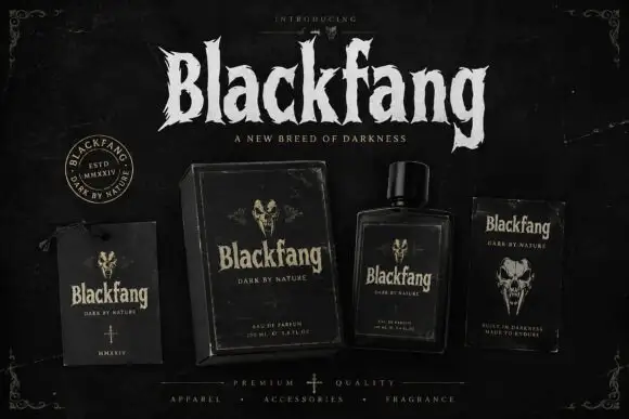
Ragged Gothic lettering with torn points and uneven bowls
Blackfang is a gothic display face with sharp spiked terminals and a smooth filled contour, shown here across a hang tag, a box, a bottle and a folded card.
Ideas for this font
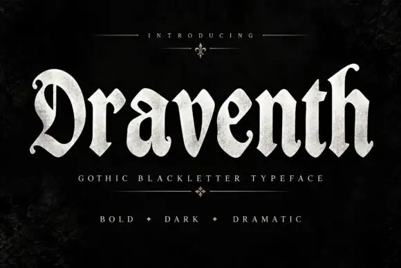
Broad rounded blackletter with curled D and pointed lower joins
Draventh is a wide gothic blackletter display face with heavy stems, sharp hooked shoulders and a weathered silver fill that reads as rubbed metal.
Ideas for this font
Allow optional Google Analytics to measure visits and catalogue actions. Your search words and notes are not included. Privacy & storage