High-Contrast Display Serif

Rastive + Resquel
Pairs sculptural editorial warmth with Rastive's clean modern geometry.
Inspect Resquel specimenDisclosure: MakerFileHub may earn a commission from qualifying purchases via paid links on this page. How our links work.
Clean sans family shown across weights
Rastive is a clean sans shown in white and lime on a dark ground: one line in a light cut with the last three letters in a very heavy lime cut, a list of eight weight names stacked at the right, and a small copy block at the lower left.
Paid link
Get this fontProject & layout blueprintsAt-a-glance maker compatibility
Sturdy stroke walls and open counters weed cleanly on adhesive vinyl, HTV apparel film, and cut cardstock.
Visual anatomy & craft review
The plate demonstrates the family by contrast rather than by specimens: the same word is split between a light cut and a heavy one, so a buyer sees the two extremes in a single line, and the stacked list of weight names at the right names what is available. The drawing is a clean grotesque with even strokes and open counters, so the face is intended for text and interface work, and the split also shows that the weights share proportions, which is the point of buying a family. The copy block at the lower left is genuine product text that names the range. It suits a studio identity, a report and a screen interface.
Sans serif, family, weights, modern
Two-font hierarchy recipes
Tested contrast partners — pairing Rastive with grounded secondary typography.
Rastive + Resquel
Pairs sculptural editorial warmth with Rastive's clean modern geometry.
Inspect Resquel specimen
Rastive + Hello Honey
Introduces organic movement on pull-quotes, signatures and gift tags.
Inspect Hello Honey specimenPractical applications
Concrete hierarchy, scale and production guidance tailored to Rastive’s stroke geometry.
A clean family covers a mark, a heading and a caption from one licence, which is what a studio needs across print and screen.
Hierarchy & layout recipe
Set the mark at 18 pt in the heavy cut, the headings at 22 pt and the captions at 8.5 pt in the regular. Keep one colour and clear space equal to the cap height on four sides.
Pre-production check
Check the 8.5 pt captions on uncoated paper, where an open counter can fill; use the regular there. Confirm the mark reads at eight metres and that the captions keep a 4.5:1 contrast.
A clean grotesque holds a report at body size, and the family keeps the headings in step with the text. The family keeps the headings in step.
Hierarchy & layout recipe
Set the body at 10 pt on a 130 mm measure with 1.45 leading, the headings at 22 pt in a heavier cut, and the captions at 8.5 pt. Print one ink on an uncoated stock.
Pre-production check
Check the 10 pt body in a proof, where a counter can close; keep the size at 10 pt or above. Confirm the captions keep a 4.5:1 contrast and that the measure holds 65 characters.
A clean family suits an institution, and the heavy cut reads from a corridor without looking like a poster face. It reads as institutional.
Hierarchy & layout recipe
A3 panel: the hall at 60 mm cap height, the rooms in a 22 mm sans, and the floor at 12 mm. Keep 25 mm margins, specify a matte laminate and mount the panel at adult eye height.
Pre-production check
Check the panel at 60 mm, where an even stroke can look light in metal; keep the weight up. Confirm the 12 mm floor reads at two metres and that the laminate kills the glare.
Technical & licence verification
Confirm included OTF/TTF/WOFF formats, full glyph tables and licence coverage on the live store page before batch production.
Closest visual alternatives
Matched across letterform anatomy, stroke behaviour and craft applications.
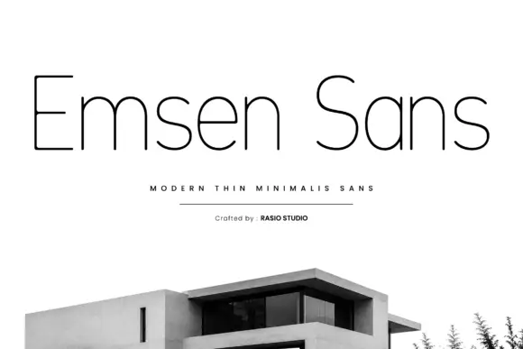
Very thin mixed case with rounded shoulders and a plain narrow capital E
Emsen shows black lettering on white above a cropped modern building photograph. Very thin nearly even strokes build narrow upright stems, rounded m and n shoulders and an open e with a long horizontal bar, while the capital E keeps plain flat arms and the a is a simple round bowl with a straight right side.
Ideas for this font
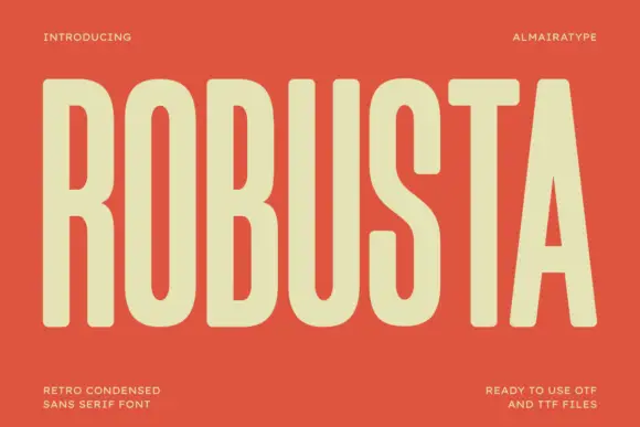
Tall condensed retro sans
Robusta is a tall condensed sans in cream on terracotta: very tall caps with softly squared curves, an even heavy stroke and a triangular counter in the A, set as one word across the plate with tracked notes in all four corners.
Ideas for this font

Bold modern geometric sans
Olline is a bold geometric sans in red on black: circular counters, a heavy even stroke, a lowercase with a straight-sided o and a dot that floats away from the i, presented at extreme size with small tracked captions in the corners, so the plate reads as a contemporary identity study.
Ideas for this font

Open rounded mixed case with a tall t and broad circular bowls
Cultivo shows a large black title-case name across the lower part of a pale beige cover, where light to moderate nearly even strokes form an open C, a broad u and near-circular bowls, the t finishes with a rounded lower turn and the v opens a clean diagonal.
Ideas for this font
Same independent foundry
Allow optional Google Analytics to measure visits and catalogue actions. Your search words and notes are not included. Privacy & storage