Neutral Sans Workhorse

Skrap Kiddo + Saltriver Grotesk
Lets Skrap Kiddo own the focal silhouette while handling secondary copy, sizing and subheads cleanly.
Inspect Saltriver Grotesk specimenDisclosure: MakerFileHub may earn a commission from qualifying purchases via paid links on this page. How our links work.
Wavy solid and outline shapes
Skrap Kiddo is a wavy display face in two cuts, one solid and one outline: fat rounded letters with wobbly contours and a loose hand-drawn bounce, presented over a dark photograph of a café banquette.
Paid link
Get this fontProject & layout blueprintsAt-a-glance maker compatibility
Sturdy stroke walls and open counters weed cleanly on adhesive vinyl, HTV apparel film, and cut cardstock.
Visual anatomy & craft review
The sheet shows the same words twice, once drawn as a hollow outline in cream and once as a solid cream shape, which demonstrates the two cuts a buyer gets: an outline that can be used as a decorative layer or cut for a stencil, and a solid that reads at a distance. The letters themselves are fat and rounded with wavy edges and uneven widths, so a word looks cut from dough rather than typed, and the counters are small enough that a long word reads as a single shape. Small sticker labels in blue with short phrases sit on the composition, and the ground is a grainy photograph. Skrap Kiddo is a display face for posters, packaging, apparel and children's products, and it works best in one or two words at a large size where the wavy contour is visible.
A wavy display pair on a dark photograph
Two-font hierarchy recipes
Tested contrast partners — pairing Skrap Kiddo with grounded secondary typography.
Skrap Kiddo + Saltriver Grotesk
Lets Skrap Kiddo own the focal silhouette while handling secondary copy, sizing and subheads cleanly.
Inspect Saltriver Grotesk specimen
Skrap Kiddo + Brenco
Grounds bold display lettering with classic typographic authority on posters, badges and apparel.
Inspect Brenco specimenPractical applications
Concrete hierarchy, scale and production guidance tailored to Skrap Kiddo’s stroke geometry.
The solid cut reads across a room while the outline cut decorates the same banner, so one purchase covers both a loud word and a quiet one.
Hierarchy & layout recipe
Print a 900 by 400 mm banner: set the greeting at 140 pt in the solid cut over two lines, set the date at 44 pt in the outline cut beneath, and hold 26 mm of border on all four sides.
Pre-production check
An outline cut on fabric can break when stretched; print one section at the final size and check the contour before the order.
A wavy display face gives a snack a playful voice, and the solid cut holds on a small pouch label where an outline would fill in.
Hierarchy & layout recipe
Print a 60 by 90 mm pouch label: set the brand at 18 pt in the solid cut on two lines, keep 6 mm of clear ground beneath before the weight at 5 pt, and hold 5 mm of margin on all four sides.
Pre-production check
Wavy contours at eighteen points can look like a printing fault; print one on the real pouch and check the edges before the order.
A wavy display face sets a playful tone on a cover, and the outline cut lets a second word sit over the same photograph without blocking it.
Hierarchy & layout recipe
Print a 210 by 280 mm cover: set the title at 84 pt in the solid cut, set the second line at 60 pt in the outline cut beneath, and hold 20 mm of margin on all four sides.
Pre-production check
An outline over a busy photograph disappears; print one cover and check both cuts separate from the image before the run.
Technical & licence verification
Confirm included OTF/TTF/WOFF formats, full glyph tables and licence coverage on the live store page before batch production.
Closest visual alternatives
Matched across letterform anatomy, stroke behaviour and craft applications.
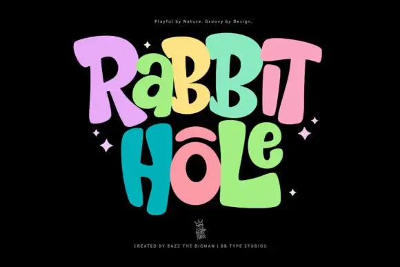
Groovy multicolour display
Rabbit Hole is a groovy multicolour display in pastel tones on a black ground: chunky rounded letters with soft corners and uneven widths, a bounce across both lines, four-point sparkles at the sides and a small crest at the foot.
Ideas for this font
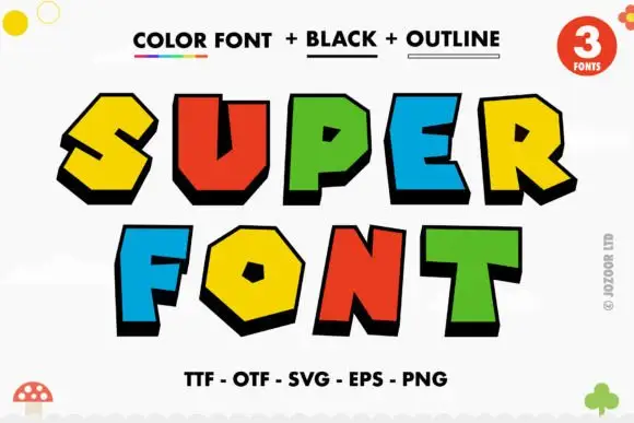
Faceted bright block capitals with heavy lower-right shadows
Super is a comic display face of fat angular caps, supplied three ways: a colour version with hard offset shadows, a solid black version and an outline version, all with sharp bevels and pointed corners.
Ideas for this font
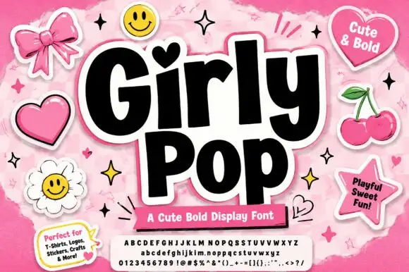
Heavy playful sans with a heart dot and slightly tilted letter bodies
Girly Pop is a heavy playful sans in which the letters stand at slightly different tilts, the i carries a heart dot and the weight stays maximal from first letter to last.
Ideas for this font
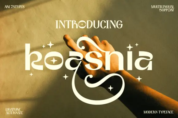
Rounded stylized lowercase with large upper curls and a deep lower sweep
Koasnia shows pale rounded lettering across a warm photograph of hands: wide bowls and fairly even substantial strokes contrast with a large curl above the middle letters and an open sweep that descends far below the line.
Ideas for this font
Allow optional Google Analytics to measure visits and catalogue actions. Your search words and notes are not included. Privacy & storage