Editorial Serif Anchor

Cartelística + Orvelia
Anchors Cartelística's fluid strokes with crisp Roman proportions on wedding suites, headers and packaging.
Inspect Orvelia specimenDisclosure: MakerFileHub may earn a commission from qualifying purchases via paid links on this page. How our links work.
Narrow uneven vintage print
Cartelística puts narrow, unevenly weighted block capitals over a sepia bicycle photograph, with the second word set smaller and tucked beneath.
Paid link
Get this fontProject & layout blueprintsAt-a-glance maker compatibility
Weld or Unite overlapping script joins into one continuous vector path before sending to the blade.
Visual anatomy & craft review
The letters are drawn rather than geometric: stems vary in width, the corners are slightly rounded, and the baseline shifts a little between characters, which produces the hand-printed poster feel. Cap height is tall relative to the width, so a long word stays in a narrow column, and the smaller second word is set as a stencil-like block of even width beneath the first. Counters are tight but open enough to survive at small sizes, and the edges carry a soft irregularity that reads as worn ink rather than as a distressed filter. The bicycle, the wooden wall and the sepia grading are photographic context; the typeface itself is a flat, single-colour alphabet.
Narrow · Uneven · Vintage
Two-font hierarchy recipes
Tested contrast partners — pairing Cartelística with grounded secondary typography.
Cartelística + Orvelia
Anchors Cartelística's fluid strokes with crisp Roman proportions on wedding suites, headers and packaging.
Inspect Orvelia specimen
Cartelística + Clyne Sans
Keeps small-scale dates, URLs, nutrition facts and care instructions crisp and legible below script titles.
Inspect Clyne Sans specimenPractical applications
Concrete hierarchy, scale and production guidance tailored to Cartelística’s stroke geometry.
Narrow uneven capitals suit a hand-painted workshop sign, where a perfectly geometric face would look out of place against brick and timber.
Hierarchy & layout recipe
Paint the first word at 6-inch height on a 60 cm board, set the second word at 40 percent of that height beneath it, and keep 5 cm between the two words.
Pre-production check
Uneven stems read as charming at six inches and as sloppy at one inch, so keep the sign at the larger size.
Tight narrow capitals fit long produce names into a narrow column, which is what a market price board actually needs at a glance.
Hierarchy & layout recipe
Set the produce names at 2-inch height in one column, the prices in a plain condensed face at 1 inch beside them, and keep the baseline of each row shared.
Pre-production check
Check the tightest counter, in the R and the a; on a chalkboard rubbed between uses these fill in first.
A narrow uneven display face gives a retro-styled masthead its period feel without any texture filter, distress overlay or faux ageing.
Hierarchy & layout recipe
Run the masthead at 120 pt across the cover width, keep the strapline in a plain serif at 12 pt, and leave 15 mm under the masthead for issue details.
Pre-production check
At masthead size, unevenness is the whole point, so do not tighten the tracking and flatten the rhythm.
Technical & licence verification
Confirm included OTF/TTF/WOFF formats, full glyph tables and licence coverage on the live store page before batch production.
Closest visual alternatives
Matched across letterform anatomy, stroke behaviour and craft applications.
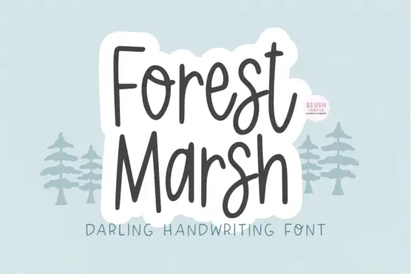
Loose upright handwriting with tall narrow frames and uneven baselines
Forest Marsh is loose upright handwriting in which the frames stay tall and narrow, the baselines drift a little and the strokes keep an even medium weight throughout.
Ideas for this font
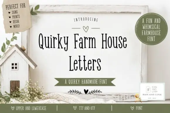
Tall narrow irregular serif letters
Quirky Farm House Letters is a tall narrow hand-drawn face with small irregular serifs, set on a painted signboard with a tiny house, sprigs and a heart, in a farmhouse palette of olive and cream.
Ideas for this font
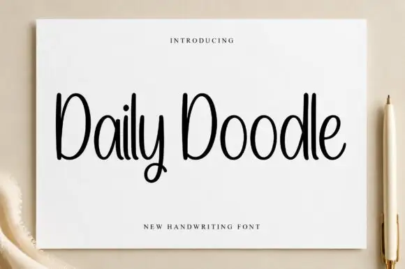
Narrow upright handwriting with tall ascenders and a soft even stroke
Daily Doodle is narrow upright handwriting in which the ascenders run tall, the stroke stays soft and even, and the letters stand apart at a gentle rhythm.
Ideas for this font
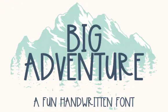
Tall handwritten capitals
Big Adventure shows tall separate capitals with narrow bowls and an angular A, where the G, T and R stand above an uneven baseline and a mountain illustration sits behind the lettering.
Ideas for this font
Allow optional Google Analytics to measure visits and catalogue actions. Your search words and notes are not included. Privacy & storage