Neutral Sans Workhorse

Cow + Taught
Lets Cow own the focal silhouette while handling secondary copy, sizing and subheads cleanly.
Inspect Taught specimenDisclosure: MakerFileHub may earn a commission from qualifying purchases via paid links on this page. How our links work.
Broad rounded slab capitals carrying contrasting cow-like patches
Cow Font draws heavy rounded capitals and fills each with a cow print: a pale ground spotted with large irregular patches, available in four colourways from turquoise to purple.
Paid link
Get this fontProject & layout blueprintsAt-a-glance maker compatibility
Sturdy stroke walls and open counters weed cleanly on adhesive vinyl, HTV apparel film, and cut cardstock.
Visual anatomy & craft review
COW over FONT fills the card on an illustrated farmyard of fences, a barn, a hay bale and two cartoon calves, and each letter is a fat rounded shape with a fine outline and a fill of large spots. The four versions are shown side by side: turquoise spots on cream, brown on white, black on white and lilac on lilac, so the set reads as a family rather than as four different fonts. A badge at the upper right states the count. The letters are wide with generous counters, so the print reads at a distance and the spots only appear as shapes up close, and the spot pattern is drawn per letter rather than laid behind the word, which keeps each shape looking hand-filled. It is a farm, nursery and children's party face, and it works best at poster and label sizes.
Broad rounded slab capitals carrying contrasting cow-like patches
Two-font hierarchy recipes
Tested contrast partners — pairing Cow with grounded secondary typography.
Cow + Taught
Lets Cow own the focal silhouette while handling secondary copy, sizing and subheads cleanly.
Inspect Taught specimen
Cow + Flowsky Editorial
Grounds bold display lettering with classic typographic authority on posters, badges and apparel.
Inspect Flowsky Editorial specimenPractical applications
Concrete hierarchy, scale and production guidance tailored to Cow’s stroke geometry.
The print names the subject of the trip before the heading is read, and the wide letters stay clear for a child reading at desk distance.
Hierarchy & layout recipe
Print an A4 worksheet: set the header at 34 pt on one row, keep 18 mm of clear ground beneath before the first question at 11.5 pt, and hold 18 mm of margin at both sides of the sheet.
Pre-production check
Small spots fill in on a school photocopier; copy one sheet on the classroom machine and check the pattern stays open.
The spots and the wide shapes set the theme, and the pale palette keeps a children's invitation from looking busy behind the details.
Hierarchy & layout recipe
Print a 105 by 148 mm invitation: set the name at 38 pt across two rows, keep 14 mm of clear ground beneath before the details at 8 pt, and hold 12 mm of margin so no letter edge is cropped.
Pre-production check
The fine outline around each letter disappears at small sizes; print one card at the finished size and check it first.
The print says what is inside the bottle, and the rounded shapes stay legible on a label that curves away at both ends of the glass.
Hierarchy & layout recipe
Print a 55 by 80 mm label: set the dairy name at 20 pt on one row, keep 7 mm of clear ground beneath before the volume at 4.5 pt, and hold 5 mm where the label starts to curve.
Pre-production check
Curved labels squeeze the outer letters; print one label and roll it onto a bottle before the order.
Technical & licence verification
Confirm included OTF/TTF/WOFF formats, full glyph tables and licence coverage on the live store page before batch production.
Closest visual alternatives
Matched across letterform anatomy, stroke behaviour and craft applications.
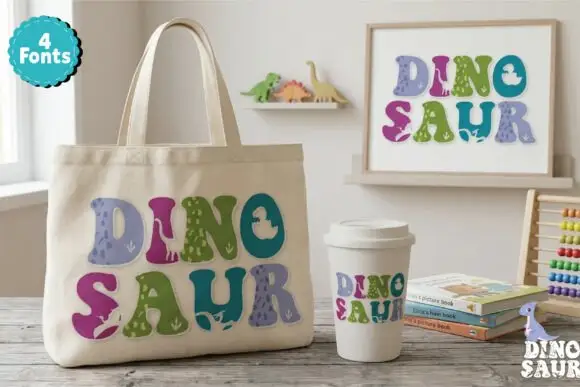
Soft chunky multicolour forms with small dinosaur-like silhouettes
Dinosaur Profonts fills chunky pastel capitals with dinosaur-skin textures, from scales to smooth hide, and sells four versions of the same alphabet so one word can mix four patterns.
Ideas for this font
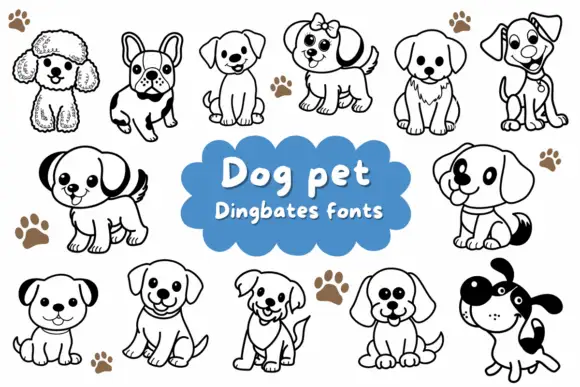
Rounded puppy outlines with dark ears, collars and varied facial expressions
Dog Pet is a typable set of about fifteen puppies — a poodle, a French bulldog, a spaniel, a terrier, a labrador, a dalmatian — drawn in a bold outline with a few patches solid black.
Ideas for this font
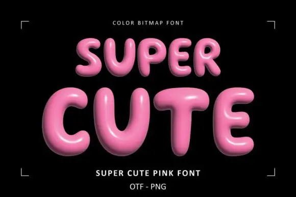
Glossy pink rounded display
Super Cute Font is a colour display on a black ground: glossy pink rounded capitals with soft highlights, dark shaded undersides and a slight taper, set in two lines inside small corner brackets, with a small note above and two plain lines beneath naming the style and the formats.
Ideas for this font
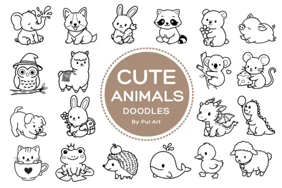
Rounded black outline animal dingbats with simple expressions and props
Cute Animals Doodles is a typable collection of about two dozen animals — elephant, corgi, bunny, raccoon, bear, owl, alpaca, koala, mouse, hedgehog, whale, duck, sheep, a small dragon — each drawn in one even black line.
Ideas for this font
Same independent foundry
Allow optional Google Analytics to measure visits and catalogue actions. Your search words and notes are not included. Privacy & storage