Neutral Sans Workhorse

Cute Dot Duo + Limited Coffee
Lets Cute Dot Duo own the focal silhouette while handling secondary copy, sizing and subheads cleanly.
Inspect Limited Coffee specimenDisclosure: MakerFileHub may earn a commission from qualifying purchases via paid links on this page. How our links work.
Soft uneven block capitals alternating filled white-dot and hollow dark-dot bodies
Cute Dot is a two-face set in black and white: fat rounded caps packed with dots on a white ground, and a matching face where the dots invert to white on black, both with a hatched shadow.
Paid link
Get this fontProject & layout blueprintsAt-a-glance maker compatibility
Sturdy stroke walls and open counters weed cleanly on adhesive vinyl, HTV apparel film, and cut cardstock.
Visual anatomy & craft review
CUTE over DOT fills the card, the first row dotted black on white and the second row in the same construction with the fills reversed, so the pair reads as a positive and a negative of one drawing. Each letter is a soft shape with uneven edges and a shadow hatched at a single angle, and the dots are spaced by eye rather than on a grid, which is what gives the set its hand-drawn feel. Two small doodles sit beside the words, an arc of cloud and a scalloped flower, and a caption at the foot names the set as a duo. The face is built for two-colour print, stickers and craft cutting, and it holds at moderate sizes, though the dots close up quickly below about 20 pt.
Soft uneven block capitals alternating filled white-dot and hollow dark-dot bodies
Two-font hierarchy recipes
Tested contrast partners — pairing Cute Dot Duo with grounded secondary typography.
Cute Dot Duo + Limited Coffee
Lets Cute Dot Duo own the focal silhouette while handling secondary copy, sizing and subheads cleanly.
Inspect Limited Coffee specimen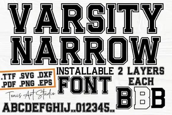
Cute Dot Duo + Varsity Narrow
Grounds bold display lettering with classic typographic authority on posters, badges and apparel.
Inspect Varsity Narrow specimenPractical applications
Concrete hierarchy, scale and production guidance tailored to Cute Dot Duo’s stroke geometry.
The two faces let a label carry a name and a strapline without a second typeface, and the black and white palette keeps a small range looking deliberate.
Hierarchy & layout recipe
Print a 55 by 45 mm jar label: set the range name at 15 pt in the dotted face and the strapline at 8 pt in the reversed one, keep 5 mm of clear ground between them, and hold 4 mm from the shadow to the die line.
Pre-production check
Reversed dots fill in on small labels; print one label on the real stock and check the white dots before the batch.
The positive and negative pairing gives a cheap photocopied zine a designed cover with no colour budget, and the two faces give the page hierarchy.
Hierarchy & layout recipe
Print an A5 cover: set the title at 54 pt in the dotted face and the issue line at 10 pt in the reversed one, keep 14 mm of clear ground between them, and hold 12 mm of margin on all four sides.
Pre-production check
Photocopiers close the small dots; copy one cover on the machine the zine will use and check both faces.
The face is friendly without being babyish, and the plain black construction with the hatched shadow copies cleanly enough that a teacher can run a set for thirty pupils on the room machine without losing the letters.
Hierarchy & layout recipe
Print an A4 sheet: set the header at 34 pt in the dotted face, keep 14 mm of clear ground beneath before the first task at 11 pt, and hold 16 mm of margin at both sides.
Pre-production check
The shadow doubles the ink and greys the page; copy one sheet on the school machine and check the contrast before the run.
Technical & licence verification
Confirm included OTF/TTF/WOFF formats, full glyph tables and licence coverage on the live store page before batch production.
Closest visual alternatives
Matched across letterform anatomy, stroke behaviour and craft applications.
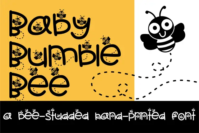
Bee-filled rounded lettering
Baby Bumble Bee has rounded separate letters with small cartoon bees sitting inside and above their counters, where dotted flight trails pass through the large B and e shapes and a much larger bee drawing stands at the right on a two-tone yellow and white field.
Ideas for this font
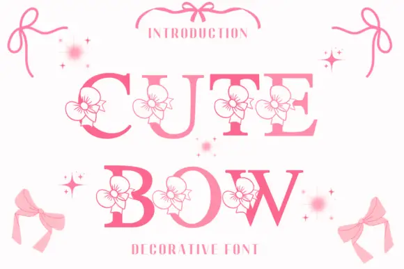
High-contrast serif capitals interrupted by outlined flower-like ribbon motifs
Cute Bow is a high-contrast serif display face in pink, with a drawn ribbon bow attached to each letter and small sparkles scattered around the word.
Ideas for this font
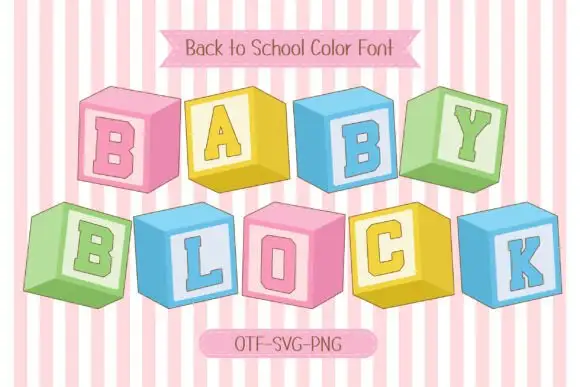
Pastel cube-like blocks with inset capitals and shaded side faces
Baby Block is a colour font that draws every letter as a wooden toy block seen at an angle: a pastel cube with the character on the front face and two shaded sides turning away.
Ideas for this font
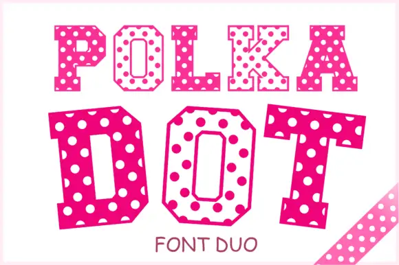
Angular slab-serif capitals alternating solid dotted and hollow dotted treatments
Polka Dot draws its capitals as octagons with the corners cut straight off, then punches a scatter of round holes through the fill so every letter looks like a punched paper tag.
Ideas for this font
Same independent foundry
Allow optional Google Analytics to measure visits and catalogue actions. Your search words and notes are not included. Privacy & storage