Neutral Sans Workhorse

Pixelvolt + Monure
Lets Pixelvolt own the focal silhouette while handling secondary copy, sizing and subheads cleanly.
Inspect Monure specimenDisclosure: MakerFileHub may earn a commission from qualifying purchases via paid links on this page. How our links work.
Neon pixel display
Pixel Volt is a neon pixel display in magenta on a dark cyberpunk street: letters built from square modules with a soft glow, stepped diagonals, and a wide even spacing, so the word reads as a screen sign rather than as a printed bitmap.
Paid link
Get this fontProject & layout blueprintsAt-a-glance maker compatibility
Sturdy stroke walls and open counters weed cleanly on adhesive vinyl, HTV apparel film, and cut cardstock.
Visual anatomy & craft review
The word is set once, wide, and the drawing is a coarse pixel grid: the curves step in single modules, the counters are one or two modules across, and the spacing is generous so each letter reads as its own block of light. The glow is a second layer behind the fill, which is how a neon sign actually reads at night, and the flat magenta keeps the colour count to one. Because the module is large, the face needs a display size, and the specimen sets it across the plate with the city behind it rather than a flat colour, which shows the glow working against real darkness. Three tracked lines above and below explain the format, and a small credit sits at the foot, so the page reads as a product listing with a strong mood.
Pixel, neon, digital, retro-future
Two-font hierarchy recipes
Tested contrast partners — pairing Pixelvolt with grounded secondary typography.
Pixelvolt + Monure
Lets Pixelvolt own the focal silhouette while handling secondary copy, sizing and subheads cleanly.
Inspect Monure specimen
Pixelvolt + Grandeur – Elegant Classic Serif
Grounds bold display lettering with classic typographic authority on posters, badges and apparel.
Inspect Grandeur – Elegant Classic Serif specimenPractical applications
Concrete hierarchy, scale and production guidance tailored to Pixelvolt’s stroke geometry.
A neon pixel mark reads at night on a dark street, which is when an arcade bar is busiest, and the coarse grid means the mark can be fabricated as individual LED modules.
Hierarchy & layout recipe
Build a 1,200 mm sign: the name at 180 mm cap height, a 12 mm module, and a 20 mm glow band behind the letters. Keep the mounting depth at 60 mm so the glow spills onto the wall and specify warm white or magenta diodes.
Pre-production check
Check the module at 12 mm, where a smaller module cannot be fabricated in LED channel; keep it above 10 mm. Confirm the sign reads at thirty metres and that the glow band does not wash out the letter shapes.
A neon pixel face sets a night-time gaming tone, and the stepped letterforms read at card size where a fine bitmap would turn into noise on a home printer.
Hierarchy & layout recipe
A6 card: the headline at 30 pt, the details in a 9 pt mono, and one glow layer behind the fill. Keep the palette to two colours on a dark card so the steps stay crisp and print at the highest home setting.
Pre-production check
Check the 30 pt headline on a home printer, where a glow layer can print as grey mud; keep the glow to one soft step. Confirm the 9 pt details keep a 4.5:1 contrast and that the steps survive at half size on a phone screen.
A pixel display gives a games book a cover that speaks the medium's own language, and the modular construction means the title can be rebuilt as a graphic element on the spine.
Hierarchy & layout recipe
Set the title at 90 mm cap height across 210 mm, the subtitle in a 10 pt mono, and the author at 8 pt. Print two inks on a dark matte stock with the glow as a halftone, and keep the grid aligned to a 6 mm module.
Pre-production check
Check the title at thumbnail size, where the steps can read as a low-resolution image; keep the module above 4 mm. Confirm the 8 pt author survives lamination and that the module grid does not clash with the cover's trim.
Technical & licence verification
Confirm included OTF/TTF/WOFF formats, full glyph tables and licence coverage on the live store page before batch production.
Closest visual alternatives
Matched across letterform anatomy, stroke behaviour and craft applications.
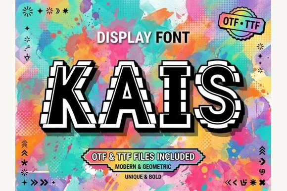
Bold geometric sans framed in perforated film-strip / arcade borders (OTF & TTF)
Kais is an eye-catching geometric display font wrapping solid white-and-black capitals inside dashed film-strip / marquee border tracks (OTF & TTF).
Ideas for this font
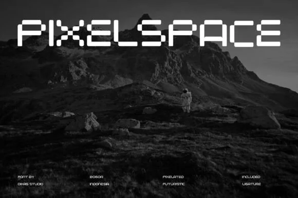
Pixelated futuristic stencil display
Pixel Space is a pixelated display in white on a dark mountain landscape: wide capitals assembled from square blocks with stencil gaps where the segments meet, a flat top and bottom on every letter, and a lowercase-sized x-height that keeps the line horizontal.
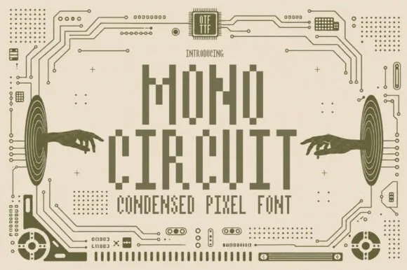
Condensed pixel font with a technical ground
Mono Circuit is a condensed pixel font in olive on cream: letters built from square blocks in a narrow grid, with circuit-board traces, hands reaching toward the type and small technical marks filling the page.
Ideas for this font
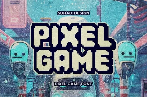
Double-outlined retro pixel arcade alphabet with a filled inner core
Pixel Game is an arcade alphabet in which every letter carries two outlines and a filled core, so a word reads as an eight-bit game logo rendered as a sticker.
Ideas for this font
Allow optional Google Analytics to measure visits and catalogue actions. Your search words and notes are not included. Privacy & storage