High-Contrast Display Serif

Pinnacle + Lumera Editorial
Pairs sculptural editorial warmth with Pinnacle's clean modern geometry.
Inspect Lumera Editorial specimenDisclosure: MakerFileHub may earn a commission from qualifying purchases via paid links on this page. How our links work.
Angular stencil sans with cut corners
Pinnacle is an angular stencil sans in beige on dark brushed metal: heavy capitals with forty-five degree cut corners, notched stems and flat apexes, lit as if the letters were cut from a plate.
Paid link
Get this fontProject & layout blueprintsAt-a-glance maker compatibility
Open counter bridges hold interior islands intact on laser-cut wood, acrylic, and mylar stencils.
Visual anatomy & craft review
The word is set in one line of large capitals on a scratched metal ground, and the face is a stencil sans with a military tone: every corner is cut at forty-five degrees, the A and the V come to flat apexes, the N loses a diagonal to a clean notch, the C opens wide, and the E keeps short even arms so the letters read as plates cut by hand rather than drawn. The stroke is heavy and uniform with no contrast, the fit is tight, and the counters are narrow slots, which is what gives the line its machine-cut look. A drop shadow and a light source from above suggest the letters stand off the surface, and two lines of smaller capitals give the introduction and the file formats. The ground is dark, scratched metal with a soft vignette. Pinnacle is a display face for posters, game art, sport graphics and industrial branding, and it needs capitals at a large size with a dark, textured ground.
Angular, tactical, cut
Two-font hierarchy recipes
Tested contrast partners — pairing Pinnacle with grounded secondary typography.
Pinnacle + Lumera Editorial
Pairs sculptural editorial warmth with Pinnacle's clean modern geometry.
Inspect Lumera Editorial specimen
Pinnacle + Hailey
Introduces organic movement on pull-quotes, signatures and gift tags.
Inspect Hailey specimenPractical applications
Concrete hierarchy, scale and production guidance tailored to Pinnacle’s stroke geometry.
A cut stencil sets a hard, professional tone, and heavy capitals with flat apexes hold their shape at newsstand size in poor light.
Hierarchy & layout recipe
Print a 230 by 300 mm cover: set the title at 96 pt on one line, keep 30 mm of clear ground beneath before the subtitle at 12 pt, and hold 20 mm of margin on all four sides.
Pre-production check
Notched stems can look like printing faults at small sizes; keep the face above sixty points and proof the cover flat.
An angular stencil reads as engineering rather than school spirit, which suits a club that builds machines and prints its own signage.
Hierarchy & layout recipe
Print a 900 by 400 mm banner: set the club name at 140 pt over two lines, keep 30 mm of clear ground beneath before the meeting time at 30 pt, and hold 26 mm of margin on all four sides.
Pre-production check
A heavy stencil on coarse banner vinyl can close its notches; print one section at the final size and check the gaps.
A cut face looks stamped rather than printed, and the narrow counters survive being reproduced small on a box or a metal plate.
Hierarchy & layout recipe
Print a 40 by 20 mm box label: set the brand at 9 pt on one line, keep 3 mm of clear ground beneath before the model at 4 pt, and hold 2.5 mm of margin on all four sides.
Pre-production check
At nine points a stencil face can lose its notches on a flexo press; print one label on the real board and inspect it before the run.
Technical & licence verification
Confirm included OTF/TTF/WOFF formats, full glyph tables and licence coverage on the live store page before batch production.
Closest visual alternatives
Matched across letterform anatomy, stroke behaviour and craft applications.

Broad heavy capitals with a round O and sharply pointed N diagonal
Furion presents a large black uppercase name on a pale technical cover. Broad near-even strokes form a circular O, an open U, flat F arms, a diagonal R leg and a sharply pointed upper start to the N, while the surrounding panels advertise a variable system and list weights.
Ideas for this font
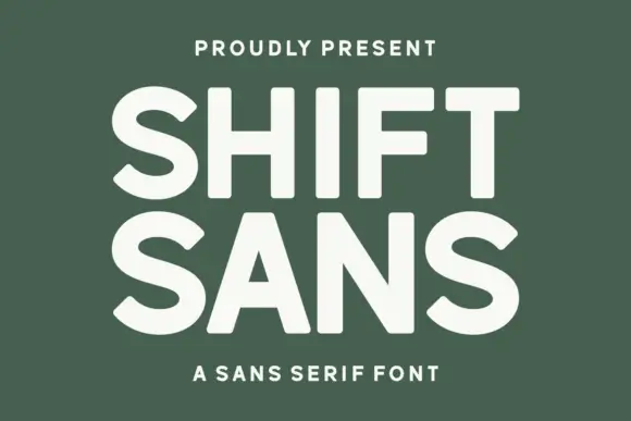
Bold high-x-height grotesque
Shift Sans is a bold grotesque in cream on green: very tall x-height, short ascenders, flat terminals and slightly narrow counters, with two stacked lines filling the plate and a tracked caption above and below, so the pair reads as a contemporary poster headline.
Ideas for this font
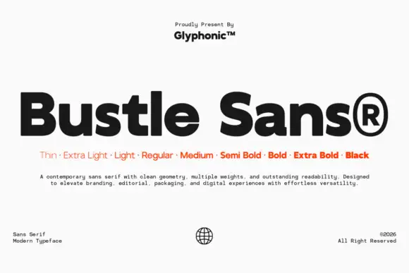
Dense rounded mixed case with open e bowls and a compact high t shoulder
Bustle shows black mixed-case lettering on white in a heavy treatment, where broad nearly even strokes surround compact bowls, the e opens horizontally, the u stays rounded and the t carries a compact shoulder high above the baseline.
Ideas for this font

Modern geometric grotesque caps
Limited Coffee is a modern geometric grotesque in black on cream: wide round capitals, a circular O and C, a low crossbar on the A, flat terminals and even spacing, so the pair reads as a contemporary retail sign rather than a period revival.
Ideas for this font
Same independent foundry
Allow optional Google Analytics to measure visits and catalogue actions. Your search words and notes are not included. Privacy & storage