Modern Grotesque Body

Bright Gesture + Mansory
Creates crisp high-hierarchy contrast beneath Bright Gesture headlines across menus, websites and labels.
Inspect Mansory specimenDisclosure: MakerFileHub may earn a commission from qualifying purchases via paid links on this page. How our links work.
Rounded serif lettering with curled capitals and low returning tails
Bright Gesture shows dark brown mixed-case lettering on a pale torn-paper field, where the B opens with a small inward curl, the G carries a much larger rounded entry and the descending g turns into a broad loop, while a long returning stroke beneath Gesture gives the lower word its own underline-like ending.
Paid link
Get this fontProject & layout blueprintsAt-a-glance maker compatibility
Weld or Unite overlapping script joins into one continuous vector path before sending to the blade.
Visual anatomy & craft review
The stems stay substantial, the joins thin into curves, the entries curl inward and one descender sweeps back as a rule. That returning stroke is the character: the lower word draws its own underline, which is why the two lines sit close and the studio credit stays at the right. The torn paper and the gold flecks are styling. Keep 40 pt so the curls stay open, reserve 22 mm beneath the lower row and keep supporting copy off the returning stroke.
Rounded serif lettering with curled capitals and low returning tails
Two-font hierarchy recipes
Tested contrast partners — pairing Bright Gesture with grounded secondary typography.
Bright Gesture + Mansory
Creates crisp high-hierarchy contrast beneath Bright Gesture headlines across menus, websites and labels.
Inspect Mansory specimen
Bright Gesture + Black Ink Brush
Adds a warm human signature touch for 1-to-3-word callouts without competing against structured serif capitals.
Inspect Black Ink Brush specimenPractical applications
Concrete hierarchy, scale and production guidance tailored to Bright Gesture’s stroke geometry.
The warm serif with a returning stroke gives a feature opener its ornament, and the two rows keep a title and deck in one voice.
Hierarchy & layout recipe
Print a 210 by 280 mm page: set the title at 54 pt across two rows, keep 22 mm of clear ground beneath for the returning stroke, and keep 20 mm of margin at each side.
Pre-production check
The underline stroke may be an alternate; check your file before relying on it in a new line.
The rounded entries give a small ceramic maker a crafted mark, and the returning stroke frames a short name on a wide label.
Hierarchy & layout recipe
Print a 75 by 50 mm label: set the studio name at 20 pt on one row, keep 13 mm of clear ground beneath for the returning stroke, and keep 6 mm to the die edge.
Pre-production check
The g loop drops below the returning stroke; check the artwork and keep 12 mm between them.
The soft serif gives a note warmth, and the curl on the opening letter makes a short greeting look drawn rather than typed.
Hierarchy & layout recipe
Print a 105 by 148 mm card: set the greeting at 26 pt on one row, keep 18 mm of clear ground beneath for the message, and keep 16 mm of margin at each side.
Pre-production check
Torn paper behind the letters competes with them; check the card and keep the field plain.
Technical & licence verification
Confirm included OTF/TTF/WOFF formats, full glyph tables and licence coverage on the live store page before batch production.
Closest visual alternatives
Matched across letterform anatomy, stroke behaviour and craft applications.
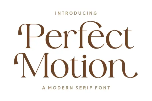
Broad modern serif with hooked entries
Perfect Motion is a broad modern serif in warm brown on white: mixed case with moderate contrast, hooked entries on the P and the M, round bowls and an outward tail on the last n, set on two lines with a tracked line above and beneath.
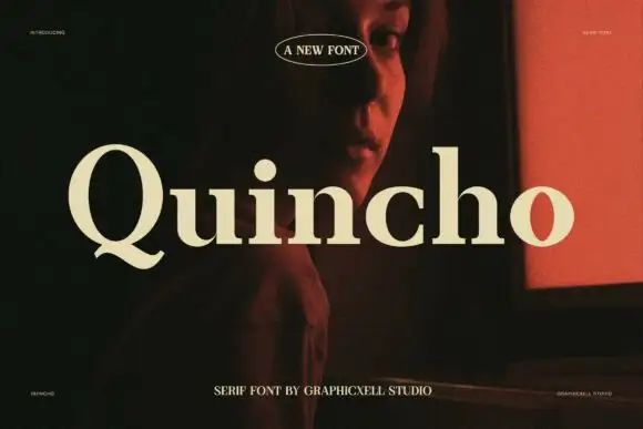
Substantial upright serif
Quincho is a substantial serif in cream over a dark interior with a red screen: upright mixed case with moderate contrast, a short curled Q tail, round bowls and a large x-height, with an oval badge above and a tracked line beneath.
Ideas for this font
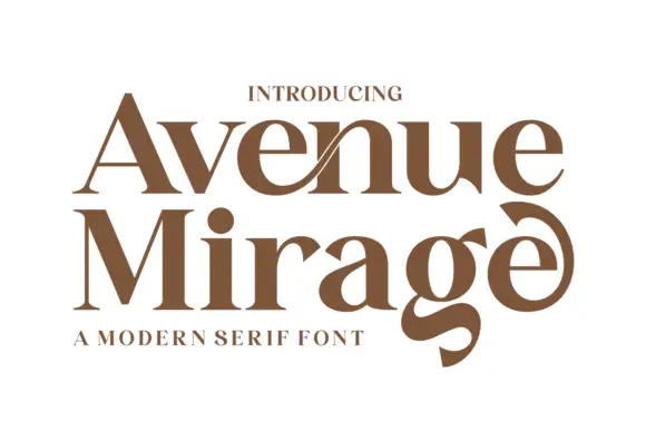
Heavy contrasting mixed case with a low g and curled final e
Avenue Mirage shows brown serif lettering in two rows on white. Broad heavy bowls meet fine joins, a slender diagonal crosses the upper n area, the lower g descends into a thick curved tail, and the final e curls upward into a large terminal above a compact subtitle.
Ideas for this font
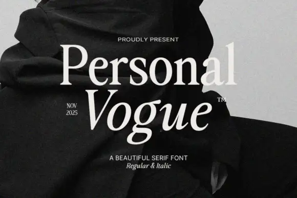
Elegant editorial serif with italic
Personal Vogue is a serif in cream on a monochrome fashion photograph: a moderate-contrast roman with fine serifs and a true italic with a strong slant, set on two lines with small tracked notes at the sides and an attribution beneath.
Same independent foundry
Allow optional Google Analytics to measure visits and catalogue actions. Your search words and notes are not included. Privacy & storage



