Modern Grotesque Body

Quincho + Taught
Creates crisp high-hierarchy contrast beneath Quincho headlines across menus, websites and labels.
Inspect Taught specimenDisclosure: MakerFileHub may earn a commission from qualifying purchases via paid links on this page. How our links work.
Substantial upright serif
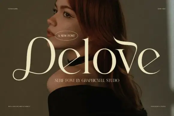
Quincho is a substantial serif in cream over a dark interior with a red screen: upright mixed case with moderate contrast, a short curled Q tail, round bowls and a large x-height, with an oval badge above and a tracked line beneath.
Paid link
Get this fontProject & layout blueprintsAt-a-glance maker compatibility
Weld or Unite overlapping script joins into one continuous vector path before sending to the blade.
Visual anatomy & craft review
The word spans the plate and the drawing is a substantial serif in mixed case: the contrast is moderate, the Q tail curls short, and the bowls are round, which gives the face a confident, unfussy voice. That construction makes it usable at both display and text sizes, and the plate demonstrates the display end by setting the word as wide as the sheet allows over a dark photograph. The cream holds against the warm background because the stems are thick enough, which is the honest test a specimen should give. The oval badge above and the tracked line beneath are small and plain, and the red screen at the right is staging that adds warmth without competing. Because the contrast is moderate, the face prints well on uncoated stock at text sizes.
Serif, substantial, editorial, warm
Two-font hierarchy recipes
Tested contrast partners — pairing Quincho with grounded secondary typography.
Quincho + Taught
Creates crisp high-hierarchy contrast beneath Quincho headlines across menus, websites and labels.
Inspect Taught specimen
Quincho + Coastal Honey
Adds a warm human signature touch for 1-to-3-word callouts without competing against structured serif capitals.
Inspect Coastal Honey specimenPractical applications
Concrete hierarchy, scale and production guidance tailored to Quincho’s stroke geometry.
A substantial serif gives a personal book a warm authority, and the moderate contrast holds at thumbnail size where a didone would fade.
Hierarchy & layout recipe
Set the title at 85 mm cap height across 195 mm, the subtitle in a 12 pt serif, and the author at 9 pt. Print one ink on a cream stock and keep the title in the upper half.
Pre-production check
Check the title at thumbnail size, where round bowls can clot; open the spacing. Confirm the 9 pt author survives lamination and that the title clears the trim by 12 mm.
A warm serif reads as a small batch, and the large x-height keeps a short brand legible on the small label a jar allows.
Hierarchy & layout recipe
Print a 60 by 80 mm label: the brand at 15 pt, the product at 8 pt, and the weight at 6 pt. Keep 4 mm inside the die and print one ink on a cream stock.
Pre-production check
Check the 15 pt brand on a curved jar, where the outer letters distort; reduce the width. Confirm the 6 pt weight reads on the shelf and that the label survives a chilled cabinet.
A substantial serif holds across a long table, and the moderate weight reads at nine point where a hairline face would disappear in low light.
Hierarchy & layout recipe
A5 menu: the heading at 20 pt, the courses at 9.5 pt with 14.5 pt leading, and the date at 8.5 pt. Keep 20 mm margins and print one ink on a cream card.
Pre-production check
Check the 9.5 pt courses in evening light, where a moderate serif holds better than a hairline; keep the contrast above 4.5:1. Confirm the heading reads across the table and that the card stands.
Technical & licence verification
Confirm included OTF/TTF/WOFF formats, full glyph tables and licence coverage on the live store page before batch production.
Closest visual alternatives
Matched across letterform anatomy, stroke behaviour and craft applications.
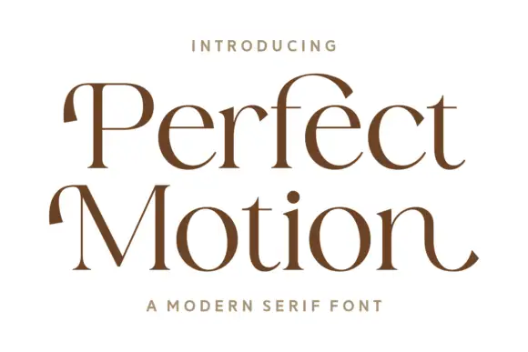
Broad modern serif with hooked entries
Perfect Motion is a broad modern serif in warm brown on white: mixed case with moderate contrast, hooked entries on the P and the M, round bowls and an outward tail on the last n, set on two lines with a tracked line above and beneath.
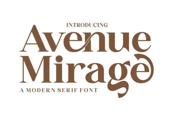
Heavy contrasting mixed case with a low g and curled final e
Avenue Mirage shows brown serif lettering in two rows on white. Broad heavy bowls meet fine joins, a slender diagonal crosses the upper n area, the lower g descends into a thick curved tail, and the final e curls upward into a large terminal above a compact subtitle.
Ideas for this font
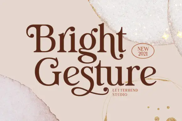
Rounded serif lettering with curled capitals and low returning tails
Bright Gesture shows dark brown mixed-case lettering on a pale torn-paper field, where the B opens with a small inward curl, the G carries a much larger rounded entry and the descending g turns into a broad loop, while a long returning stroke beneath Gesture gives the lower word its own underline-like ending.
Ideas for this font
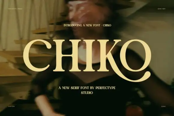
Broad capitals with sturdy stems and a long curved K leg
Chiko is a broad capital serif in which the stems stay substantial, the transitions curve smoothly and the K leg sweeps far beneath the neighbouring O to finish in a thick rounded terminal, so a single word reads as an extended editorial mark.
Ideas for this font
Same independent foundry
Allow optional Google Analytics to measure visits and catalogue actions. Your search words and notes are not included. Privacy & storage