Neutral Sans Workhorse

Pencil + Memoir Slang
Lets Pencil own the focal silhouette while handling secondary copy, sizing and subheads cleanly.
Inspect Memoir Slang specimenDisclosure: MakerFileHub may earn a commission from qualifying purchases via paid links on this page. How our links work.
Pencil-shaped letter frames
Pencil is a novelty display on a cream sheet: each capital sits inside a tall pencil drawn with a coloured body, a rounded cap and a shaded tip, with small school illustrations at the corners, a banner above and a badge at the left naming the styles.
Paid link
Get this fontProject & layout blueprintsAt-a-glance maker compatibility
Sturdy stroke walls and open counters weed cleanly on adhesive vinyl, HTV apparel film, and cut cardstock.
Visual anatomy & craft review
The plate explains its own construction: each letter is a small capital centred inside a pencil shape, so the word reads as a row of pencils rather than as lettering, and the pencils differ in colour, which gives the row rhythm. That construction sets a large size floor, because a capital inside a pencil is much smaller than the enclosing shape, and the plate sets the row large enough that the letters remain readable. The badges and the illustrations around the sheet are staging and product copy. Because the letters are enclosed, the face suits a name, a label and a card for a school or a stationery brand, and it is not intended for a sentence; the note at the foot names the regular and outline variants, which is the useful detail for a buyer.
Decorative, novelty, pencils, playful
Two-font hierarchy recipes
Tested contrast partners — pairing Pencil with grounded secondary typography.
Pencil + Memoir Slang
Lets Pencil own the focal silhouette while handling secondary copy, sizing and subheads cleanly.
Inspect Memoir Slang specimen
Pencil + Majestic Letters
Grounds bold display lettering with classic typographic authority on posters, badges and apparel.
Inspect Majestic Letters specimenPractical applications
Concrete hierarchy, scale and production guidance tailored to Pencil’s stroke geometry.
A pencil-shaped display names the trade in the lettering, and the coloured bodies read on a window from a distance. The trade is named before a word is read.
Hierarchy & layout recipe
A2 print: the shop at 60 mm cap height inside 120 mm pencils, the line at 18 mm, and the address at 10 mm. Keep 28 mm margins and print five colours on a light stock.
Pre-production check
Check the A2 at four metres, where an enclosed capital can read as too small; keep the cap at half the pencil height. Confirm the 10 mm address reads at arm's length and that the tips stay even.
A pencil face gives a child's card a theme in the lettering, and the coloured bodies print at home without registration trouble.
Hierarchy & layout recipe
A6 card: the name at 26 pt inside a 50 mm pencil, the message at 9.5 pt, and the date at 8.5 pt. Keep 15 mm margins and print four colours on a white card.
Pre-production check
Check the 26 pt name at home-print resolution, where the cap can close; keep it above 30 pt. Confirm the 9.5 pt message keeps a 4.5:1 contrast and that the card folds flat.
A pencil label signals the product category on a shelf, and the enclosed letters hold on a small tag where a script would fail.
Hierarchy & layout recipe
Print a 50 by 70 mm tag: the brand at 11 pt inside a 22 mm pencil, the line at 7.5 pt, and three colours on a white card. Keep 5 mm inside the die and punch the hole clear.
Pre-production check
Check the 11 pt brand on a tag, where the pencil can crowd the die; keep 6 mm clearance. Confirm the 7.5 pt line reads at arm's length and that the tag ties cleanly.
Technical & licence verification
Confirm included OTF/TTF/WOFF formats, full glyph tables and licence coverage on the live store page before batch production.
Closest visual alternatives
Matched across letterform anatomy, stroke behaviour and craft applications.
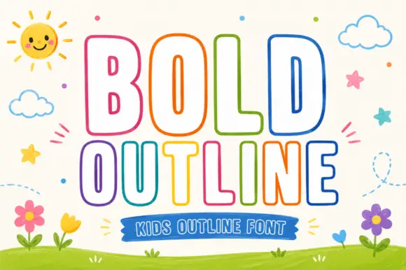
Rounded outline capitals
Bold Outline shows tall rounded capitals traced by a thin coloured contour on a pale field, where the B keeps small narrow counters while the L and D leave broad white interiors, and the letter widths change across the two rows so the second word runs wider than the first.
Ideas for this font
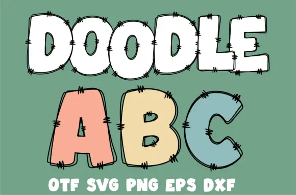
Broad rounded outlined capitals with doubled sketch contours and short crosshatched edge marks
Doodle Abc shows a white DOODLE row above large pastel A, B and C on green, where broad rounded bodies carry doubled irregular outlines and small groups of short dark strokes cross the edges at intervals.
Ideas for this font
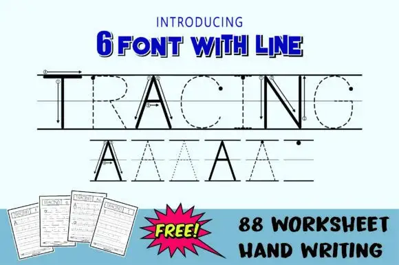
Tracing paths with guides
Tracing is a teaching set shown in black on a pale blue sheet: a large word drawn twice — once as solid letters with guide lines and arrows, once as dashed and dotted outlines on ruled guide lines — above three drawn worksheet pages and a plain caption block at the foot.
Ideas for this font
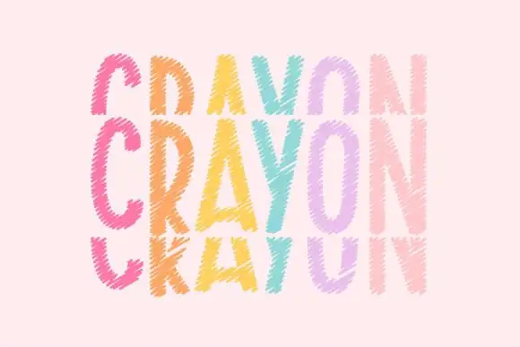
Tall crayon-textured capitals repeated in cropped upper and lower rows
Crayonfriends Stacked repeats the same tall word in three pastel rows on pale pink, where the middle row is complete while the rows above and below are cut by broad horizontal blank bands, and scratchy diagonal marks break both the coloured strokes and their edges.
Ideas for this font
Same independent foundry
Allow optional Google Analytics to measure visits and catalogue actions. Your search words and notes are not included. Privacy & storage