High-Contrast Display Serif

Peach Club + Marquis - Elegant Modern Serif
Pairs sculptural editorial warmth with Peach Club's clean modern geometry.
Inspect Marquis - Elegant Modern Serif specimenDisclosure: MakerFileHub may earn a commission from qualifying purchases via paid links on this page. How our links work.
Hand-drawn vintage script with a sans companion
Peach Club is a duo in forest green on cream: a drawn vintage script with heavy strokes and curled entry strokes, a small sans capital line above it, and pink palm fronds and grass drawn around the block.
Paid link
Get this fontProject & layout blueprintsAt-a-glance maker compatibility
Sturdy stroke walls and open counters weed cleanly on adhesive vinyl, HTV apparel film, and cut cardstock.
Visual anatomy & craft review
The pair is sold as five styles in one: the script carries Peach Club with a heavy connected stroke, tall curled entries on the P and the C and an exclamation mark, while a narrow sans in orange carries the small words above and below, so a label can mix a drawn script with a clean line without a second purchase. The script has a period feel: the bowls are fat, the joints are tight and the letters lean slightly, which is what makes it read as a hand-painted club sign rather than a modern script. Drawn palms in two tones and a strip of grass frame the block, and small pink badges name the style and the studio. The ground is a plain cream sheet. Peach Club is a duo for packaging, menus, signage and apparel, and it needs a wide measure for the script and a short word for the sans.
A vintage club script with palm fronds
Two-font hierarchy recipes
Tested contrast partners — pairing Peach Club with grounded secondary typography.
Peach Club + Marquis - Elegant Modern Serif
Pairs sculptural editorial warmth with Peach Club's clean modern geometry.
Inspect Marquis - Elegant Modern Serif specimen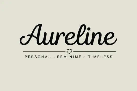
Peach Club + Aureline
Introduces organic movement on pull-quotes, signatures and gift tags.
Inspect Aureline specimenPractical applications
Concrete hierarchy, scale and production guidance tailored to Peach Club’s stroke geometry.
A drawn vintage script with a small sans line gives a welcome board two voices, and the palm illustration sets the setting before a guest reads a word.
Hierarchy & layout recipe
Print a 500 by 350 mm board: set the place name at 96 pt in the script, set the date at 26 pt in the sans with 22 mm of clear ground, and hold 22 mm of border on all four sides.
Pre-production check
A heavy script beside a fine sans can look unbalanced; print one board at the final size and check the weight of each line before the set.
The pair covers a brand name and a flavour line on one label, and the period script suits a drink sold on summer nostalgia.
Hierarchy & layout recipe
Print a 60 by 100 mm can label: set the brand at 17 pt in the script, set the flavour at 8 pt in the sans with 6 mm of clear ground, and hold 5 mm of margin on all four sides.
Pre-production check
A fine sans at eight points on a curved can distorts; print one on the real can and check the ends before the order.
A vintage script over a sans list reads at a table and looks printed rather than typed, which is what a seasonal bar wants on a menu.
Hierarchy & layout recipe
Print a 130 by 210 mm menu: set the heading at 34 pt in the script, set the items at 10 pt in the sans with 16 mm of clear ground, and hold 14 mm of margin on all four sides.
Pre-production check
A script heading with a heavy stroke can dominate a long list; print one menu at the finished size and check the balance before the run.
Technical & licence verification
Confirm included OTF/TTF/WOFF formats, full glyph tables and licence coverage on the live store page before batch production.
Closest visual alternatives
Matched across letterform anatomy, stroke behaviour and craft applications.
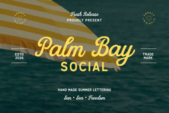
Summer script with an upright block companion
Palm Bay Social is a duo on a sunlit water photograph: a casual looped script in golden yellow for the place name and a plain uppercase block line beneath it, with small tracked proofs and stamps around the edges.
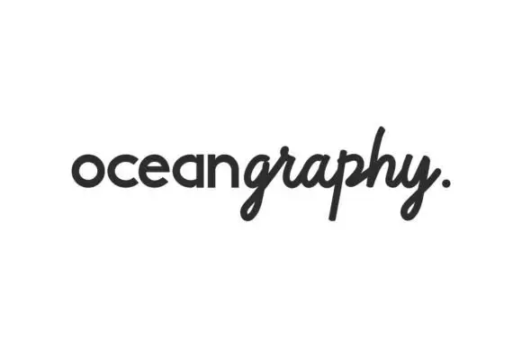
Rounded sans and flowing script duo
Oceangraphy is a duo in near-black on white: a rounded upright lowercase sans for the first part of the word and a flowing slanted script for the second, joined without a space, with a looped descender on the g and a full stop at the end, and nothing else on the sheet.
Ideas for this font
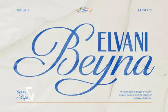
High-contrast calligraphic script with a wide sweeping capital
Beyna Elvani is a high-contrast calligraphic script in which the capital sweeps below the baseline, the joins stay thin and the ligatures tie the letters, so a name reads as an engraved signature with a single long gesture.
Ideas for this font
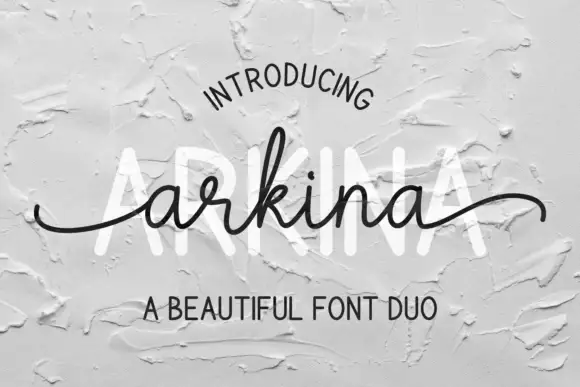
Tall sans capitals with a low looping script duo
Arkina Duo layers a very low looping connected script over tall narrow capitals that read as engraved lettering pressed into plaster, with entry strokes starting well left of the first letter.
Ideas for this font
Same independent foundry
Allow optional Google Analytics to measure visits and catalogue actions. Your search words and notes are not included. Privacy & storage