Modern Grotesque Body

Omar + Bareum
Creates crisp high-hierarchy contrast beneath Omar headlines across menus, websites and labels.
Inspect Bareum specimenDisclosure: MakerFileHub may earn a commission from qualifying purchases via paid links on this page. How our links work.
Military and sport stencil display
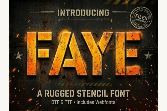
Omar is a military stencil display in cream and orange on a distressed metal ground: heavy condensed capitals with bridge gaps cut through the stems, a horizontal two-tone fill across the middle, and a hard offset that gives the word thickness.
Paid link
Get this fontProject & layout blueprintsAt-a-glance maker compatibility
Open counter bridges hold interior islands intact on laser-cut wood, acrylic, and mylar stencils.
Visual anatomy & craft review
The word spans the frame and the drawing is a stencil first and a display face second: every letter is cut with at least one bridge gap, the stems are thick and squared, and the counters are rectangular, which is what makes the word read as a painted crate rather than as a poster headline. The fill is split horizontally, cream above and orange below, which gives the lettering a utility look without a gradient, and a solid offset behind the shapes lifts the word off the ground. Because the gaps are wide, the face stays legible at distance and can be cut as a physical stencil, which is exactly how this genre is used. The ground is a scratched metal panel, and the supporting lines are small tracked caps with star separators, along with two round badges at the corners.
Military, stencil, athletic, utility
Two-font hierarchy recipes
Tested contrast partners — pairing Omar with grounded secondary typography.
Omar + Bareum
Creates crisp high-hierarchy contrast beneath Omar headlines across menus, websites and labels.
Inspect Bareum specimen
Omar + Hailey
Adds a warm human signature touch for 1-to-3-word callouts without competing against structured serif capitals.
Inspect Hailey specimenPractical applications
Concrete hierarchy, scale and production guidance tailored to Omar’s stroke geometry.
A stencil face is the honest choice for a workshop sign because it can be cut and sprayed, and the wide bridges keep the letters clear at a distance.
Hierarchy & layout recipe
Cut a 500 by 250 mm stencil from oiled board: the word at 80 mm cap height, the room number at 25 mm, and a 5 mm border. Keep every bridge at least 4 mm so the stencil survives repeated use and cleaning.
Pre-production check
Check the cut stencil at full size, where a bridge under 4 mm tears on the first spray; widen it. Confirm the 25 mm room number reads from three metres and that the overspray does not close the rectangular counters.
A stencil face reads as utility on a garment tag, and the two-tone fill can be simplified to one ink for a woven label without losing the look.
Hierarchy & layout recipe
Print a 45 by 60 mm tag: the brand at 14 pt, the size at 9 pt in the same face, and a single-ink version for the woven label. Keep the bridge gaps at 1 mm minimum at tag size and use a solid fill for woven.
Pre-production check
Check the 14 pt tag at actual size, where the bridges can close; increase the size or drop to the solid cut. Confirm the 9 pt size reads at a glance and that the woven version matches the printed mark at arm's length.
A military stencil reads as an event with grit, and the condensed weight stays legible on a banner seen from a distance in poor light.
Hierarchy & layout recipe
Print 1,200 by 600 mm: the event name at 220 mm cap height, the start times in a 40 mm sans, and a 10 mm border. Keep the fill in one colour so the stencil gaps read as cuts rather than as shading.
Pre-production check
Check the banner at ten metres, where the two-tone fill can merge into one value; use a single ink for the large format. Confirm the 40 mm times read from five metres and that the border clears the eyelets.
Technical & licence verification
Confirm included OTF/TTF/WOFF formats, full glyph tables and licence coverage on the live store page before batch production.
Closest visual alternatives
Matched across letterform anatomy, stroke behaviour and craft applications.
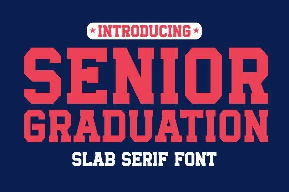
Heavy varsity slab caps
Senior Graduation is a heavy varsity slab in red on navy: very wide caps with block serifs as thick as the stems, flat tops, rectangular counters, and tight even spacing, so the pair reads as a college jersey print at its most emphatic.
Ideas for this font
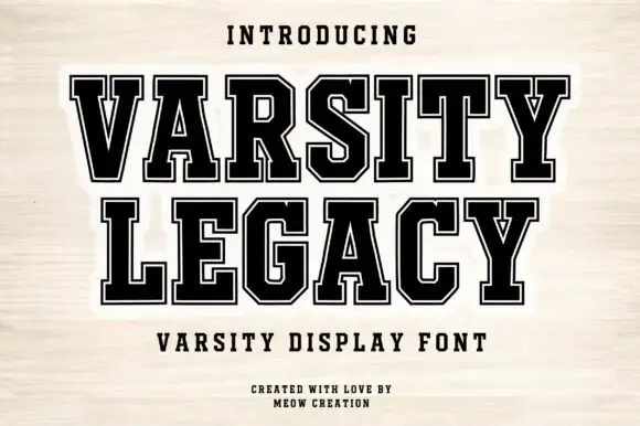
Collegiate slab with inline border
Varsity Legacy is a collegiate slab in black with a thin light inline border on a pale wood ground: wide caps with heavy slab serifs, a low waist and closed counters, edged by a light contour that follows every stroke, with tracked lines above and below.
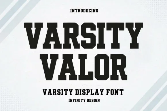
Solid varsity slab with flat serifs
Varsity Valor is a varsity display face in solid black on a pale ground: heavy capitals with thick flat serifs, flat apexes and a tight fit, with a small hatched pattern behind the words and tracked capital lines above and below.
Ideas for this font
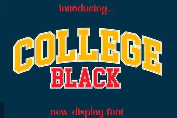
Double-outlined varsity jersey display
College Black pairs heavy collegiate slab capitals with a built-in athletic border framing, where wide stable letterforms and generous counter openings keep arched headlines crisp on jerseys, pennants and party backdrops.
Ideas for this font
Same independent foundry
Allow optional Google Analytics to measure visits and catalogue actions. Your search words and notes are not included. Privacy & storage